There is a small feature in RISE now that took a redesign of the renderer’s entire editing model to make possible, and a few days to build once it was. Right-click any property row in the inspector (a sphere’s radius, a material’s roughness) and choose “Reveal in Scene File”. The scene text editor scrolls to the exact byte run that defines that value and highlights it; not the line, the bytes. Then go the other way: right-click anywhere in the scene text, choose “Select in Inspector”, and the entity that owns that text lights up in the outliner with its properties laid out beside it.
As parlor tricks go it is modest. Nobody gasps. But it is the visible corner of the largest architectural change in RISE’s twenty-five years, and that change is the reason I can now build scenes in the renderer with an AI agent as a genuine partner rather than a very fast typist. This is the first essay in a series about that build. It starts where the build had to start: with the language the human, the GUI, and the agent all agree to speak.
Three dialects
RISE has always had a scene language. I hand-wrote the original ASCII parser back in the renderer’s research days; plain text was the easiest, most cross-platform way to feed scenes to a codebase that had to build everywhere, and in research code, easiest and portable wins. You declare a geometry chunk, a painter, a material, an object that binds them, and the renderer assembles a world. The format grew a descriptor system that defines every chunk’s parameters, and for most of the renderer’s life that text was how I talked to it. The GUIs came later, and they spoke something else entirely.
The GUI’s native tongue (now built in the AI era) was a live, mutable, in-memory scene. Edits were commands that mutated it. Undo was reconstructed from inverse edits. The file on disk was a lossy dump you produced when you remembered to save. Which means the system was really speaking three dialects at once: the text on disk, the object graph in memory, and the widgets on screen, with translation layers between all of them and no authority on what the scene actually was.
When it came to using AI agents to build scenes, they gravitated straight to the file. Text is an agent’s native medium; it can read a scene the way it reads a program, diff it, and propose a change as a patch. The agent and I had converged on the same dialect. The GUI was the odd one out, but my human brain likes working with a GUI.
Plenty of tools live comfortably with a human-facing GUI and a machine-facing format that drift politely apart, and I could have left it there; what forced the issue was a long stretch of unglamorous work that kept teaching the same lesson.
The translation tax
Before any of the redesign, I spent weeks using the agent to harden the GUI’s editor and transaction subsystem, the machinery for apply, undo, redo, and round-trip save, with review rounds that kept finding more. By the end the count stood at roughly two dozen correctness bugs: a transaction baseline that never captured quite every field, edit handling duplicated across five separate code walks so a fix in one missed the others, an undo that landed on the wrong camera, invalidation logic that a dozen call sites each had to remember independently.
Individually each bug was ordinary. Collectively they had one anatomy. Nearly every failure came from two or more mutable representations of the scene that had to be kept in agreement, and the consistency problem was unbounded; you could always find one more field the baseline forgot, one more walk the fix missed. We were paying a translation tax between dialects, and the tax was not going down with effort. Careful syncing does not reduce this class of bug. Removing the second representation dissolves it.
One canonical document
So the pivot. The attribution here matters, because the idea and its sharpening came from different minds. The product thesis was mine: RISE should be agent-forward by design, the 3D package for nerds, where the agent is a first-class user of the tool rather than a feature bolted onto it, the scene file is canonical, and the UI is a live view of it that never diverges. The sharpening was the agent’s. “The scene file is canonical” is a slogan until you commit to what canonical means, and the agent’s formulation was the one that held. The canonical object is the scene document, a lossless concrete syntax tree; comments and whitespace survive parsing, so it round-trips byte for byte. The text is its serialization. The file on disk is the last serialization you deliberately persisted. The rendered scene is its evaluation. And the GUI and the agent are two clients of the same edit boundary.
Compilers are not my field; my roots are in light transport, not language tooling, so before committing I did the reading on syntax trees and on how compilers and IDEs keep lossless source representations, and came out knowing considerably more about that world than I went in. The agent supplied the direction; validating it was mine to do.
The two-clients clause is the one carrying the weight. When you drag a slider in the inspector, the GUI performs a structured edit on the document, exactly as the agent does when it proposes a change in chat; at the edit boundary they are peers. Document undo stops being a reconstruction from inverse edits and becomes restoration of a previous immutable version, which shares structure with the new one, an edit path-copying only the handful of nodes on its spine. Session state, what camera you are looking through, where the animation is scrubbed to, still needs its own careful handling, and later essays will show us learning that. But the architecture removes the need to synchronize independent mutable representations of the document itself, which is where the translation tax lived.
There was a satisfying discovery when we audited the codebase against this design: RISE had been trying to become this for years. A proto syntax tree had been built for round-trip save and then thrown away, the derivation pipeline was already incremental, and the descriptor system was already the schema for parsing and highlighting, ready to also drive the UI and validate agent edits. Even the old GUI roadmap declared “text is the source of truth” while the implementation did the opposite, which I choose to read as aspiration rather than irony. The redesign was less a rewrite than the completion of a trend the code was already on.
Canonical, it turns out, does not mean automatically persisted. The editor now mirrors the live document; every GUI edit, agent edit, and undo appears as text within half a second, so you are always looking at the document, not a copy. But saving stayed deliberate: an auto-save experiment lasted one day, until it wrote camera-navigation residue from merely looking around into two scenes and the golden tests caught it. Exploring a scene is not editing it. Meanwhile agent proposals became reviewable in the one format we both fully trust, a diff against the document, read the way I would read a pull request; and the GUI’s “Add Sphere” menu turned out to be the agent’s validated chunk-insertion primitive with a different caller.
Closing the loop
Which brings us back to the parlor trick, because traceability is where the language claim gets tested, and where review’s job was to protect one user-facing invariant.
The forward direction fell out of a single decision: the address a UI element uses to reveal itself is the same address it uses to edit itself. The reveal resolver reuses the edit path’s lookup verbatim, then asks the document for the byte range of one parameter. Reveal and edit can never disagree about where a value lives, because there is only one resolution path for both.
The reverse direction (text cursor to UI element) looked symmetrical and was not. The question sounds trivial: given the chunk under the cursor, which UI category owns it? The first cut was a hand-written suffix table; _material means Material, _light means Light. A reviewer (another agent; the review loop in this project is agents adversarially reviewing agents, with me as the court of appeal) checked it against all 158 registered chunk parsers and found the drift every hand-maintained list accumulates: csg_object is an object, expression_function2d is a painter, neither matches a suffix, so the reverse direction silently failed on entities the forward direction resolved fine.
The obvious fix was to delegate to the parser registry, which already declares a category for every chunk. Drift-proof by construction, except it drifted the other way: the registry’s category is a parsing classification, not a statement about what is selectable. scene_options is filed under Camera for parsing purposes, so clicking inside a scene options block now selected the scene’s camera; an actively wrong answer, worse than the honest “I don’t know” the suffix table gave. One attempt trusted a naming convention to be a taxonomy; the next trusted a taxonomy to answer a question it was never built for.
The fix that held was not a better taxonomy but a self-check. Whatever entity the reverse direction computes, forward-resolve it and demand you land back on the chunk you started from; if you do not, the address is not real, and the answer is no answer. No blocklist, no curated exceptions. The feature’s founding equation, revealable equals editable, promoted from design principle to runtime guard: the reverse mapping is valid exactly when forward-of-reverse is the identity.
One last detail about where the project’s values landed. Reveal offsets resolve against the live serialization of the document, which matches the editor buffer only while it is clean; one keystroke of a hand edit and they are stale. The first “Select in Inspector” shipped always-enabled and silently did nothing in exactly that state, and a reviewer escalated on principle: an enabled affordance is a promise, and one that fails in the common case is a lie the user has to debug. It now disables itself, with a reason. Disabled with a reason beats enabled with silence, in menus as elsewhere.
Two kinds of machines
There is a deeper reason the answer is one language with three faces, rather than retiring the GUI and living in text (the ascetic option an agent-forward pitch might imply). Humans and agents are efficient at different things. I can skim a stretch of scene text and tell whether it looks right, and I can do it with a render of the same object sitting in the corner of my eye, text and pixels checked against each other in a single glance; validation, for a human, is naturally multimodal and essentially free. Editing is where the asymmetry gets extreme, because there humans are remarkable parallel multimodal machines: eyes on the render, hand on the trackpad, dragging a slider in real time until the roughness just looks right, a feedback loop no text field can match. The agent is the mirror image. It is at its best reading and writing text and values, and it is nowhere near as efficient a multimodal machine; asking it to nudge a slider is asking it to work in translation. Each kind of machine should edit in the medium where it is strongest, and that only works without reintroducing the three-dialect problem if every medium is bound to the same canonical document, correctness included: a slider drag, a typed value, and an agent patch must be the same operation, validated the same way, undone the same way.
Why this is the foundation
It would be fair to ask why a hobby renderer needs any of this rigor, and the answer is that none of it was for the renderer. It was for the partnership. In an earlier essay, “What Will Be Tuesday?”, I argued that AI products are stochastic at their core and earn trust by changing the promise they make to the user. RISE is my attempt to build a whole tool around a stochastic core on purpose: the agent at the center is probabilistic, and for that matter so is the renderer, which converges on an image rather than computing one. You do not make a stochastic partner trustworthy by making it deterministic; you make everything around it deterministic and inspectable. The canonical document is that contract: whatever the agent proposes is a diff against a document whose meaning is exact, validated like any other edit, and undoable.
What RISE suggests as a broader pattern is that the agent question is downstream of the state question. Coding agents are formidable in software because software already has a canonical textual representation with mature tooling around it; RISE borrowed that machinery (a lossless syntax tree, pure derivation, structured edits, addresses that round-trip; compiler and IDE technology, decades old) and pointed it at a renderer, the way OpenSCAD made text the model for CAD. A canonical, addressable representation does not make a tool agent-native for free; twenty-five years of architecture and a long cutover say otherwise. What it does is remove the most expensive translation boundary and let the agent surface stay thin: essentially one mutating verb, validated by the same descriptors that drive the UI, instead of hundreds of bespoke mutation calls with their own documentation, their own validation, and their own bugs.
So the question your own product’s agent story hinges on is probably not which model to call. It is whether there is a single representation of your system’s state that a human, a UI, and an agent can all read, address, and edit without translation. Get that wrong and every capability becomes a translation and consistency problem, and no amount of careful syncing will settle the bill.
Next in this series: how the design survived six rounds of adversarial review before a line of engine code, and why it came out smaller each time.
Midway through my latest RISE project, one of my agents documented a small quality-of-life feature: put a spectral absorption curve in a plain text file, reference it from the scene, and the renderer carries it per wavelength through the entire light transport. The data file began, as human-authored data files do, with a # comment describing its contents. I loaded the scene, and RISE hung forever.
The loader was the textbook mistake, a while (!feof(f)) wrapped around an unchecked fscanf. On a comment line the fscanf matches nothing and doesn’t advance the stream, so the loop spins on the same line indefinitely. Every render the agent had produced along the way used a curve inlined directly in the scene text; the file path, the one its own documentation advertised, had never been exercised even once. The documentation was writing a check the code couldn’t cash, and it took a human reader one pass to find out.
A thirty-minute bug, on its face. What it turned into is the subject of this essay.
The rule
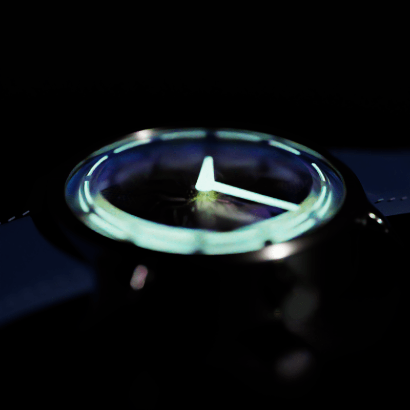
Some context first. The project was to reproduce a vitreous enamel watch dial from physical first principles: a deep red anOrdain Model 1, its enamel a few hundred microns of colored glass fused over a stamped silver dome, its color a genuinely spectral absorption curve, and its signature darkening toward the rim (the fumé gradient) nothing more exotic than Beer-Lambert absorption through glass that pools thicker where the dome falls away. If you read the Ming Lightning post, this is the same game with different physics, run through the same loop of coding agents, adversarial reviewers, and me as the controller.
What was different this time was a rule, written at the top of the design journal on day one: improve RISE along the way, and never cut corners or accept a limitation for the sake of rendering the scene. The scene is the forcing function, not the deliverable. My last essay mentioned this discipline in a single clause; this is the long version, from inside one project.
The rule sounds like it’s about ambition. In practice it’s about what you are not allowed to do when something breaks.
Nine loaders, then sixteen getters
Back to the hanging curve file. The expedient fix is obvious: patch that one loader, reload the scene, get on with the render. The rule says no; a bug with this shape rarely lives alone. So the agent working the parser grepped for the shape itself (a feof loop around an unchecked read) and turned up nine loaders carrying it, spread across every file-driven form the scene language has. One shared comment-tolerant line reader replaced all nine, and as a small bonus, inline trailing comments now work everywhere.
That closed the text loaders, and the agent filed itself a follow-up about two binary loaders that ignored their read counts; one had no error branch at all for a missing file and simply handed back uninitialized memory. This is where the story stops being about file parsing. A second agent, reviewing the first, reframed the pattern from “unchecked fread” to “unchecked bulk binary read into a caller’s buffer,” and one hop out sits getBytes, the read primitive underneath every image and mesh loader in the engine. Its bounds check existed only inside #ifdef _DEBUG. In a release build, a truncated asset whose header promises more bytes than the file holds reads clean off the end of the heap allocation: an out-of-bounds heap read, guarded in every developer build and compiled out of every build anyone would actually run. The one configuration where the check mattered was the one where it didn’t exist.
The first agent fixed it and wrote in the commit message that the binary-read family was now genuinely complete. Another reviewer called that claim, ran the grep it should have run itself, and proved it wrong: the real pattern was “bounds check hidden behind #ifdef _DEBUG,” and all sixteen scalar getters in both buffer classes carried it, across 242 call sites. Fixing those, the agent caught a defect in its own patch, a guard that would have traded the out-of-bounds read for an infinite loop on the same malformed input, and found it only by narrating the behavior to itself, line by line, in its journal.
Three humbling things came out of that one thread, and for once none of the humility was mine, since my entire contribution was the #. The “family complete” claim was a guess dressed as a fact, and it took another agent’s grep to expose it. The fix for a correctness bug shipped with a bug of its own. And a security-relevant defect had lived for years in exactly the place nobody looks: the build you ship, rather than the build you test. The agents made precisely the mistakes I would have made, at considerably higher speed, and the loop caught every one.
None of this is the enamel. All of it exists because a watch dial wanted to read a curve from a file, and a rule said the agents weren’t allowed to stop at the symptom.
The bugs that don’t crash
The curve-file thread is the flashiest thing the rule produced, but not the most important. That distinction belongs to two quieter discoveries from earlier in the project, both of a type I’ve come to fear more than any crash.
The first surfaced during initial research, before a line of new code was written. RISE’s homogeneous medium, the thing that would become the enamel body, collapsed its coefficients to a single luminance value in spectral mode. A gold-ruby red absorber rendered as gray fog under the very spectral pipeline the project existed to use. A sibling audit found the same collapse in three separate places in the heterogeneous medium, a much newer addition. The second discovery was worse: the volume estimator’s no-scatter branch multiplied the full transmittance on top of the stochastic survival probability, counting Beer-Lambert twice. Every absorbing medium RISE had ever rendered was roughly twice too thick, exp(-2σd) where the physics says exp(-σd), in RGB and spectral alike, for as long as the volume system had existed, with no regression test standing guard.
What makes these dangerous is that nothing fails. No hang, no crash, no black frame; the image is simply a little too dark, and a renderer is an instrument with a thousand knobs. You can calibrate a factor of two away without ever knowing it was there, match your reference, publish the picture, and bake the lie in permanently. The only defense I know of is an external oracle. Here that meant an analytic Beer-Lambert slab computed from scratch: the formula was ground truth, and the renderer was the thing on trial. That’s a strange inversion to hold in your head about a codebase you first wrote twenty-five years ago, and exactly the right one.
The payoff, when it came, was almost comically legible. Once the loop had rebuilt the medium to carry genuine per-wavelength coefficients, we authored a curve that absorbs green and blue, bound it to a clear slab, and rendered a white environment through it. Red came out the other side, twenty-two times more red than blue. Swap in a flat curve: gray. Remove the curve entirely: gray, the old collapse. That three-way contrast, authored purely through scene text, was the proof that the whole stack finally carried wavelength. A year of “the medium renders gray in spectral mode” ended with a red slab, and later the same day with a slab of colloidal-gold ruby over silver: a clean, deep cranberry produced by absorption physics rather than a tint.
The sparkle
Which brings me to the strangest arc of the project. The anOrdain’s most distinctive trait in the reference footage isn’t the color; it’s a crystalline, orange-peel sparkle across the whole face, hundreds of tiny white glints shifting as the watch tilts. I had a committed design for it: a new material, a conductor with a discrete glint lobe, in the lineage of the sparkle models used for snow and car paint. Before writing any code I ran the spec through a three-reviewer adversarial design gate with a single question attached: is this even the most physically principled approach? The spec died twice in one afternoon.
The first death was mechanical. The enamel scene bans transparent-shadow approximations (a straight-through shadow is precisely the kind of corner the rule forbids on any render you keep), which means direct-light sampling is occluded at surfaces buried under the glass. Glints down there can only be lit through BSDF sampling, and the design as written didn’t importance-sample its glint lobe. The feature, as specced, would have rendered no buried flecks at all; a null result, approved by committee. The remedy wasn’t better sampling but a better vehicle: not a new material, a small normal-perturbation modifier that composes with the existing, already-correct materials and inherits their sampling machinery for free.
The second death was empirical, and came from measurement rather than argument. Zoomed crops of the reference footage show the flecks neutral white and sharply angle-gated. Glints originating at the silver substrate would exit maroon, having passed twice through the gold-ruby glass on the way out. Neutral means the sparkle happens at the top surface, before light ever reaches the colorant. The design had been aimed at the wrong layer of the physics entirely.
So the feature pivoted twice before implementation, then went through the full grind: four slices, seven review rounds, eighteen-odd revert-proven mutations, three defects found by fresh reviewers, each one a class of error I could not have caught alone. A test that couldn’t fail against the very mutation it was written to catch. A claim I transcribed from one reviewer without re-verifying, which turned out to be inverted. A NaN-handling fix that the compiler silently deleted under -ffast-math, a flag that deserves and will eventually get its own essay. At the end of it the modifier worked, provably: on a plain dark metal plane, discrete facets flash and turn over as the light moves, each pinned to a fixed spot on the surface, unmistakable.
Then I put it on the watch, rendered the with/without comparison, and could not tell the difference.
For an hour that read as failure. An absurd-parameter render (full coverage, wide spread) proved the modifier was firing fine; the real explanation was arithmetic. At the density calibrated from the reference, the facet layer adds a few dozen flecks to a dial whose orange-peel relief already carries about nine hundred bright pixels of shimmer. The system was performing exactly to spec. My expectations were the miscalibrated component.
Which finally forced the question I should have asked on day one: what is the most physically accurate description of what this object actually does? Grand feu enamel is fired glass, a continuous, fire-polished surface; its twinkle is that surface’s own Fresnel glints catching a light as the dial tilts. And the dial already had that surface: a real micro-displaced heightfield whose cells measure out to roughly 380 microns, the same scale as the flecks measured from the footage. The fleck-scale structure had been modeled all along, correctly, as continuous geometry. Discrete, independently oriented facets are the physics of genuinely discrete scatterers, metal-flake paint, glitter, aventurine glass; the wrong material class for fired glass, and redundant on this dial besides. A final check confirmed the dimples alone twinkle just fine: 88 percent of the bright pixels turn over across a ten-degree tilt. I took the modifier off the watch.
So the feature I spent the session building is not used by the scene that motivated it, and that is the correct outcome rather than a failure. RISE keeps a general, proven glint capability with its own showcase scene (five spheres: a smooth control, fine flakes, coarse flakes, car paint, glitter) for the materials that genuinely are discrete. The dial keeps the model that matches its physics. One investigation produced both answers, and keeping a physically wrong model on the hero render because I had paid for it would have been its own corner, cut from the other side.
That was the part of the rule that took me longest to understand. “Never cut corners” reads as a commitment to doing more, and the loader saga fits that reading: don’t stop early, follow the pattern past the symptom until the family is closed. The glint saga is the same rule facing the other way: don’t stop late, and don’t let sunk cost keep something the physics has ruled against. The rule was never about effort in either direction. It’s about letting the physics decide where the work ends.
The ledger
“We’ve Run This Experiment Before” ended on the claim that every shortcut carries a price tag and every invoice a name. This project is the degenerate case that makes the mechanics visible: one person is both the operator of the amplifier and the payer of every invoice it prints. When the loop is that tight, the discipline stops being a virtue and becomes arithmetic. Skipping the loader audit would have saved an afternoon and left an out-of-bounds heap read for a future me to meet under worse circumstances. Keeping the glint modifier on the dial would have preserved a week’s pride at the cost of shipping a model I knew was wrong. Neither invoice disappears when declined; you only get to pick the delivery date, and the interest rate is not in your favor.
The tally for one watch dial: a spectral participating medium rebuilt end to end, a double-count as old as the volume estimator itself retired, nine hanging loaders replaced with one honest reader, an out-of-bounds read family closed across two buffer classes and 242 call sites, and a general glint feature the dial itself declined to use. The scene never cared about getBytes. Forcing functions are like that; they don’t know what they’re forcing until you refuse to let anything slide.
The render, for the record, is a nice picture of a watch. The renderer is the thing that changed.
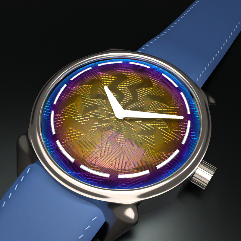
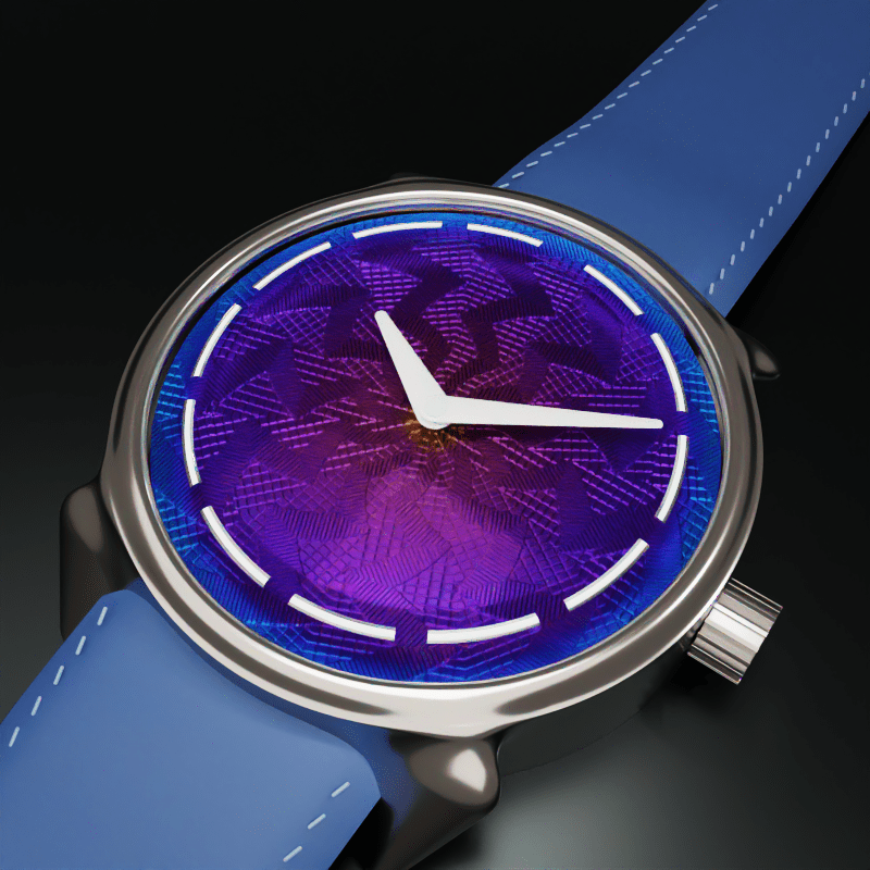
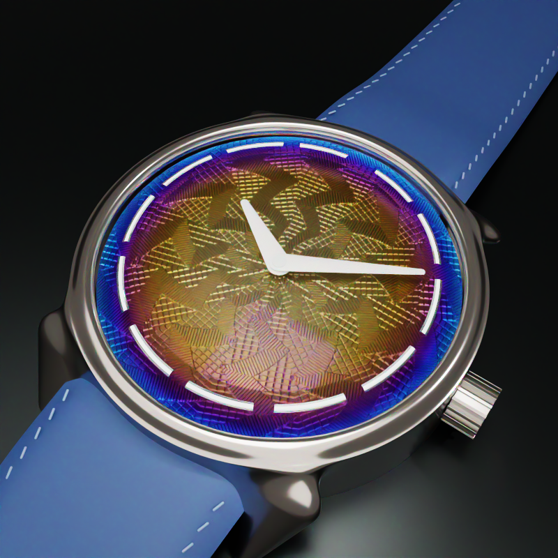
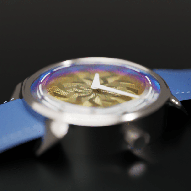
In early June, Ming and J.N. Shapiro released a watch called the 37.06 Lightning, and the first batch was claimed the same day it was announced. It is a grade-2 titanium dial, hand-engraved on a rose-engine lathe in Josh Shapiro‘s Los Angeles workshop, then hand-colored with a butane torch by Ming Thein in Kuala Lumpur. At around 6,250 Swiss francs it is, improbably, the least expensive way into one of Shapiro’s engine-turned dials. The color runs from warm golds and oranges at the centre, through purple in the middle, to a deep blue at the rim. It is not paint. It is oxidation, controlled by temperature, executed by eye, and a large share of the dials get thrown away because the color lands wrong.
This fired up a burning question: why does it look like that? The color is not pigment, the pattern is not printed, and the whole thing is doing something with light that I could feel I didn’t fully understand. The honest way for me to understand a watch like this is not to keep staring at the beautiful photography on the Ming website; it’s to try to rebuild the light that comes off it, and to find out exactly where my mental model is thinner than the dial.
Three weeks of evenings and some weekends later, RISE had grown a thin-film optics stack, its first implicit-geometry primitive, a deferred scene-realization pass, an HDR movie pipeline, and a small pile of bugs that were each more interesting than the feature that surfaced them. This is the account of that, dead ends and all. If you want the short version: the renders were never the point. The point was that the watch stopped being opaque to me.
The watch poses three mysteries, and they map cleanly onto three pieces of physics. There is the color, which is interference. There is the pattern, which is kinematics. And there is the problem of making the light actually play across the thing, in motion, without lying about any of it. I went after them in that order.
I. The color is not paint
The first real decision was a modelling one, and getting it right saved me a refactor I would have regretted.
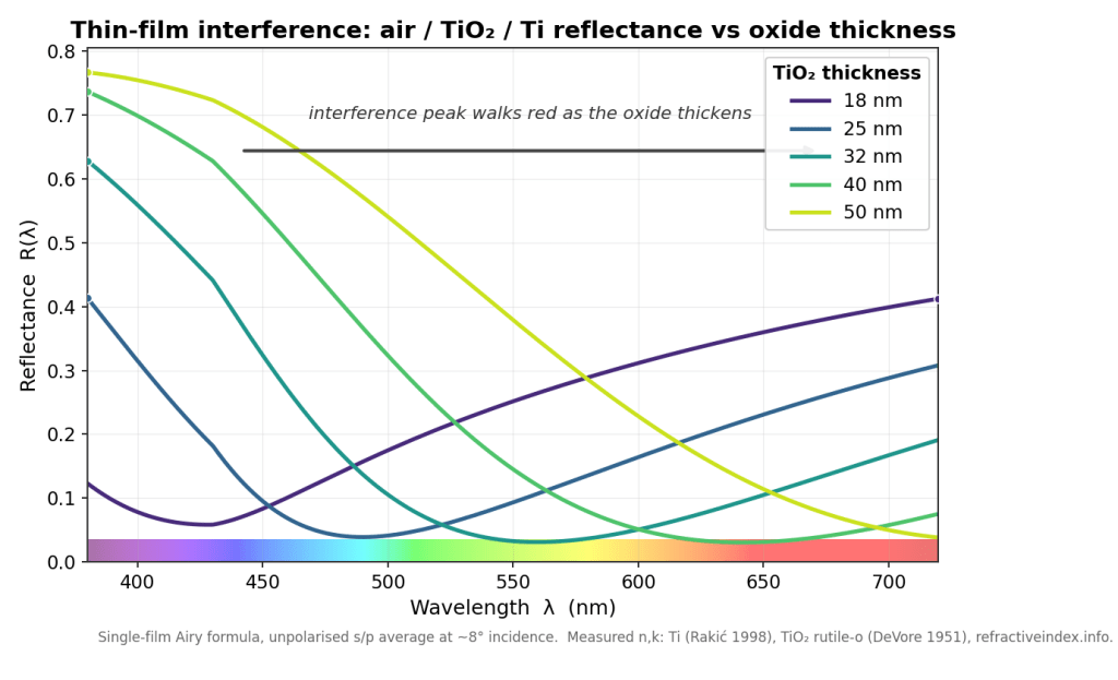
Heat tint and anodization look like a surface treatment, like a coat of something. They are not. Physically, the color is the specular reflectance of an air-oxide-metal stack: a thin, coherent dielectric film (the oxide) sitting on a conductor (the titanium). When white light hits it, part reflects off the top of the oxide and part off the metal underneath, the two paths differ in length by an amount that depends on the film thickness and the wavelength, and they interfere. Thicken the oxide by tens of nanometres and you walk the constructive peak across the visible spectrum, which is why a torch sweeping a dial paints gold, then purple, then blue as the metal gets hotter and the oxide grows. The color you see is the surviving wavelengths after interference, not a dye.
That single fact tells you where the feature belongs. The bare-metal reflectance already lives on RISE’s microfacet specular lobe, computed in exactly one place. Anodized color is the same Fresnel calculation with one extra layer in front of the metal, so it is not a new material type at all; it is a third Fresnel mode on the lobe that already exists.
This is also, pleasingly, the industry-standard surfacing. glTF calls the same thing KHR_materials_iridescence: a base metal plus an iridescence layer with a film index of refraction and a film thickness. RISE’s new slots map onto that one for one, so the material imports and exports glTF iridescence for free, which I did not plan and was glad to have. What it is explicitly not is a clearcoat (that is a thick, incoherent dielectric, a separate lobe) and it is not a color-gradient painter (RISE has one of those, a cosmetic lerp, and the design doc carries a literal warning not to mistake the two). The temptation to model a color gradient as a color gradient is strong and wrong; the gradient is a side effect of physics, and if you model the side effect you spend forever hand-tuning something the physics would have handed you.
Why a spectral renderer makes this trivial
Here is the architectural fact that made the whole project tractable, the one I would put on the first slide. RISE does not carry red, green, and blue. Its primary integration path carries hero wavelengths: each camera path samples a small set of wavelengths (the watch uses sixteen across 380 to 720 nm), and a material is asked for its reflectance at a wavelength. Interference lives in the phase term δ = 2πnd/λ, an explicit function of wavelength. A spectral renderer evaluates the real reflectance R(λ) at each hero wavelength and is exact by construction. An RGB renderer is asked to represent that same interference integral with three point samples, which is roughly like trying to reconstruct a chord from three keys chosen in advance; you can fake an average color but you cannot get the spectral structure right, and thin-film is spectral structure. If you have ever wondered why iridescence is the thing that makes RGB renderers look subtly wrong, that is why.
So the spectral path needed no clever antialiasing, no famous paper. The famous paper here is Belcour and Barla (2017), which is the reference for thin film in a renderer, and the survey’s conclusion was that RISE does not need it on the spectral path. Belcour integrates in optical-path-difference space precisely because they cannot carry wavelength in an RGB engine; RISE can, so it just evaluates the truth. Knowing not to implement the famous paper was one of the better decisions. Their machinery does reappear, in a simplified form, on RISE’s RGB convenience path, which still has to fake the integral for tools that want a quick preview.
Implement the oracle twice
Phase one was deliberately standalone, no renderer integration at all. The point was a ground truth, and the discipline was to implement the optics twice and force the two to agree.
One implementation is a general N-layer transfer-matrix method (characteristic matrices, per-polarisation). The other is the closed-form Airy summation for a single film. With one layer, the transfer-matrix result reduces algebraically to the Airy result, so the two must match to machine epsilon or one of them is wrong. This redundancy is the entire point: a single implementation is internally consistent with its own mistakes, and the classic thin-film bug is a sign-convention slip in the p-polarisation branch that a lone implementation will reproduce identically in both its “check” and its “answer,” agreeing with itself all the way to a confidently incorrect render.
It paid off immediately and a little embarrassingly. The cross-check, 6,086 assertions worth, caught a sign-convention inconsistency in my own design doc: a mismatch between the forward-travelling cosine root, the matrix off-diagonal sign, and the Airy round-trip exponent. Pair the wrong two and you get a wave that grows instead of decays, and reflectance greater than one for an absorbing film, which is the universe’s way of telling you that you have invented a laser. The energy invariant (R must lie in [0,1]) and the transfer-matrix-versus-Airy comparison are both built to catch exactly that, and they did. The validated convention got pinned down and written into the doc, and the production evaluator, lifted from the Airy form, now matches that oracle to within 3.3e-16. Adversarial review found one more real bug before it shipped: a grazing-incidence NaN at cosθ = 0, fixed with an input clamp that leaves the valid domain bit-identical to the oracle, plus a sign-mutation test to prove the oracle comparison isn’t tautological. (If your test passes when you deliberately corrupt the thing it tests, your test is decorative.)
Generality is a data file
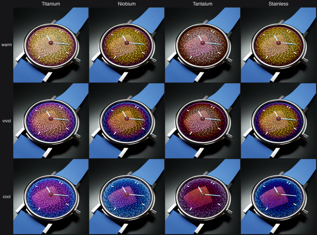
The hard requirement I set was that adding a metal must be data only, no code. The optical maths is N-layer from day one, so a new metal is a pair of measured optical-constant files (n and k) for the substrate and another pair for its oxide, dropped straight in from refractiveindex.info. The shipped set covers titanium with its TiO₂ oxide (the canonical case, the oxide is transparent in the visible), steel with magnetite (Fe₃O₄, which is absorbing, so it gives the duller, browner temper ladder you see on heat-blued screws), tantalum with Ta₂O₅, and niobium with Nb₂O₅ (the classic anodized-jewellery palette). Steel’s absorbing oxide is the coverage win: it exercises the complex-film-index path that titanium, with its near-zero absorption, barely touches. The human acceptance gate is therefore a single grid, metal down one axis and thickness across the other, that proves generality and stress-tests transparent against absorbing films in one image, and pins the D65 white point dead on while it is at it. The watch ships titanium, but the scene also defines the niobium, tantalum, and steel variants, swappable in the GUI, purely as authored data.
However, this is all pure theory, in practice, what happens with each of these metals is that once the temperature reaches a certain point, the oxide layer flakes off. This makes the physical effort that someone like Ming Thien has to go through to get just the right color even more daunting, push the temperature just a little too far and you’ve wasted the whole dial. This is also why for stainless steel, to get that blue color it’s typically anodized which allows precise oxide layer thickness but then you get none of that color gradient.
Two parallel pipes, and why IOR can’t go through the color one
This is the kind of detail that reads as trivia until it silently mangles a render. RISE has two parallel painter interfaces, and the split is load-bearing. One pipe carries color: reflectance, emission, anything tinted, and on the spectral path it uplifts an inline RGB value to a full spectrum through a learned lookup table (the Jakob-Hanika method). The other pipe carries physical scalars: index of refraction, roughness, scattering coefficient, film thickness. It never touches the uplift; it returns a per-wavelength magnitude directly.
The film parameters (film_ior, film_extinction, film_thickness) go through the scalar pipe for the same reason index of refraction does: routing an IOR of 2.7 through the color pipe would “uplift” it as if it were the color (2.7, 2.7, 2.7), handing you whatever spectrum the table thinks that means, which is nonsense. The historical version of exactly this bug is instructive: a scattering coefficient of one million, sent through the color pipe, got clamped to about 1.0 in the visible band, which rendered glass spheres invisible in every spectral mode for longer than I would like to admit. The rule, now written down, is a one-liner. Is it a tinted reflectance sample? Color pipe. Is it a physical coefficient? Scalar pipe. And never add a color accessor to the scalar pipe to “fix” something, because the absence of that path is the entire safety property. The type system is the correctness guard; encode the physical meaning in the type, not in a runtime check you will forget to write.
The bug that lived in two places at once
Two correctness bugs from this stretch are worth telling because of how they were found, not just what they were.
The first is an energy-conservation subtlety. Rough metals lose energy at each microfacet bounce, and a good renderer adds it back with a multiscatter compensation term. The term is nonlinear in the Fresnel reflectance. The draft pulled the metal’s tint outside that nonlinear function, which over-brightens tinted rough metals because the tint actually compounds through the multiscatter series and has to go inside. Measured, the tail was about 4.3 times too bright at a tint of 0.3. The fix is a one-line rearrangement. The interesting part is what came next.
Once you can state a bug in a single sentence (“the multiscatter tail pulls the tint outside the nonlinear term”), you can enumerate every place that sentence could be true. That compensation function has exactly two callers in the codebase: the GGX material I was working in, and the older Cook-Torrance material I was not. Cook-Torrance carried the identical bug. It was fixed in the same breath. The lesson, which I have started calling audit-by-bug-pattern, is that a fix is not done when the reported site is fixed; it is done when no sibling carries the same pattern. The reported site is a sample, not the population.
The second bug is a foundation I inherited from my own past. The thin-film-aware hemispherical Fresnel average was measured before it was implemented: a furnace test showed that ignoring the film and using the bare-substrate average was off by up to 0.50, a thirteen-percent albedo error on rough surfaces, because the oxide is strongly anti-reflective at some thickness-wavelength combinations. So it got implemented properly, sharing the existing integration rule so that the film-equals-air case stays byte-identical to the bare conductor. Measure first, then decide whether you even have a problem; I had assumed this one was negligible and the furnace told me it was not.
The color foundation under all of it
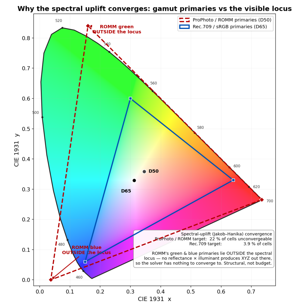
None of the color would have been trustworthy without a change I had made just before this work, almost as housekeeping. RISE’s internal working color space had been ProPhoto (a wide-gamut space with a D50 white point), and that was quietly poisoning the spectral uplift. ProPhoto’s green and blue primaries lie outside the spectral locus, which means a chunk of its color cube corresponds to colors no physical reflectance can produce, and the uplift solver had 22 percent of its cells unconverged. This is not a solver-budget problem; there is literally nothing for the solver to converge to in those cells. I tried a smarter solver, more iterations, a different training illuminant; all marginal, because the problem is structural, not numerical. The fix was to retrain against Rec.709 linear, whose primaries all sit inside the locus. Failures dropped to 3.9 percent, all in the deep-blue corner where the underlying sigmoid model itself runs out of expressive power, and the residual is comfortably below the display quantum. So by the time the watch rendered, the swatch I tuned color against and the image the renderer integrated lived in the same Rec.709/D65 space, which is the only reason the two ever agreed. The lesson is dull and important: get your color space honest before you trust a single color you measure in it.
II. The pattern, and the wall
Guilloché looks like ornament. It is closer to a mechanical recording of a motion.
A rose engine is a lathe whose headstock can rock side to side, steered by a shaped cam called a rosette as the workpiece turns. Run a cutter against the rocking face and it traces one wavy line per revolution; feed the cutter slowly inward and the lines stack into the pattern. So the “design” is not drawn, it is the trace of a kinematic system, and once you see it that way the whole field collapses into a little maths. A rosette with some number of lobes rocks the radius by an amplitude as the angle sweeps, which gives a phase field ψ = (r − amp·cos(lobes·θ)) / pitch, and the groove is just a sharp V whose height is the distance to the nearest line: h = clamp((0.5 − |frac(ψ) − 0.5|) / landHalf, 0, 1), zero at the floor of the cut and one on the flat land between cuts. Set the amplitude to zero and it degenerates to plain concentric circles, exactly as a rose engine does when you lock the rocking off. The companion field, the direction of each groove, falls out of the same expression by differentiation, and I needed it because the anisotropy of the brushed metal has to follow the grooves; a watch dial that catches light across the grain instead of along it looks instantly fake. Both fields were checked against an independent reimplementation of the formula at a set of dial points, to 1e-9. (A golden-image snapshot would not have been a real test here; the oracle has to be a second derivation, not a frozen output of the first.)
That is the satisfying part. Now the wall.
The constraint that decided the architecture
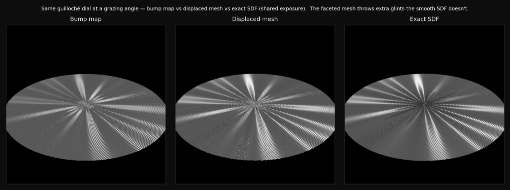
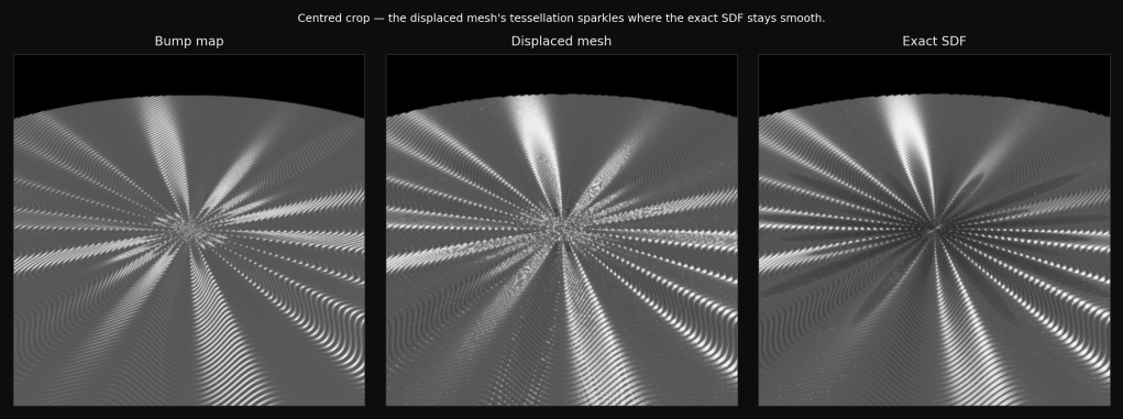
The constraint I refused to relax was authentic engraving pitch. Real hand guilloché cuts grooves at roughly 0.10 to 0.20 mm pitch and 40 to 130 µm deep, on a dial blank that is only 0.4 to 0.6 mm thick. I wanted to reproduce that, not a stylised approximation with the grooves three times too wide so the triangle count stays polite. And the moment you commit to honest pitch, a problem appears that has nothing to do with optics.
A faithful full-dial mesh at 0.20 mm pitch is 11 to 24 million triangles, and baking it transiently costs 19 to 43 GB of memory. For a dial the size of a coin. That is not a render-time number, it is a does-this-fit-in-the-machine number, and on this machine it does not. (There is a lesson buried here about the Mac Studio I did not order with 128 GB of RAM. Had I bought the bigger box, 43 GB would have fit, I would have shrugged, accepted the mesh, and moved on, and none of what follows would have happened. Under-specifying my own hardware turned out to be the single best decision in the project, which is not a sentence I expected to write.) The original plan had been a fine displaced mesh with anisotropic shading and no bump mapping (I had rejected bump as an off-brand fake), and the measurement phase demolished the plan. The right response to a wall is not to argue about which technique you prefer; it is to build all the candidates and score them. So the plan became a three-way study: realize the same dial as a bump map, as a displaced mesh, and as an exact signed-distance surface, from one shared kinematic field and one shared material, and measure each against the exact surface as ground truth. A number, not a dogma.
The verdict, with the trap inside it
The exact signed-distance surface holds 0.23 GB regardless of pitch, because it never tessellates; it evaluates the height function analytically as a ray marches it. The displaced mesh at a coarse, demo-able pitch is fast to trace (about five times faster than the exact surface) but already wants 3 GB, and at honest pitch it walks straight into the 19-to-43 GB wall. So the deciding axis is memory, not trace time, and the exact surface is the only memory-feasible representation of the full dial at real pitch. That single fact is why it got promoted from a benchmark curiosity to the production path.
And “exact” turns out to matter for this particular look, not as a purity argument but visibly. Under flat, diffuse lighting all three realizations agree to about 95 percent; geometry barely shows. But the guilloché look is a sharp directional flash raking across the grooves, and under that flash the faceted mesh deviates from the smooth exact surface, because the flat facets throw glints the smooth surface does not. That extra sparkle reads as detail and is in fact an artifact: it is the tessellation, not the metal. The smooth analytic normal is the honest one.
The trap in the study was a measurement trap, and it cost me a couple of hours and some dignity. The first pass reported that bump mapping “did not engage at any scale” and disqualified it, which sounded like a plumbing bug. It was not; it was a unit mismatch. The bump strength and the mesh displacement were set to the same number, but they are different units, and the legacy bump’s amplitude secretly couples to its sampling window, so the value that matched the mesh was about eight times too weak and the dial rendered flat. Fixed (with an opt-in flag that makes the strength window-independent, default off so every existing scene stays byte-identical), the bump suddenly carried the full twelve-lobe rosette. And then the second trap: the now-working bump scored a higher error against the exact surface than the broken flat one had. Not because it was worse, but because root-mean-square error rewards the conditional mean, and a featureless grey disc is an excellent approximation of the average of a textured one. A flat disc scores low error with zero structure. The lesson, which generalises well past rendering: never read RMSE without a structure metric beside it, or you will congratulate yourself for predicting nothing. The honest verdict is that bump is the lightest and fastest of the three and reproduces the pattern fine head-on; it loses to the exact surface only when the shot tilts into grazing relief, where a normal-only fake has no self-shadow, no parallax, and no silhouette, which is exactly where guilloché earns its keep.
III. RISE grows an implicit primitive
The study needed an exact surface, and separately the watch case needed organic, melded forms: flying-blade lugs that flow into the bezel, a ribbed gear of a crown. Both pointed at the same missing capability, so RISE got its first implicit-geometry primitive: a signed-distance field, a surface defined as the set of points where a distance function reads zero, ray-traced by sphere tracing (you step along the ray by as much as the known distance to the nearest surface, which is always safe because nothing can be closer than that, and you close onto the surface without ever tessellating it). It is a list of distance primitives (spheres, boxes, rounded boxes, cylinders, tori, capsules, cones) composed with union, smooth-minimum (which gives the molten fillet where two forms blend), subtraction, and intersection. It was built for the watch’s lugs, and named and shaped so that nothing in it knows what a watch is, which is a rule I will come back to.
The directive I set myself was that it be a first-class citizen, not a guarded stub: real mesh generation and real surface sampling, not bounding-box fakes. Real meshing meant a marching-tetrahedra mesher (I chose tetrahedra over the more famous marching cubes because the cubes algorithm’s 256-case table cannot be safely hand-written, and a watertight, unambiguous mesh mattered more than familiarity). Real surface sampling meant that an emissive signed-distance surface is a genuine light the renderer can aim shadow rays at, which I validated by Monte-Carlo-integrating the lighting integrand against the closed form and getting a ratio of 1.00019. The machinery is provably unbiased, which is the sort of sentence that is boring to write and very reassuring to have.
The black-glass bug
The gem of this stretch was a bug that rendered a glass signed-distance object solid black, and its cause is two correct-in-isolation pieces conspiring.
When a ray refracts into glass, the renderer spawns the continuation ray exactly at the surface point, with no offset. That is correct. Separately, a sphere tracer reports its hit a hair before the true surface, because it marches until the distance drops below a small epsilon and stops just shy of the zero crossing. That is also correct. Put them together and the refracted ray, born exactly on the reported hit, is actually a hair outside the true surface; it immediately re-hits the same surface band it was just spawned on, the renderer concludes the ray travelled an infinitesimal distance through glass and then another and another, and the interior medium absorbs over what is effectively an infinite path. Black. The fix is to step the ray off the surface band before deciding which side of the glass it is on, which is exactly the trick analytic primitives use to reject the spurious “I hit myself at distance zero” root. It is a general correctness fix for any glass implicit surface, and it only became visible because the watch needed glass with an interior medium. This is the recurring shape of the whole project: the interesting bugs live at the seams between components that are each individually right, and the way you get to meet them is to build the thing yourself.
A small family of related bugs surfaced the same way and each got fixed at its own layer: bounds that grew wrong when a watch crystal’s huge dome blew the box out to dead space (the union-of-boxes was order-blind, and the first fix for it was also order-blind, caught by review before it shipped); an “invisible lume” bug where a wide, thin emitter’s bounding pad was thinner than the marcher’s surface band, so camera rays entered already inside the surface and reported the exit face, silently skipping the tops of the lume batons (glowing sides, dark tops). None of these are exotic once found. All of them are invisible until an implicit surface makes you confront the gap between a bounding box and a true surface.
And one more measurement trap, because they cluster. A signed-distance emitter has about twice the pixel variance of an analytic one, for a real reason (its surface-curve sampling fragments the stratification at the visibility boundary). Through an 8-bit sRGB PNG, that extra noise reads as a fake four-percent brightness deficit, because clipping and the concave display transfer interact with noise the way Jensen’s inequality says they will. I spent real time chasing a brightness bug that did not exist. The rule that came out of it is blunt: compare emitters in linear high-dynamic-range, never through an 8-bit preview, because the preview is not a neutral observer of brightness when noise is in play.
IV. The boring twenty-five-x
Here is the least glamorous and most quietly important thing I built, and it never appears in a single pixel of the final image.
The watch scene defines six dial patterns but renders only one; the other five are an artistic library I flip between in the GUI. Under the old model, parsing the scene baked all six displaced meshes, spending minutes and gigabytes on five dials that never appear on screen. The fix is to defer all the expensive parse-time work into a single realize pass that runs once, on a single thread, at the precise moment the scene becomes immutable and just before the parallel render starts. (Deliberately not lazily during the render itself, because the scene is shared and immutable across all the render threads, and realizing geometry there would be a data race wearing a convenience costume.) A small freeze gauge asserts, loudly and in every build, that nothing tries to realize during the parallel pass, so the invariant is exercised by the whole test suite rather than trusted.
The payoff on the watch: parse 25 times faster (17.55 seconds to 0.69), parse memory 6.4 times smaller (3.74 GB to 586 MB), total wall time 2.3 times faster, and provably behaviour-neutral (the before-and-after images differ only at the renderer’s own run-to-run noise floor, which is the only honest way to prove a change like this is neutral, because the multithreaded integrators are not bit-deterministic and “exact zero difference” is a fantasy).
There was a second phase available, deferring the painters and image decodes too, and I scoped it, found it was a roughly 75-class recursive cascade with five separate correctness landmines, noted that the motivating case was already solved and the remaining cost was an environment map that is almost always used anyway, and did not do it. Knowing where to stop is a feature. The most expensive code is the code you write to solve a problem you do not actually have.
V. Finishing the dial, and two times the watch lied to me
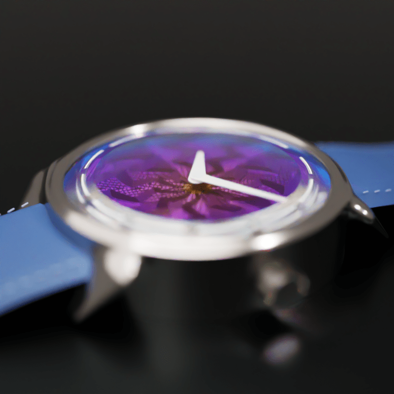
With honest optics, an exact surface, and a fast parse, the dial could finally be finished as the actual Lightning motif: eleven jagged radial bolts, the in-bolt grooves running straight but re-angling at every zigzag of the bolt, and the finer sector grid kept between the bolts. I assembled it under a real double-domed sapphire crystal (two concentric spheres, a roughly 1.2 mm wall, with the hour markers cut as cavities into the underside and filled with inset lume, the way the real watch etches them), and shot it on a macro rig built the way watch photographers actually work: a 100 mm lens on a full-frame sensor at f/16, lit off-axis so no light sources sit in frame, the watch laid on a dark glossy tabletop that fades to black. Then the watch lied to me twice.
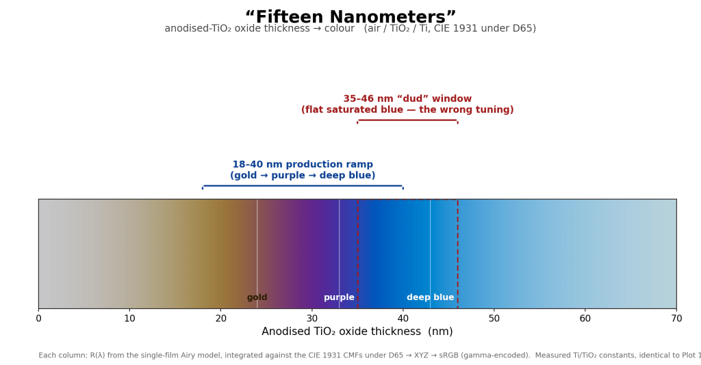
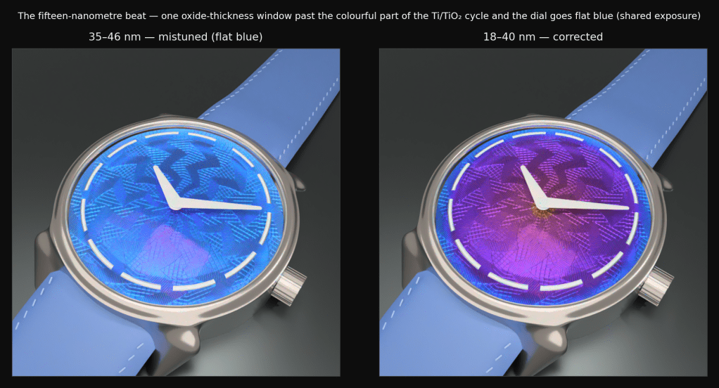
The fifteen-nanometre lie
I had tuned the dial’s color on a fast RGB preview, the convenience path, using scalar indices of refraction. On that preview the bronze-to-purple-to-blue interference cycle landed across a thickness sweep of 35 to 46 nm, so I set the production oxide ramp to sweep 35 to 46 nm from centre to rim, hit render on the real spectral path, and got a dial that was flat, sulking deep blue. No gold. No purple. A blueberry.
The diagnosis is the title of this essay. The production material uses measured spectral optical constants for titanium and TiO₂, not the scalar approximations the preview used, and the same color cycle lives about fifteen nanometres lower on the real material. At 35 to 46 nm the real titanium was already fully into saturated blue, past the colorful part of the cycle entirely. A thin-film color tuned on a scalar swatch simply does not transfer to the real spectral material; they are not interchangeable per thickness, and nothing warns you, because each is internally consistent.
The tool that nailed it is the obvious one in retrospect: render a spectral swatch of the actual material, a flat panel with the exact measured constants and a thickness gradient, on the real spectral path, and read the thickness-to-color map straight off it. With that map, the ramp re-tuned to 21 to 40 nm, then to 18 to 40 nm with a deliberately thin gold centre, and the dial finally read gold at the centre, purple through the middle, deep blue at the rim. The general rule is now a law I keep: tune a thin-film color against the material the hero actually renders, not a convenient proxy.
And this is the place where I have the most respect for the people who made the real watch, because they cannot cheat the way I did. My fifteen-nanometre window is a number I can dial in with measured spectra and a swatch render. Theirs is a butane torch and a man’s eye and the moment he decides to pull the heat. The reason so many of the real Lightning dials get scrapped (Ming has put the reject rate as high as two thirds) is that same narrow window, except he is hitting it by hand, on a guilloché surface whose grooves heat unevenly, on titanium whose crystalline structure, by the brand’s own account, can betray the color at the last second. I spent two days finding the window with instruments. He finds it with a flame, and throws away the ones that miss. After this exercise I understand exactly how thin that margin is, and I did not understand it before.
Which reframes the price, too. The 6,250 francs I mentioned up top looked steep for a steel watch with a hand-wound Sellita inside, a spec sheet that elsewhere costs a third of that. It looks different now. You are not paying for the movement. You are paying for a hand-cut guilloché surface and a hand-torched color with a brutal yield, and once you have felt how narrow the window is, the number stops reading like a markup and starts reading like an honest tally of everything that has to not go wrong.
The blurry-crystal lie
The second lie was subtler. The dial looked faintly soft, blurred, when viewed through the crystal, and the obvious suspect was the crystal: refraction, lensing, the dome acting as a bad magnifier. I almost spent a day on the optics of the dome.
It was innocent. A concentric meniscus shell, inner and outer surfaces sharing a centre, is afocal; it bends light on the way in and bends it back on the way out, and does not blur anything. The real culprit was the denoiser. The dial was being lit almost entirely through stochastic refraction (the direct-lighting shadow rays were being blocked by the glass shell, because a shadow ray treats the crystal as opaque), so the dial pixels were extremely noisy, and the denoiser, doing its job on garbage, smeared the noise into softness. I proved it with a clean A/B at high sample count with the denoiser off: through the crystal and with the crystal removed entirely, the raw images were equally sharp (and equally noisy). The geometry was never the problem. The fix is a general engine feature, transparent shadow rays: let a shadow ray pass through a clear dielectric, attenuated by the per-surface Fresnel transmittance, instead of treating glass as a wall. The dial snapped crisp. Both lies share a moral I will state once: the obvious suspect is usually innocent, and the cost of arresting it is the day you do not spend on the actual culprit.
VI. Making it move
The whole point of this watch is the flash. The anodized shimmer and the specular highlights are the look, and a still can only ever show you one instant of them. So the turntable had to be high-dynamic-range, and the existing movie writers were 8-bit, which clamps everything brighter than white to white and crushes every highlight the watch is famous for into a flat sheet. I rebuilt the export to an HDR10 ProRes 4444 master: take the renderer’s scene-linear output, convert from Rec.709 primaries to Rec.2020, encode through the PQ transfer (which keeps headroom above reference white so highlights survive the codec’s integer quantisation), and tag the result as HDR10. Two color-science bugs got caught in review along the way, both instructive: encoding through a linear transfer re-clips the highlights at the integer encode even though the float buffer held them fine (HDR in a codec needs a transfer with headroom, which is the whole point of PQ), and tagging Rec.2020 onto Rec.709 data without actually remapping the gamut produces oversaturated color in any color-managed player. Either convert the colors or tag them honestly; do not tag what you did not convert.
The atom that wasn’t there
And then the best bug of the entire project, the one I will be telling for a while.
The headless encoder produced a file that was HDR in its pixels, HDR in its bitstream color tags, and reported as correct HDR by every probing tool I pointed at it. And it played back as standard-dynamic-range. Flat. The pixels were right, the tags were right, the tools agreed with me, and the picture was wrong.
I found it by dumping the low-level atoms of two files side by side, mine and a known-good one from the GUI path, and diffing. The good file had a tiny container-level atom called colr; mine did not. It turns out QuickTime and macOS decide whether to engage HDR off that container atom (nclc: pri 9 trc 16 matrix 9, meaning Rec.2020 / PQ / Rec.2020), not off the ProRes bitstream tags that every probe tool reads and reports. The bitstream tags are real, and read correctly, and the player ignores them. Worse, the obvious flag to force the atom writes a different, useless atom (marked “unspecified”) because the color flags do not reach the relevant muxer. The working recipe is to stamp the frame parameters and force the atom explicitly, and to verify with a single grep that the atom reads pri 9 trc 16 matrix 9, identical to the GUI output that was never broken. An entire afternoon, an HDR pipeline that was correct in every component, defeated for want of one container atom. I wrote the whole workflow down as a reusable skill so I never have to rediscover it, which is the only revenge available against a bug like that.
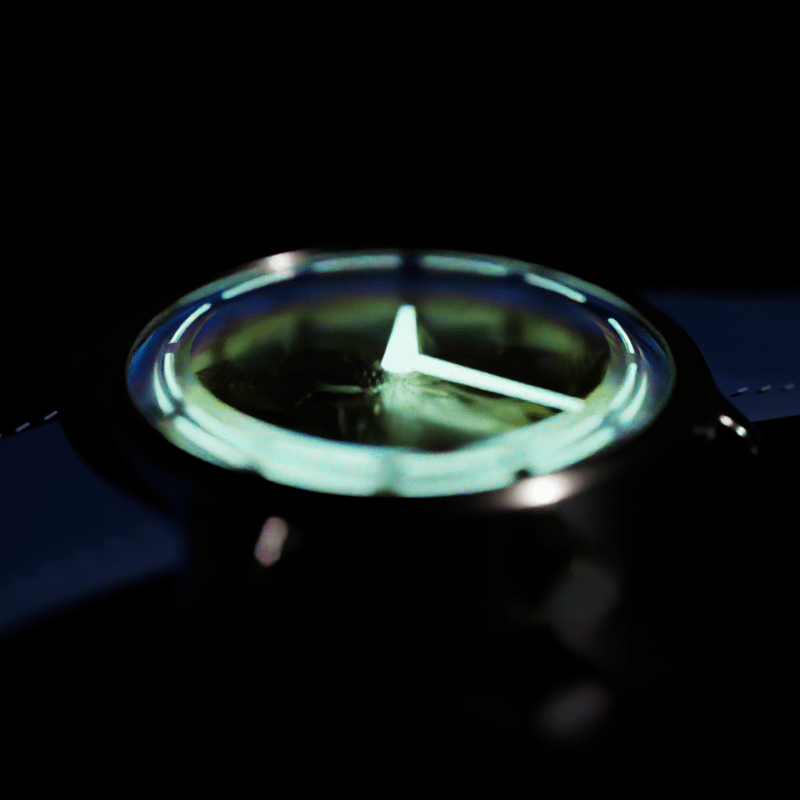
The animation itself was authored in RISE’s native keyframe timeline, no script: a turntable orbit with the lights held fixed so that the specular highlight sweeps across the guilloché and the thin-film colors shimmer as the dial turns, which is the entire reason for making it move at all. (One standing rule the watch reinforced and I will pass along: keep the denoiser on for presentation renders. I once turned it off for an animation out of a flicker worry, and was overruled, correctly and emphatically. At high sample count the denoise is light, and a steady standing preference beats a clever one-off aesthetic theory every time.) The watch later grew running hands, each hand a small implicit cone whose orientation is keyframed about the hub, which is a pure scene change and needed no new engine feature, exactly as it should be. (Like the real Lightning, mine carries no seconds hand; Ming left it off on the grounds that the dial was busy enough without one more moving thing reminding you that time is passing, and I saw no reason to argue with him. The hour and minute hands sweep, which is plenty to make it feel alive.)
VII. The discipline
The technical work above would have collapsed under its own weight without a process, and the process is as much the deliverable as the renders. I ran this the way I increasingly run everything: as a master-controller session directing worker subagents, with the humans (me) holding the parts that must not be automated.
Three rules carried it. First, every non-trivial change was validated by two or three independent reviewers, each given an orthogonal concern (the optics maths, the spectral integration, the API and lifecycle, the thread-safety, the blast radius) and run in parallel; the thin-film merge alone went through three rounds and nine reviewers. This is not a rubber stamp, and the proof is that it found real bugs before they shipped: a material that dereferenced an optional parameter unconditionally and segfaulted on a documented-as-supported scene, the order-blind bounds fix that was itself order-blind, a photon-map classification that would have rendered a dispersive-caustic test black. Implement, review on orthogonal axes, fix every finding, then declare done.
Second, features must be general. The test I apply is simple: would this chunk look reasonable in the engine’s feature list, next to “sphere” and the Perlin painters? If its description needs the watch to make sense, it is wrong. This is why so much of the work was excision. A “watch strap geometry” I had written early was a scene generator wearing an engine-feature costume, and it got deleted and replaced by two genuinely general primitives (a profile swept along a path with rotation-minimising frames, and a template stamped along a path), with the strap’s actual cross-section moved out into the scene file as authored data, derived in a comment. The guilloché field itself eventually dissolved the same way, into a general in-scene maths-expression evaluator, deleting a couple of hundred lines of pattern-specific C++; the proof of equivalence was a dense fifty-thousand-point sweep that matched bit-exact. The watch scene is now fully procedural, no baked meshes and no baked textures, and the truth of the dial is readable in the scene text. Every excision left RISE more capable than the watch required, which is the entire return on the discipline: the watch was the muse, and the engine kept the technique.
Third, trust the measurement before the conclusion, and cross-check the tool. The three-way study is the canonical instance (a number, not a dogma), but the theme runs through everything: the RMSE-versus-structure trap, the compare-emitters-in-linear-HDR rule, the behaviour-neutral proof against the noise floor, and a sibling lesson from elsewhere in the codebase that I keep taped to the inside of my skull, which is never trust a tool that reads through the suspect component. (The EXR reader had been silently clipping very bright values on read, so a “the integrator produces infinities” verdict turned out to be a reader artifact, not an integrator bug. The bug was in the instrument.)
A few environment traps were vicious enough to institutionalise, and they are worth a paragraph because they are the kind of thing that is never in a paper and always in the work. The build compiles with fast-math, under which infinity does not behave, and an infinity-seeded min/max reduction in the dial bake produced uniformly 37-times-compressed heights while the identical source compiled without fast-math was correct; the fix is to never seed a reduction from infinity and never write a NaN guard that assumes IEEE semantics you have told the compiler to discard. The source is hard-tab indented and the editor renders tabs as spaces, so a multi-line edit reconstructed from what you see silently mismatches what is on disk. And the shell does not word-split an unquoted variable the way I assumed, so a list of frames collapsed into one impossibly long filename. None of these are interesting. All of them cost time, and all of them are now written down, because the second time you lose an afternoon to fast-math is the afternoon you should have read your own notes.
I will say one honest thing about the human-and-machine arrangement, because it is my actual day job and I think the shape of it matters. The machine is extraordinary at the breadth: holding a 99-commit feature branch in view, running adversarial reviewers in parallel, enumerating every sibling of a bug pattern, writing the swatch test that disproves the brightness deficit. The judgement that did not delegate well was the taste: refusing to relax the pitch, rejecting the color gradient as a model, deciding not to implement the famous paper, knowing when to stop the deferral work. The interesting frontier is not whether the machine writes the code (it does, well) but where exactly the irreducible human judgement sits, and on this project it sat almost entirely in choosing the constraints and refusing to bend them. The workers never committed and never pushed; the controller verified independently and committed to a branch; only the human pushed. That last rule is not about trust in the machine. It is about who is accountable for the artifact, which is still, for now, a person.
Coda
What I came away with is not a render I am proud of, though I am, and not a longer feature list for the engine, though that too. It is an appreciation I am fairly certain I could not have reached any other way.
Before this, I would have looked at the Lightning and seen a very pretty dial. Now I see the specific, unforgiving things that had to go right to make it. I know what a rose engine is doing, that the pattern is a recorded motion and not a drawing, and roughly how much control it takes to feed a cutter into titanium at that pitch without the whole figure wandering. I know that the color is not pigment but a fifteen-nanometre window of oxide, and I know it in my hands because I missed the window myself and rendered a blueberry. And I know that Josh Shapiro cuts that surface by hand and Ming Thein finds that window with a torch and his own eyes, on a metal that fights them both, throwing away the ones that miss. I had to assemble measured spectra, a swatch render, and an exact analytic surface to do, in software and imperfectly, a thin sliver of what the two of them do with a lathe and a flame.
That is the part that surprised me. I went in expecting to understand the physics, and I did. What I did not expect was to come out the far side with so much more respect for the craft, precisely because I now know which parts of it are hard and why. The bugs were the teachers in all of this, every one of them: the black glass, the fifteen nanometres, the missing atom, the flat disc that scored a suspiciously good error. Each was a place where I was sure I knew how the light worked and did not, and each one quietly moved a piece of the watch from “magic” into “earned.”
You can admire an object from across a display case. You can also take it apart in simulation, fail to reproduce it a dozen ways, and come out admiring it more, for sharper and more specific reasons. I went looking for the physics and found, instead, a great deal of respect for two people doing by hand what I could barely fake with a renderer. That trade was worth every evening.
A friend who works at an early-stage startup told me recently that the number of people at his company truly using AI to transform how they build software is relatively small. I found this surprising. I had assumed the lean, ambitious places were pulling away, that the picture I was getting from larger companies or browsing my X feed was a story about organizational inertia: real engineers using AI in real ways (autocomplete, generating tests for code that already exists, summarizing a diff or a stack trace) but not yet letting it shape the substance of what they build. But this was a young startup with strong people, real product-market fit, and no dead weight.
I have been wrestling with my hobby renderer for the last two weeks, trying to get a satisfying implementation of Specular Manifold Sampling working. SMS, briefly, is a technique for rendering light paths that bounce through a chain of specular surfaces before reaching a diffuse one (think caustics through a glass egg, the kind of bright pattern your eye picks up on a dining table at lunch). These paths sit on a thin manifold in path space; a vanilla path tracer will essentially never stumble onto them (in my scene, the only light source is embedded inside the displaced surface of the egg, which makes it inaccessible to a path tracer altogether). SMS finds them by setting up a Newton-style root finder over surface positions, which in practice means you are debugging a tower of half-broken pieces: the Jacobian construction, the surface derivatives, the solver itself, the manifold walk’s step-size logic, and the unbiasedness corrections that sit on top.
It has been slower than it should be. I am somewhere past thirty hours of evenings and weekends and the renderer still occasionally produces images that look less like caustics and more like the static at the end of a VHS tape. None of this matters as there are no stakes. The renderer is a personal project, the kind of thing that exists because somewhere around 2010 I had a graduate-level grasp of light transport and I like to pretend I can get it back.
What is interesting (and what I want to talk about) is what the project has done for my fluency with AI coding tools. I have had to invent and discard several workflows for getting useful work out of the agent on this problem. Early on I would describe the whole feature and ask for an implementation; the result was confidently wrong code that compiled but produced garbage. I tried more aggressive verification next, asking the agent to derive the math before writing, which caught some errors and missed the structural ones. Eventually I had to do the decomposition myself: isolate the Jacobian, write finite-difference tests for the surface derivatives, hand the agent the pieces with explicit acceptance criteria. There wasn’t a single bug but a stack of them: typos and arithmetic errors in the derivatives, chain-rule connection issues, geometric precision problems, and some fundamental limitations of the algorithm itself. By the time I was done, I knew which questions to ask and how to ask them, and I now apply that template to other unfamiliar work.
If I were still a working veteran of physically based rendering, none of this would have been necessary. The thirty hours I have spent would have been a few focused days of typing code I already understood. The agent would have been an actively negative contribution; reading and correcting its output would have cost more than just writing it. By any reasonable metric of “did this project ship faster,” the AI tools made it worse.
That is the wrong metric. What I got from those thirty hours wasn’t an SMS implementation (I could have downloaded one). What I got was a workflow for using these tools on hard, unfamiliar code, a sense for which tasks to delegate and which to break down myself, and a calibrated intuition for when the agent is just being lazy. These are foundational skills, and like most foundational skills, the only way to build them is to spend time on a problem where the foundation is the point.
This, I suspect, is what is happening at my friend’s startup and at most large companies. The senior engineers (the ones whose buy-in matters most for a real shift) are exactly the people for whom the local economics of AI tools are worst. They have decades of muscle memory for their workflows. They are under deadline pressure. When the agent produces something unsatisfying, it is rational for them to label it AI slop and return to the way they have always worked. Each individual instance of this decision is correct. The cumulative effect is that the people with the deepest context, the ones who would benefit most from an extension of their abilities, are the last to develop the new skill.
The optimistic reading is that the junior engineers, who have no tried-and-true workflow to fall back on, are pulling ahead, and the team will rebalance over time. I am not sure this reading survives contact with what the juniors are actually building. They are becoming fluent with the tools faster, yes, but the expertise the senior engineers have (the kind that lets you smell a code path is wrong before you can articulate why, the kind I was relying on every time I had to decide whether to trust the agent on SMS) is not something the tools deliver as a side effect of being used. It comes from years of being wrong in instructive ways, and the tools are quite good at preventing exactly that. A junior engineer who never sees the failure modes the senior engineer learned from, because the agent papered over them, is an engineer with a faster cycle time and a thinner foundation. A team needs both populations excelling, and the current dynamic delivers neither.
Without a forcing function the gap widens, and the forcing function cannot be “use more AI.” Every senior engineer I know who has actually become fluent with these tools has a project they tinker with at home: a smart home control system they’re writing, a synth they’re building, a renderer they swore they’d retire in 2010 and apparently haven’t. The pattern is suspicious enough that I have started to think the side project isn’t a perk of being AI-fluent; it is a prerequisite. You need a place where the cost of inefficiency is zero, where you can afford to learn slowly because nobody is waiting on the output.
Most engineers don’t have this. They have families, exhaustion, hobbies that aren’t code: in short, lives. Telling them to develop a side project isn’t a strategy; it is just a way of ensuring that the people who already had personal projects keep their lead. If a company actually wants its senior people to internalize these tools, it has to provide what the side project provides, and that is harder than it sounds.
The first instinct will be to schedule the time. A recurring afternoon, a quarterly week, a percentage carved off the calendar. We have run this experiment before and we know what happens. The time gets absorbed back into the day job when a release slips. The projects that survive review-cycle scrutiny are the ones quietly producing impact, which means the deadline pressure has been displaced rather than removed. The whole point of the side project, the reason mine has worked as a learning vehicle, is that nobody is keeping score. The output is allowed to be embarrassing. If a company schedules an “AI fluency block” that culminates in a demo to leadership, it has built a small hackathon, not the conditions for learning.
What is actually needed, and what nobody wants to defend in a quarterly business review, is something closer to unproductive play. The output shouldn’t matter, including to the engineer. The work should be allowed to fail in ways that don’t interest anyone else. The form it takes has to be the engineer’s to choose, because the choosing is part of the mechanism. The moment any downstream metric attaches itself (a promo case, a visibility win, a tool that gets adopted, a brag in a staff meeting) the local economics that drove the engineer away from these tools in the first place reassert themselves. Play that ladders to outcomes is not play; it is unconfessed work, which is what an engineering organization already excels at producing.
This runs against everything we know about how to run an engineering organization. We have spent a decade getting good at concentrating effort on outcomes, and “give your most expensive engineers time to do things that won’t matter” is a sentence I would have laughed at in 2018. But the alternative is watching your most experienced engineers, the ones whose judgment is doing the most load-bearing work in your company, fall further behind a tool that is now writing a non-trivial fraction of all new code. I would rather lose four hours a week to genuine waste than reframe them as productive in disguise; the disguise is exactly what stops the mechanism from working.
The Veach egg, incidentally, is now kind of rendering correctly (within the limits of what is possible for a heavily displaced surface with my current Newton solver). I am told by my agent that the implementation is “production-ready,” which I have learned means roughly the opposite.
I stopped doing serious rendering work around 2010. Path tracing, BSDFs, Monte Carlo integration were all second nature. From the start of my undergrad in 1997 right up to building the Adobe Ray Tracer in Photoshop in 2010 I had been steeped in this world. Then life moved on: building consumer products at scale, building teams, building platforms. My renderer sat dormant.
Recently I picked it back up both to have something concrete to work on with agents but also to scratch that graphics itch that never went away. Normally to catch up I’d plow through the fifteen years of SIGGRAPH papers that been stacked up, but I did something different.
I started implementing instead.
Read less, build more
There’s a difference between understanding a technique and understanding why it works the way it does. Papers give you the former. Code gives you the latter. I am also a ‘doing’ learner, so for me working on something is how I learn. I’d read many papers on MIS but it wasn’t until actually going and implementing it, working through all the bugs and watching the variance drop that it really locks on.
The problem used to be velocity. Getting from “I understand this algorithm” to “a working implementation” took days to weeks. Boilerplate, scaffolding, debugging the trivial stuff. The interesting parts were buried under setup cost.
Coding agents collapsed that ratio.
The agent workflow, honestly
My workflow isn’t careful line-by-line review. That’s not the point; the speed is the feature. When you can go from a paper to a running implementation of GGX microfacet with VNDF sampling in a fraction of the time it used to take, you get to spend your cognitive budget on the parts that actually require thinking.
What I’ve found is that agents aren’t uniformly fast. Some things, like well-specified algorithms with solid reference implementations(Dupuy-Benyoub spherical cap VNDF sampler for example) they handle cleanly. Others require real steering. Getting light subpath guiding right in BDPT came down to a subtle decision about separate vs. shared guiding fields that no prompt was going to resolve on its own. When separate eye and light fields produce destructive interference at the same surface position, you need to understand why, not just what to type.
That pattern (full speed on clear specs, hard stops where physical insight is required) has been one of the more interesting meta-lessons. More on where the boundary actually falls in a later post as I let that stew more.
The biggest surprise: the field went physical
When I left, biased techniques were the pragmatic answer to hard light transport problems. Dipole approximation for subsurface scattering. Photon mapping as a caustics crutch. Spectral rendering was a research luxury, RGB was good enough.
Coming back, I expected things to have fully moved to the GPU but that trade-off to still be alive.
It isn’t. The field has largely moved to unbiased physical simulation across the board. Random walk SSS has replaced diffusion approximations as the standard. Hero wavelength spectral sampling means that spectral rendering is the default. Null-scattering volume formulations handles participating media properly while being physically based. The question isn’t “can we afford to be physically correct?” anymore.
This landed differently for me than it might for others. My original skin rendering work was dual-purpose: graphics and biomedical light transport simulation. The biomedical side required physical random walks and spectral interaction simulation; you can’t use a dipole approximation when you need to know where photons actually go in tissue. At the time, that work lived in a completely separate world from production rendering. The techniques were too expensive, too specialized.
Now seeing random-walk SSS become the graphics standard felt like watching a conversation finally arrive somewhere you’d been standing for a while.
What’s been implemented so far
In a few weeks, working alongside agents, RISE (the renderer I am modernizing) has gone from a reasonable 2010-era foundation to something a lot closer to where the field is now with things like:
GGX microfacet with anisotropic VNDF sampling (Dupuy-Benyoub 2023) and Kulla-Conty multiscattering energy compensation