On July 9th, a merge landed in RISE that deleted the legacy scene parser. That parser was the renderer’s front door for twenty-five years; I hand-wrote the first version of it, and every scene the renderer has ever drawn came in through it or its descendants. The branch that replaced it carried 426 commits. At the end, the runtime speaks only the new path, the corpus is migrated (the new parser retains controlled compatibility with older headers), and the intent held throughout was that nothing about anyone’s workflow should break; where behavior did change, it changed on purpose, with a decision attached. This essay is about how.
This is the third essay in a series about rebuilding RISE as an agent-native tool. The first covered the destination, one canonical scene document that the human, the GUI, and the agent all edit through; the second covered the design review that shaped it on paper. This one is about paper meeting machine, and it is organized around five decisions that made an irreversible change safe: build the oracle before the kernel, put a clock on the architecture’s own headline, measure the migration before building it, treat divergence as a product decision, and sequence reversible work first.
The rhythm underneath all five was constant: build a small increment, measure it, put it in front of fresh adversarial reviewers with no stake in the change, fix, commit, repeat, with my own independent review at checkpoints. If the design review of the last essay transformed promises, this loop’s job was blunter: falsify implementation claims. Every major slice before the cutover produced at least one material correction under independent review, which is not an indictment of the builder; it is the base rate of building anything nontrivial, finally made visible because someone was looking.
The oracle before the kernel
The new kernel had one non-negotiable job: parse a scene into the lossless document and derive what the legacy parser derives. The first sequencing decision, made on the advice of an external review that refused to accept prototypes as evidence, was to build the comparison harness before the kernel it would judge: run both parsers, compare the derived scenes structurally, and let the diff arbitrate. “Matches the old behavior” is a claim people wave at constantly, and it means nothing until something can falsify it.
The oracle promptly earned its keep. The first in-tree kernel passed on the test scene, and a reviewer found three ways it silently disagreed with twenty-five years of precedent, all on plain sphere scenes. It derived chunks that were commented out. It took the first value of a repeated parameter where legacy takes the last. And a value-less line swallowed the next line’s token, producing a sphere named “radius”, which sounds harmless until you imagine an agent confidently editing the radius of a sphere named radius.
The verifier itself then went through review, which is the part I did not expect. The structural comparison was blind to a swath of render-affecting state (refractive indices, light power, camera intrinsics, accelerator settings), so equivalence-by-structure was a weaker claim than it looked, and the gates grew: structure first, then the values structure cannot see, and eventually pixels. An oracle is a claim like any other; the only difference is that when you strengthen it, everything behind it gets honest at once.
Four words and a demoted headline
The architecture was sold on one claim: editing one thing in a big scene costs on the order of that thing’s dependency closure, not the scene. Several correctness slices came and went without testing it, which the reviewers pointed out with increasing impatience, and when the cost work finally landed, the last measurement had been written as a reference to a known engine cost rather than a measurement, with a perfectly reasonable argument for why that was fine. I said four words: let’s do wall clock measurements.
The clock confirmed the claim and demoted it in the same breath. On the benchmark scenes, the incremental apply, the expensive-sounding part, ran at about four microseconds and stayed flat as the scene grew sixteen times, roughly ten thousand times cheaper than a full re-derive. And the cheap-sounding part, computing which chunks to re-apply, re-traced the whole reference graph on every edit and dominated the operation. The expensive part was already cheap; the bottleneck was hiding in the bookkeeping. Asymptotic analysis alone could not rank the two, because both had defensible complexity stories; only a measurement orders them. The fix came later (a maintained reverse-adjacency graph answers a closure in about 0.2 microseconds against 17,000-plus microseconds from scratch, on the same scenes), but the lesson stuck: a measurement is a claim that outranks the argument it replaces.
Measure the migration before building it
The migration plan inherited an assumption: the problem was the handful of scenes using imperative FOR loops and macros. Before writing the migrator, we built the gate first and ran all 376 corpus scenes through both parsers. The ground truth reframed the effort: 145 scenes already derived identically with no migration at all, and the dominant blocker was not FOR or macros; it was include directives, which the new single-file model does not follow. Flattening includes, a problem the plan barely mentioned, was the lever, and the first flattener that “worked” moved nothing because the corpus’s shared color library arrives through a bare legacy form of the load command that it silently dropped; handle that one obscure construct and 179 scenes converged at once. You do not find the lever by reading the plan; you find it by diffing reality against the plan and chasing what the diff says.
Faithfulness turned out to mean faithfulness to the quirks, not the math. The migrator folds old expression syntax through the legacy evaluator with its exact intermediate rounding, because a more accurate evaluator diverges from history at the fifteenth digit, and geometry is downstream of those digits. The strangest case: one scripting function draws from a process-global random sequence that is never reset, so a value depends on every call before it in the run, and the migrator has to replay the exact legacy state progression in corpus order rather than merely evaluate each scene correctly in isolation. There is something clarifying about maintaining bug-for-bug compatibility with your own twenty-year-old decisions.
Divergence is a product decision
Two scenes refused to converge, and they were the most interesting mismatch of all: the new path was more correct. The old parser pulled the color library in through a sub-parse that never populated a particular lookup table, so a translucent material silently skipped its energy conservation; flattening put the colors in the main parse, the table populated, and the material behaved as designed. Same chunks, different render, because the old behavior depended on a parse-order accident. The finding was engineering; the call was not. Accept the more-correct result, or suppress a correctness feature to reproduce an accident? I accepted the divergence, and the gate encodes that acceptance explicitly, so it fails only on genuine regressions rather than on ratified history.
Verifying any render-affecting change had its own twist, and readers of my earlier essay on stochastic products will see it coming. You cannot byte-compare two renders; rendering the same scene twice differs in ninety percent of bytes, because Monte Carlo noise is the medium. The parse is deterministic, the render is stochastic, so the oracle became statistical: the mean absolute luminance difference across the image, stable by the law of large numbers, separated migrated-versus-original from a deliberately broken control by a factor of about eight hundred. Building gates for a stochastic core means knowing which of your quantities converge.
Reversible first
The plan said drop the legacy parser once the corpus converts. The verification work redrew that map: the GUI’s save path did not serialize anything, it byte-spliced edits into source spans that only the legacy parser builds during a load, so deleting the old parser would cut the editor’s save out from under it. The deletion was not a parser move at all; it was gated on the editor serializing the document, which sat at the far end of the redesign. So the reversible work went first (the migrator as a real tool, the gates, the corpus conversion), and the irreversible part waited its turn. The sequencing constraint was invisible in the plan and became visible only by doing the verification, which is the general argument for doing verification early: the gates are not just things to pass, they are how the real boundaries show themselves.
The conversion had one moment of measured restraint: folding every include into every scene would have grown the corpus by 245 percent, to roughly three and a half times its size, mostly by inlining the same colors everywhere. That was measured before a single file was written; I said keep it lean, and each scene got only the colors it references.
The riskiest slice, pivoting the live edit path onto the document, is where “tests pass” and “done” parted ways most instructively. The staged version passed its tests and failed the two cases that actually matter: a property the scene file omits (most properties in most files) silently did nothing while reporting success, and the flagship watch scene could not be edited at all, because it routes edits down a fallback path the staging had not built. Later rounds added the same lesson twice more, as full re-derives kept resetting session state an edit must preserve, the active camera and the animation scrub position. Neither failure was in the code that was written; both were the cases that were not, because tests written from the implementation’s mental model share the implementation’s blind spots. The reviewer question that kept earning its keep was never “do the tests pass”; it was “what does the panel actually send, and does the hero scene work?”
Coming home
The merge that brought it all back was gentler than it had any right to be: five conflict hunks across the whole branch, because the semantic collisions had been scouted before the compiler saw them. The one moment of drama was sixteen spectral scenes whose golden checksums had moved about one percent, and the discipline held: a changed golden is a claim to prove, not a diff to accept, and an A/B derivation against the pristine branch traced the delta to a specific loader fix from the prior week. The goldens stayed honest, and so did the merge.
The parser is gone, and the renderer never noticed, which is a strange feeling for something whose first version I typed in graduate school. But the feeling worth ending the series on is different. The agent did not make this replacement safe. What made it safe was the system around the agent: an oracle built before the thing it judges, claims put on a clock, a migration measured before it was written, divergences decided rather than discovered later, reversible work sequenced ahead of irreversible, and independent review falsifying something in every major slice. Code generation was the least remarkable part. The decisions were the work, and they did not delegate.
A follow-up piece, separate from this series, will take the last question head-on: which models can actually run a loop like this, measured on real RISE agent tasks.
Before a single line of engine code was written for RISE’s redesign, the design went through six rounds of adversarial review and accumulated forty-seven P1 findings. Zero P0s, which I choose to believe means the foundation was sound, and forty-seven P1s, which definitely means the details were not. The counterintuitive part, and the reason this essay exists, is what the review did to the design: it got smaller each round. Reviews usually add scope; this one kept deleting obligations and narrowing promises (the mechanics underneath got sharper, but the footprint of claims kept shrinking), which I took as a sign we were doing something unusual, possibly even right.
This is the second essay in a series about rebuilding RISE, my spectral renderer, as an agent-native tool. The first covered the destination: one canonical scene document that the human, the GUI, and the agent all edit through. This one covers how that design was beaten into shape before it was allowed to touch the code.
The machinery
The redesign was not a feature. It replaced the renderer’s entire editing model, touched the parser, the derivation pipeline, the undo system, the UI, and the agent surface, and it had to land across five build projects on three platforms. A design this entangled is wrong somewhere; the only question is whether you find out on paper or in the debugger. Paper is cheaper by orders of magnitude, but only if the paper review has teeth. Too often the ritual runs to a meeting, some nodding, a few comments about naming, and approval; the adversarial energy a good reviewer brings to a pull request rarely makes it to the design document, not for lack of good reviewers but because nothing in the process demands it.
So we hunted it. I had the agent write a charter locking the decisions we had converged on, fan out six parallel design agents (one per subsystem, each grounded in the actual code rather than the aspiration), and synthesize the six documents into one, reconciling the seams. Then came the reviews, and I deliberately did not use one mind for them: each round fanned out review agents drawn from several different frontier models, each hunting the package for contradictions, hand-waves, and over-claims. Different models miss different things, which makes a multi-model fan-out the cheapest reviewer diversity there is. I read what came back, kept the findings that held, discarded the ones that did not, and fed a consolidated, numbered P1 list into the loop; the agents did the reading, while the taste, and the final product and architecture calls, stayed with me. Each finding was resolved as a numbered decision, D1 through what eventually became D51, propagated into every affected document, followed by a cross-document consistency sweep. Then fresh reviewers went again.
The decision record became the spine of the whole effort. It is append-only; later decisions amend earlier ones explicitly rather than silently rewriting them, so the document shows its own history of being wrong. When a scope dispute came up weeks later in implementation, the record could be quoted; there was never an argument from memory or authority. If you have ever watched two senior engineers reconstruct a design agreement from vibes, you know what this is worth.
Four transformations
The six rounds produced findings of four kinds, and the kinds matter more than the chronology.
The first transformation deleted obligations. Two of the hardest findings were compatibility problems (the multi-file scene mechanism, and supporting the old format forever), and both had sprouted elaborate design machinery. I said the sentence that dissolved them: I am open to deprecating anything; we own and can migrate every scene. That permission turned both problems into deletions. RISE has one user with commit access to every scene in existence, which is an unusual luxury, but the general lesson holds anywhere: the design work you avoid by asking “do we actually have to support this?” is the cheapest design work there is.
The second separated concepts the design had been conflating. The first draft used one notion of “identity” for three different jobs: a content hash for sharing, a derivation key for memoization, and a lineage identity that references follow across edits. Prose tolerates that conflation; code detonates on it, and pulling the three apart rippled through half the decisions that followed. The same round found the copy-on-write walkthrough was simply wrong for a raw-pointer scene graph and replaced it with a reverse-dependency closure copy, which is the difference between an example that gestures and an example that would run.
The third named prerequisites and weakened promises. The cost headline that sold the architecture only holds if persistent containers exist; they did not yet, so the claim was rewritten to name the prerequisite explicitly, with a stated O(N) fallback for version one. Deeper in, the design had promised deterministic, bit-identical renders from a fixed seed, and RISE could not honestly guarantee that across its supported render paths; the defensible contract was reproducibility within statistical tolerance, so that is what the design now promises. A design written this way is smaller because it contains fewer lies; every capability either holds today or names exactly what it is gated on.
The fourth ran the design against reality: the actual engine, the old GUI roadmap’s retained specifications, and the corpus itself. “Supersede everything” stopped being a slogan when superseding meant naming the specific documents being overruled and settling each conflict (the old render coordinator, for one, dropped queued renders whenever the scene changed; the new model pins a render to the document version that requested it). And reality bit hardest in round four, where the migration analysis confidently cited seven imperative modify commands in the flagship watch scene, verified by an agent, and a reviewer then discovered all seven sit inside a comment block. A naive line-grep had counted commented-out code, and folding those commands in would have turned a day scene into night, which is at least a memorable failure mode. The fix was procedural, not apologetic: the migrator must parse, never grep, and the comment-aware recount promptly caught a second miscount elsewhere. An error owned in the open, recorded as its own numbered decision, is worth more to the project’s credibility than a clean streak would have been.
One infrastructure note, because it settled how I think about orchestration. Mid-round, a sustained API overload killed six parallel conformance agents plus a retry with zero work done, and the response was to conform five of the six documents by hand through the main loop and let a single retry take the heaviest one later. Because the authoritative artifact is written first and propagation is mechanical, a flaky infrastructure day degrades to slower, never to blocked. Orchestration is an accelerator, not a dependency; any process that dies when its automation dies was never a process, it was a bet.
Knowing when to stop
The P1 counts per round ran 8, 8, 8, 9, 7, 7. That looks like no progress until you read what the findings were made of: the last two rounds added no new subsystems and no structural changes, only precision. When a review loop stops finding new categories of problem and starts polishing the same surfaces, paper has taught what paper can teach, and the next reviewer needs to be reality, in the form of a first vertical slice with falsifiable gates attached. Reading the kind of finding, not just the count, is the signal; and the call itself, when to stop reviewing and start building, is one the loop cannot make for you.
Why this works now
None of this rigor is new in principle. What is new is the economics. The reason design documents rot, and the reason nobody reviews them like code, is that propagation was always unbearable: change one decision and a human must find and rewrite every paragraph in every document that assumed the old one, so in practice nobody does, and the documents drift into fiction. Agents lowered that propagation cost enough that repeated conformance became practical: six documents updated to a new decision, a consistency sweep across all of them, and a fresh adversarial read of the result costs an afternoon, not a sprint.
But it matters what the agents did not do. They did not decide what to deprecate. They did not choose which guarantees to weaken, or which behavioral change to accept, or when paper had taught enough. Those decisions have owners, and the mechanism only works because the boundary is explicit: the loop makes rigor affordable, and judgment stays where it always was. The design that came out of the crucible was smaller, more honest, and testable. Whether it was correct is a different question, and paper cannot answer it. The next essay is about what happened when the design met the renderer: the slices, the gates, and the four-word instruction from me that demoted the architecture’s own headline.
There is a small feature in RISE now that took a redesign of the renderer’s entire editing model to make possible, and a few days to build once it was. Right-click any property row in the inspector (a sphere’s radius, a material’s roughness) and choose “Reveal in Scene File”. The scene text editor scrolls to the exact byte run that defines that value and highlights it; not the line, the bytes. Then go the other way: right-click anywhere in the scene text, choose “Select in Inspector”, and the entity that owns that text lights up in the outliner with its properties laid out beside it.
As parlor tricks go it is modest. Nobody gasps. But it is the visible corner of the largest architectural change in RISE’s twenty-five years, and that change is the reason I can now build scenes in the renderer with an AI agent as a genuine partner rather than a very fast typist. This is the first essay in a series about that build. It starts where the build had to start: with the language the human, the GUI, and the agent all agree to speak.
Three dialects
RISE has always had a scene language. I hand-wrote the original ASCII parser back in the renderer’s research days; plain text was the easiest, most cross-platform way to feed scenes to a codebase that had to build everywhere, and in research code, easiest and portable wins. You declare a geometry chunk, a painter, a material, an object that binds them, and the renderer assembles a world. The format grew a descriptor system that defines every chunk’s parameters, and for most of the renderer’s life that text was how I talked to it. The GUIs came later, and they spoke something else entirely.
The GUI’s native tongue (now built in the AI era) was a live, mutable, in-memory scene. Edits were commands that mutated it. Undo was reconstructed from inverse edits. The file on disk was a lossy dump you produced when you remembered to save. Which means the system was really speaking three dialects at once: the text on disk, the object graph in memory, and the widgets on screen, with translation layers between all of them and no authority on what the scene actually was.
When it came to using AI agents to build scenes, they gravitated straight to the file. Text is an agent’s native medium; it can read a scene the way it reads a program, diff it, and propose a change as a patch. The agent and I had converged on the same dialect. The GUI was the odd one out, but my human brain likes working with a GUI.
Plenty of tools live comfortably with a human-facing GUI and a machine-facing format that drift politely apart, and I could have left it there; what forced the issue was a long stretch of unglamorous work that kept teaching the same lesson.
The translation tax
Before any of the redesign, I spent weeks using the agent to harden the GUI’s editor and transaction subsystem, the machinery for apply, undo, redo, and round-trip save, with review rounds that kept finding more. By the end the count stood at roughly two dozen correctness bugs: a transaction baseline that never captured quite every field, edit handling duplicated across five separate code walks so a fix in one missed the others, an undo that landed on the wrong camera, invalidation logic that a dozen call sites each had to remember independently.
Individually each bug was ordinary. Collectively they had one anatomy. Nearly every failure came from two or more mutable representations of the scene that had to be kept in agreement, and the consistency problem was unbounded; you could always find one more field the baseline forgot, one more walk the fix missed. We were paying a translation tax between dialects, and the tax was not going down with effort. Careful syncing does not reduce this class of bug. Removing the second representation dissolves it.
One canonical document
So the pivot. The attribution here matters, because the idea and its sharpening came from different minds. The product thesis was mine: RISE should be agent-forward by design, the 3D package for nerds, where the agent is a first-class user of the tool rather than a feature bolted onto it, the scene file is canonical, and the UI is a live view of it that never diverges. The sharpening was the agent’s. “The scene file is canonical” is a slogan until you commit to what canonical means, and the agent’s formulation was the one that held. The canonical object is the scene document, a lossless concrete syntax tree; comments and whitespace survive parsing, so it round-trips byte for byte. The text is its serialization. The file on disk is the last serialization you deliberately persisted. The rendered scene is its evaluation. And the GUI and the agent are two clients of the same edit boundary.
Compilers are not my field; my roots are in light transport, not language tooling, so before committing I did the reading on syntax trees and on how compilers and IDEs keep lossless source representations, and came out knowing considerably more about that world than I went in. The agent supplied the direction; validating it was mine to do.
The two-clients clause is the one carrying the weight. When you drag a slider in the inspector, the GUI performs a structured edit on the document, exactly as the agent does when it proposes a change in chat; at the edit boundary they are peers. Document undo stops being a reconstruction from inverse edits and becomes restoration of a previous immutable version, which shares structure with the new one, an edit path-copying only the handful of nodes on its spine. Session state, what camera you are looking through, where the animation is scrubbed to, still needs its own careful handling, and later essays will show us learning that. But the architecture removes the need to synchronize independent mutable representations of the document itself, which is where the translation tax lived.
There was a satisfying discovery when we audited the codebase against this design: RISE had been trying to become this for years. A proto syntax tree had been built for round-trip save and then thrown away, the derivation pipeline was already incremental, and the descriptor system was already the schema for parsing and highlighting, ready to also drive the UI and validate agent edits. Even the old GUI roadmap declared “text is the source of truth” while the implementation did the opposite, which I choose to read as aspiration rather than irony. The redesign was less a rewrite than the completion of a trend the code was already on.
Canonical, it turns out, does not mean automatically persisted. The editor now mirrors the live document; every GUI edit, agent edit, and undo appears as text within half a second, so you are always looking at the document, not a copy. But saving stayed deliberate: an auto-save experiment lasted one day, until it wrote camera-navigation residue from merely looking around into two scenes and the golden tests caught it. Exploring a scene is not editing it. Meanwhile agent proposals became reviewable in the one format we both fully trust, a diff against the document, read the way I would read a pull request; and the GUI’s “Add Sphere” menu turned out to be the agent’s validated chunk-insertion primitive with a different caller.
Closing the loop
Which brings us back to the parlor trick, because traceability is where the language claim gets tested, and where review’s job was to protect one user-facing invariant.
The forward direction fell out of a single decision: the address a UI element uses to reveal itself is the same address it uses to edit itself. The reveal resolver reuses the edit path’s lookup verbatim, then asks the document for the byte range of one parameter. Reveal and edit can never disagree about where a value lives, because there is only one resolution path for both.
The reverse direction (text cursor to UI element) looked symmetrical and was not. The question sounds trivial: given the chunk under the cursor, which UI category owns it? The first cut was a hand-written suffix table; _material means Material, _light means Light. A reviewer (another agent; the review loop in this project is agents adversarially reviewing agents, with me as the court of appeal) checked it against all 158 registered chunk parsers and found the drift every hand-maintained list accumulates: csg_object is an object, expression_function2d is a painter, neither matches a suffix, so the reverse direction silently failed on entities the forward direction resolved fine.
The obvious fix was to delegate to the parser registry, which already declares a category for every chunk. Drift-proof by construction, except it drifted the other way: the registry’s category is a parsing classification, not a statement about what is selectable. scene_options is filed under Camera for parsing purposes, so clicking inside a scene options block now selected the scene’s camera; an actively wrong answer, worse than the honest “I don’t know” the suffix table gave. One attempt trusted a naming convention to be a taxonomy; the next trusted a taxonomy to answer a question it was never built for.
The fix that held was not a better taxonomy but a self-check. Whatever entity the reverse direction computes, forward-resolve it and demand you land back on the chunk you started from; if you do not, the address is not real, and the answer is no answer. No blocklist, no curated exceptions. The feature’s founding equation, revealable equals editable, promoted from design principle to runtime guard: the reverse mapping is valid exactly when forward-of-reverse is the identity.
One last detail about where the project’s values landed. Reveal offsets resolve against the live serialization of the document, which matches the editor buffer only while it is clean; one keystroke of a hand edit and they are stale. The first “Select in Inspector” shipped always-enabled and silently did nothing in exactly that state, and a reviewer escalated on principle: an enabled affordance is a promise, and one that fails in the common case is a lie the user has to debug. It now disables itself, with a reason. Disabled with a reason beats enabled with silence, in menus as elsewhere.
Two kinds of machines
There is a deeper reason the answer is one language with three faces, rather than retiring the GUI and living in text (the ascetic option an agent-forward pitch might imply). Humans and agents are efficient at different things. I can skim a stretch of scene text and tell whether it looks right, and I can do it with a render of the same object sitting in the corner of my eye, text and pixels checked against each other in a single glance; validation, for a human, is naturally multimodal and essentially free. Editing is where the asymmetry gets extreme, because there humans are remarkable parallel multimodal machines: eyes on the render, hand on the trackpad, dragging a slider in real time until the roughness just looks right, a feedback loop no text field can match. The agent is the mirror image. It is at its best reading and writing text and values, and it is nowhere near as efficient a multimodal machine; asking it to nudge a slider is asking it to work in translation. Each kind of machine should edit in the medium where it is strongest, and that only works without reintroducing the three-dialect problem if every medium is bound to the same canonical document, correctness included: a slider drag, a typed value, and an agent patch must be the same operation, validated the same way, undone the same way.
Why this is the foundation
It would be fair to ask why a hobby renderer needs any of this rigor, and the answer is that none of it was for the renderer. It was for the partnership. In an earlier essay, “What Will Be Tuesday?”, I argued that AI products are stochastic at their core and earn trust by changing the promise they make to the user. RISE is my attempt to build a whole tool around a stochastic core on purpose: the agent at the center is probabilistic, and for that matter so is the renderer, which converges on an image rather than computing one. You do not make a stochastic partner trustworthy by making it deterministic; you make everything around it deterministic and inspectable. The canonical document is that contract: whatever the agent proposes is a diff against a document whose meaning is exact, validated like any other edit, and undoable.
What RISE suggests as a broader pattern is that the agent question is downstream of the state question. Coding agents are formidable in software because software already has a canonical textual representation with mature tooling around it; RISE borrowed that machinery (a lossless syntax tree, pure derivation, structured edits, addresses that round-trip; compiler and IDE technology, decades old) and pointed it at a renderer, the way OpenSCAD made text the model for CAD. A canonical, addressable representation does not make a tool agent-native for free; twenty-five years of architecture and a long cutover say otherwise. What it does is remove the most expensive translation boundary and let the agent surface stay thin: essentially one mutating verb, validated by the same descriptors that drive the UI, instead of hundreds of bespoke mutation calls with their own documentation, their own validation, and their own bugs.
So the question your own product’s agent story hinges on is probably not which model to call. It is whether there is a single representation of your system’s state that a human, a UI, and an agent can all read, address, and edit without translation. Get that wrong and every capability becomes a translation and consistency problem, and no amount of careful syncing will settle the bill.
Next in this series: how the design survived six rounds of adversarial review before a line of engine code, and why it came out smaller each time.
Midway through my latest RISE project, one of my agents documented a small quality-of-life feature: put a spectral absorption curve in a plain text file, reference it from the scene, and the renderer carries it per wavelength through the entire light transport. The data file began, as human-authored data files do, with a # comment describing its contents. I loaded the scene, and RISE hung forever.
The loader was the textbook mistake, a while (!feof(f)) wrapped around an unchecked fscanf. On a comment line the fscanf matches nothing and doesn’t advance the stream, so the loop spins on the same line indefinitely. Every render the agent had produced along the way used a curve inlined directly in the scene text; the file path, the one its own documentation advertised, had never been exercised even once. The documentation was writing a check the code couldn’t cash, and it took a human reader one pass to find out.
A thirty-minute bug, on its face. What it turned into is the subject of this essay.
The rule
Some context first. The project was to reproduce a vitreous enamel watch dial from physical first principles: a deep red anOrdain Model 1, its enamel a few hundred microns of colored glass fused over a stamped silver dome, its color a genuinely spectral absorption curve, and its signature darkening toward the rim (the fumé gradient) nothing more exotic than Beer-Lambert absorption through glass that pools thicker where the dome falls away. If you read the Ming Lightning post, this is the same game with different physics, run through the same loop of coding agents, adversarial reviewers, and me as the controller.
What was different this time was a rule, written at the top of the design journal on day one: improve RISE along the way, and never cut corners or accept a limitation for the sake of rendering the scene. The scene is the forcing function, not the deliverable. My last essay mentioned this discipline in a single clause; this is the long version, from inside one project.
The rule sounds like it’s about ambition. In practice it’s about what you are not allowed to do when something breaks.
Nine loaders, then sixteen getters
Back to the hanging curve file. The expedient fix is obvious: patch that one loader, reload the scene, get on with the render. The rule says no; a bug with this shape rarely lives alone. So the agent working the parser grepped for the shape itself (a feof loop around an unchecked read) and turned up nine loaders carrying it, spread across every file-driven form the scene language has. One shared comment-tolerant line reader replaced all nine, and as a small bonus, inline trailing comments now work everywhere.
That closed the text loaders, and the agent filed itself a follow-up about two binary loaders that ignored their read counts; one had no error branch at all for a missing file and simply handed back uninitialized memory. This is where the story stops being about file parsing. A second agent, reviewing the first, reframed the pattern from “unchecked fread” to “unchecked bulk binary read into a caller’s buffer,” and one hop out sits getBytes, the read primitive underneath every image and mesh loader in the engine. Its bounds check existed only inside #ifdef _DEBUG. In a release build, a truncated asset whose header promises more bytes than the file holds reads clean off the end of the heap allocation: an out-of-bounds heap read, guarded in every developer build and compiled out of every build anyone would actually run. The one configuration where the check mattered was the one where it didn’t exist.
The first agent fixed it and wrote in the commit message that the binary-read family was now genuinely complete. Another reviewer called that claim, ran the grep it should have run itself, and proved it wrong: the real pattern was “bounds check hidden behind #ifdef _DEBUG,” and all sixteen scalar getters in both buffer classes carried it, across 242 call sites. Fixing those, the agent caught a defect in its own patch, a guard that would have traded the out-of-bounds read for an infinite loop on the same malformed input, and found it only by narrating the behavior to itself, line by line, in its journal.
Three humbling things came out of that one thread, and for once none of the humility was mine, since my entire contribution was the #. The “family complete” claim was a guess dressed as a fact, and it took another agent’s grep to expose it. The fix for a correctness bug shipped with a bug of its own. And a security-relevant defect had lived for years in exactly the place nobody looks: the build you ship, rather than the build you test. The agents made precisely the mistakes I would have made, at considerably higher speed, and the loop caught every one.
None of this is the enamel. All of it exists because a watch dial wanted to read a curve from a file, and a rule said the agents weren’t allowed to stop at the symptom.
The bugs that don’t crash
The curve-file thread is the flashiest thing the rule produced, but not the most important. That distinction belongs to two quieter discoveries from earlier in the project, both of a type I’ve come to fear more than any crash.
The first surfaced during initial research, before a line of new code was written. RISE’s homogeneous medium, the thing that would become the enamel body, collapsed its coefficients to a single luminance value in spectral mode. A gold-ruby red absorber rendered as gray fog under the very spectral pipeline the project existed to use. A sibling audit found the same collapse in three separate places in the heterogeneous medium, a much newer addition. The second discovery was worse: the volume estimator’s no-scatter branch multiplied the full transmittance on top of the stochastic survival probability, counting Beer-Lambert twice. Every absorbing medium RISE had ever rendered was roughly twice too thick, exp(-2σd) where the physics says exp(-σd), in RGB and spectral alike, for as long as the volume system had existed, with no regression test standing guard.
What makes these dangerous is that nothing fails. No hang, no crash, no black frame; the image is simply a little too dark, and a renderer is an instrument with a thousand knobs. You can calibrate a factor of two away without ever knowing it was there, match your reference, publish the picture, and bake the lie in permanently. The only defense I know of is an external oracle. Here that meant an analytic Beer-Lambert slab computed from scratch: the formula was ground truth, and the renderer was the thing on trial. That’s a strange inversion to hold in your head about a codebase you first wrote twenty-five years ago, and exactly the right one.
The payoff, when it came, was almost comically legible. Once the loop had rebuilt the medium to carry genuine per-wavelength coefficients, we authored a curve that absorbs green and blue, bound it to a clear slab, and rendered a white environment through it. Red came out the other side, twenty-two times more red than blue. Swap in a flat curve: gray. Remove the curve entirely: gray, the old collapse. That three-way contrast, authored purely through scene text, was the proof that the whole stack finally carried wavelength. A year of “the medium renders gray in spectral mode” ended with a red slab, and later the same day with a slab of colloidal-gold ruby over silver: a clean, deep cranberry produced by absorption physics rather than a tint.
The sparkle
Which brings me to the strangest arc of the project. The anOrdain’s most distinctive trait in the reference footage isn’t the color; it’s a crystalline, orange-peel sparkle across the whole face, hundreds of tiny white glints shifting as the watch tilts. I had a committed design for it: a new material, a conductor with a discrete glint lobe, in the lineage of the sparkle models used for snow and car paint. Before writing any code I ran the spec through a three-reviewer adversarial design gate with a single question attached: is this even the most physically principled approach? The spec died twice in one afternoon.
The first death was mechanical. The enamel scene bans transparent-shadow approximations (a straight-through shadow is precisely the kind of corner the rule forbids on any render you keep), which means direct-light sampling is occluded at surfaces buried under the glass. Glints down there can only be lit through BSDF sampling, and the design as written didn’t importance-sample its glint lobe. The feature, as specced, would have rendered no buried flecks at all; a null result, approved by committee. The remedy wasn’t better sampling but a better vehicle: not a new material, a small normal-perturbation modifier that composes with the existing, already-correct materials and inherits their sampling machinery for free.
The second death was empirical, and came from measurement rather than argument. Zoomed crops of the reference footage show the flecks neutral white and sharply angle-gated. Glints originating at the silver substrate would exit maroon, having passed twice through the gold-ruby glass on the way out. Neutral means the sparkle happens at the top surface, before light ever reaches the colorant. The design had been aimed at the wrong layer of the physics entirely.
So the feature pivoted twice before implementation, then went through the full grind: four slices, seven review rounds, eighteen-odd revert-proven mutations, three defects found by fresh reviewers, each one a class of error I could not have caught alone. A test that couldn’t fail against the very mutation it was written to catch. A claim I transcribed from one reviewer without re-verifying, which turned out to be inverted. A NaN-handling fix that the compiler silently deleted under -ffast-math, a flag that deserves and will eventually get its own essay. At the end of it the modifier worked, provably: on a plain dark metal plane, discrete facets flash and turn over as the light moves, each pinned to a fixed spot on the surface, unmistakable.
Then I put it on the watch, rendered the with/without comparison, and could not tell the difference.
For an hour that read as failure. An absurd-parameter render (full coverage, wide spread) proved the modifier was firing fine; the real explanation was arithmetic. At the density calibrated from the reference, the facet layer adds a few dozen flecks to a dial whose orange-peel relief already carries about nine hundred bright pixels of shimmer. The system was performing exactly to spec. My expectations were the miscalibrated component.
Which finally forced the question I should have asked on day one: what is the most physically accurate description of what this object actually does? Grand feu enamel is fired glass, a continuous, fire-polished surface; its twinkle is that surface’s own Fresnel glints catching a light as the dial tilts. And the dial already had that surface: a real micro-displaced heightfield whose cells measure out to roughly 380 microns, the same scale as the flecks measured from the footage. The fleck-scale structure had been modeled all along, correctly, as continuous geometry. Discrete, independently oriented facets are the physics of genuinely discrete scatterers, metal-flake paint, glitter, aventurine glass; the wrong material class for fired glass, and redundant on this dial besides. A final check confirmed the dimples alone twinkle just fine: 88 percent of the bright pixels turn over across a ten-degree tilt. I took the modifier off the watch.
So the feature I spent the session building is not used by the scene that motivated it, and that is the correct outcome rather than a failure. RISE keeps a general, proven glint capability with its own showcase scene (five spheres: a smooth control, fine flakes, coarse flakes, car paint, glitter) for the materials that genuinely are discrete. The dial keeps the model that matches its physics. One investigation produced both answers, and keeping a physically wrong model on the hero render because I had paid for it would have been its own corner, cut from the other side.
That was the part of the rule that took me longest to understand. “Never cut corners” reads as a commitment to doing more, and the loader saga fits that reading: don’t stop early, follow the pattern past the symptom until the family is closed. The glint saga is the same rule facing the other way: don’t stop late, and don’t let sunk cost keep something the physics has ruled against. The rule was never about effort in either direction. It’s about letting the physics decide where the work ends.
The ledger
“We’ve Run This Experiment Before” ended on the claim that every shortcut carries a price tag and every invoice a name. This project is the degenerate case that makes the mechanics visible: one person is both the operator of the amplifier and the payer of every invoice it prints. When the loop is that tight, the discipline stops being a virtue and becomes arithmetic. Skipping the loader audit would have saved an afternoon and left an out-of-bounds heap read for a future me to meet under worse circumstances. Keeping the glint modifier on the dial would have preserved a week’s pride at the cost of shipping a model I knew was wrong. Neither invoice disappears when declined; you only get to pick the delivery date, and the interest rate is not in your favor.
The tally for one watch dial: a spectral participating medium rebuilt end to end, a double-count as old as the volume estimator itself retired, nine hanging loaders replaced with one honest reader, an out-of-bounds read family closed across two buffer classes and 242 call sites, and a general glint feature the dial itself declined to use. The scene never cared about getBytes. Forcing functions are like that; they don’t know what they’re forcing until you refuse to let anything slide.
The render, for the record, is a nice picture of a watch. The renderer is the thing that changed.
Most evenings lately I write code with AI agents inside RISE, the spectral renderer I’ve written about here before. The agents write most of the lines now. What they also do, constantly, is propose workarounds: plausible, tidy, well-commented shortcuts that would each mortgage some future evening of mine. I almost never take them. The rule in my codebase is that an agent either gets it right or documents the limitation and turns it into an explicit cleanup step, and that rule is now codified into the skills and prompts I use, to the point where about four times out of five the agents enforce it without me. Last week, working through a robust spectral treatment of how light interacts with grand feu enamel, the discipline earned its keep several times over.
I can hold this line for two reasons. The first is that I wrote every line of the original RISE, so I can steer agents at the level of a principal engineer; I know where the bodies are buried because I buried them. The second is blunter: every bill in that codebase is addressed to me. There is no future teammate to inherit a shortcut, no reorg to discharge the debt. When the only person who can be mortgaged is you, you read the fine print.
Neither advantage survives contact with somebody else’s code. At work, if I drop into an unfamiliar corner of a large codebase (some part of the Android framework I’ve never touched, say), both evaporate at once. I can’t steer because I don’t know the terrain, and I can’t price a proposed shortcut because I don’t know what anything costs there. No prompt library fixes that; on a shared system the relevant context lives in hundreds of heads and a dependency graph that no one person holds. I am as much at the mercy of plausible-looking output as an engineer in their first week.
I’ve come to think my home setup is about as healthy as AI-assisted development gets, and that the reasons have almost nothing to do with the AI.
The amplifier is old news
The 2025 DORA report put its central finding right in the announcement: “AI doesn’t fix a team; it amplifies what’s already there.” Strong teams get stronger, struggling teams struggle faster. This is now close to conventional wisdom, and I’ve argued adjacent versions of it myself: that AI won’t fix your culture issues, and that when you accelerate the parallelizable part of engineering work, Amdahl’s law hands the whole game to the serial fraction that remains. Code generation is the parallel fraction. Review, integration, architectural judgment, maintenance: serial.
But “amplifier” explains less than it appears to. The amplifier is roughly the same everywhere; the outcomes are not. Some amplified systems correct themselves within quarters. Others spiral for a decade while everyone writes think pieces about them. If amplification is uniform and outcomes diverge, the interesting variable is somewhere else.
Conveniently, we have already run this experiment once, at civilizational scale.
What the last amplifier taught us
Social media collapsed the cost of producing content whose entire value depends on scarce downstream attention. Before the collapse, effort was doing quality-control work: publishing anything required enough investment that what got published mostly came from people with some stake in being right, or at least in being read twice. Remove that friction and you don’t amplify everything equally. Careful work is bottlenecked by judgment, which the tool doesn’t supply; careless work was bottlenecked only by effort, which the tool eliminates. The amplification skews, structurally, toward whatever was previously rate-limited by effort alone.
Code has exactly this shape. A post is worthless until it’s read; code is worthless until it’s reviewed, integrated, and maintained. And the numbers coming out of the current transition look less like a productivity story than like a feed filling up. Telemetry from Faros across 22,000 developers shows median PR review time up 441%, 31% more PRs merging with no review at all, and incidents per PR up 242%. GitClear‘s analysis of 623 million code changes finds duplication up 81% since 2023 while refactoring has collapsed to under 4% of changed lines, and the share of work that touches code more than a year old has fallen 74%. The codebase grows outward while the older strata calcify. These are vendor numbers with vendor-shaped selection effects; I lean on them anyway because independent datasets keep converging on the same shape. Production outran judgment, which is what posting did to moderation.
The analogy has real limits, and they’re worth naming before leaning on it. Social media was also algorithmic distribution, ad-market incentives, and identity games, none of which have clean counterparts in a pull request; code doesn’t go viral, and maintainers hold gates that moderators never did. What transfers is the load-bearing part: cheap production of artifacts whose value depends on scarce downstream judgment, and the question of who absorbs the difference.
None of this means the amplifier is bad, and these are shock-phase numbers besides, drawn from the first few years after the friction dropped; part of what follows is an argument that some of them will recover. What the numbers do establish is that the amplifier moved the bottleneck. The serial fraction didn’t shrink; it just acquired a much longer line outside its door. Which raises the only question that decides how this ends, and which of those curves bend back: whose budget does the serial fraction come out of?
Follow the invoice
Social media never answered that question, and that failure is most of its story. The gains (engagement, ad revenue) were booked by the platforms. The costs (attention, civility, adolescent wellbeing; pick your favorites from the literature, there are plenty) were diffused across society with no line item anywhere. Nothing on any platform’s income statement measured the damage, so no feedback loop existed to correct it. The only forces that ever changed platform behavior were advertiser boycotts and regulators: the rare occasions when a cost found its way onto the P&L. The system didn’t fail to self-correct for fifteen years out of negligence. Structurally, it couldn’t.
Enterprise software runs the same amplifier with one enormous difference: the bill usually arrives at the right address. Incidents page the organization that shipped them. Review load lands on the team that merged. Comprehension debt slows the same roadmap that booked the throughput win. The feedback arrives in weeks and months, not decades, addressed to the people holding the amplifier. This is why I expect enterprise engineering to climb out of its current instability dip in a way social media never climbed out of anything. You can already see the loop starting to close: the same reports documenting the instability are converging on the countermeasures (small batches, review-side agents, merge gates, provenance tracking), and organizations are adopting them for the oldest reason there is. It hurts.
The climb won’t be uniform, though. Amplifiers widen variance between organizations the same way they widen it between developers. Loosely coupled architectures with fast feedback will close the loop quickly and bank the gains; calcified monoliths will respond the way large bureaucracies usually respond to pain, with process scar tissue that trades the new throughput away for the old stability. Both are the loop working. One of them just works ugly, and if you’ve sat through the meetings you know which one.
But enterprises leak, and the leaks are where the trouble concentrates. The organization’s loop can close while the individual’s stays open, and in a large enough org the insulation can hold for years: the author’s team shielded from consequences by separate on-call rotations, SRE teams that absorb the pages, middle-management metrics that count velocity but not repair. The debt gets collectivized onto the engineering balance sheet while the individual invoices go unsent. Performance systems that reward authorship volume make it worse; the engineer collects on the throughput while the debt matures on somebody else’s watch, and median tenure is shorter than the half-life of the debt being created. A reorg is many things, and one of them is a bankruptcy proceeding for technical debt in which the creditors are not invited. Even the loop between a developer and their own experience turns out to be open: in METR’s 2025 randomized trial, experienced open-source developers using AI tools were 19% slower on their own repositories while believing they’d been 20% faster. Sixteen developers, early-2025 tools; the specific number will not survive, but the direction of the self-assessment error is the durable finding. And past the enterprise boundary sits contract and agency development, the ship-and-leave end of commercial software, where the loop is nearly fully open and, I’d predict, quality is currently decaying fastest with the fewest people measuring it.
So the honest version of the claim isn’t a binary; it’s a dial. The speed at which an amplified system corrects itself is proportional to how tightly its costs loop back onto whoever holds the amplifier. My home setup sits at the tight end: one developer, one payer of debts, one architect, the invoice and the decision belonging to the same person. The same loop does double duty. Twenty years of paying my own bills in that codebase is what lets me price the debt, and it’s also what built the judgment that lets me steer the agents at all. The loop that routes consequences is the loop that manufactures taste. Enterprises sit in the middle of the dial, leaks and all.
And at the far end, the loop is open all the way around.
The commons
In January 2026, inside three weeks: curl announced the end of its bug bounty program, which since 2019 had paid over $100,000 for 87 confirmed vulnerabilities. In earlier years better than 15% of submissions had turned out to be real; starting in 2025 the rate fell below 5%, with roughly a fifth of submissions being what the ecosystem now calls slop. Daniel Stenberg’s conclusion was pure incentive economics: the bounty itself had become too strong an inducement to fabricate problems. He also noted, tellingly, that pull requests had never been a problem for curl, because two hundred CI jobs filter those before a human ever looks. The slop pooled exactly where verification still requires human judgment. The same month, Ghostty’s Mitchell Hashimoto moved from AI-disclosure requirements to a zero-tolerance policy; his commit message said the quiet part, that agentic programming had eliminated the natural friction of effort that used to filter contributions, with bad PRs up roughly tenfold by his estimate. Weeks later Ghostty added a vouching system requiring first-time contributors to introduce themselves “in your own words, not written by AI.” tldraw began auto-closing all external pull requests. NetBSD now requires core-team approval for AI-generated code; QEMU declines it outright.
The immune response has a familiar shape. Disclosure requirements are content labels; vouching is identity verification. Auto-closed PRs are closed registration, and permanent bans are deplatforming. Killing the bounty demonetizes the behavior that attracted the spam, while the muttering about decamping to Codeberg is the Mastodon exodus. Nobody coordinated any of this. A few thousand maintainers independently reinvented the content-moderation toolkit in about eighteen months, which is what happens when the same disease meets the same kind of host.
The commons moved faster than most enterprises can change a perf rubric, which can look like the open loop closing quickest of all. It isn’t, because defense is not correction. Maintainers can’t send invoices; exclusion is the only tool available to someone who bears the cost but can’t reprice it. curl didn’t close its loop, it amputated the surface the slop arrived on, and paid for the speed with the thing that made the commons a commons. The velocity is itself the mechanism showing through: people who bear the costs act decisively when they also hold the authority to set the rules, which is Ostrom’s central observation. What they cannot do, from inside a commons, is make the polluters pay.
The epilogue drives it home. A few months after the shutdown, Stenberg reported that the slop reports had stopped entirely, replaced by a rising stream of genuinely good, AI-assisted security reports arriving at a frequency he’d never seen and putting the team under comparable load. The quality improved; the workload didn’t. Generation stays cheap relative to review no matter what is being generated, which is why better models don’t dissolve the problem.
That’s because the host is a commons. Baltes and colleagues make this argument carefully in a recent position paper, “AI Slop and the Software Commons”, built on a companion empirical study of developer discourse: generating slop is cheap, reviewing it is not, and the costs of AI-accelerated contribution are externalized onto reviewers, maintainers, shared knowledge resources, and the talent pipeline. Hardin’s pasture, with pull requests. Their Ostrom-inspired prescriptions (communities free to set their own rules, gating, norms of accountable use) are the right medicine and worth reading in full. The commons isn’t uniform, of course; Kubernetes, with foundation backing and salaried corporate maintainers, has very different loop geometry from a solo-maintained library, which is part of why the defenses range from gentle disclosure rules to full closure.
What I’d add to their diagnosis is the comparative point. The commons is the one region of software where the loop is open all the way around, and it is therefore the one region faithfully reproducing the social media trajectory, platform incentives included. GitHub doesn’t run ads, but the structure rhymes: it sells the amplifier by the seat, and its value inside Microsoft is narrated in growth (36 million new developers arriving in 2025) while the review costs land on maintainers it doesn’t pay. Its own 2026 report described the flood as “a denial-of-service attack on human attention,” in the same breath as noting that maintainer capacity was not keeping pace. The platform books the volume; the commons reviews it. Meanwhile the ecosystem is bolting on, after the fact, the funding layer it always free-rode on: an Open Source Endowment launched this year, gathering north of $700,000 from its founding donors, backed by the people behind curl, Vue, and HashiCorp. Society funding the trust-and-safety function a decade late is, at this point, a tradition.
What the analogy predicts
If the loop is the variable, the predictions come cheap, and they’re checkable. Enterprise instability metrics recover quickly, on the order of months once an organization feels the pain and has the plumbing to respond; the industry-wide averages will trail by a few years, but that’s diffusion being slow, not correction. The spread between the decoupled and the calcified widens either way, because the correction has an address to arrive at and some addresses are easier to deliver to than others. Authorship-volume metrics become embarrassing in performance systems, roughly the way engagement metrics became embarrassing after 2018. Open contribution stops being the default posture of open source; vouching, provenance, and gated contribution become table stakes, and we will be nostalgic about drive-by patches the way we’re nostalgic about the open early web. Agency-built software gets recognized as its own quality tier, and AI-era debt starts showing up in acquisition due diligence. And wherever the market can’t close a loop on its own, regulation will close it clumsily; the EU’s Cyber Resilience Act is one of the first broad attempts to force software’s externalities back onto their producers, and it will not be the last.
Underneath them all is a less glamorous one. The industry is going to spend the next few years rediscovering, at considerable expense, that our practices (code review, ownership, on-call, blameless postmortems) were never process for its own sake. They were plumbing for routing consequences back to decisions. AI didn’t break that plumbing. It turned up the water pressure and showed us where the joints were loose. And agents reviewing agents won’t retire it either; that just moves the human job up a level, from judging the code to auditing the judgment, and the serial fraction migrates there right behind it.
Closing the loop
Tonight an agent will almost certainly propose another persuasive workaround somewhere in my next project in RISE, and about four times out of five a skill I wrote will bounce it before I even see it: get it right, or document the limitation and put the cleanup on the books. The reflex took twenty years of tripping over my own shortcuts to build. Writing it down took an afternoon, and unlike the twenty years, the writing down scales. Not without limits: rules transfer in proportion to how coherent the system underneath is, and RISE accepts mine because a single mind shaped it. But making larger systems rule-shaped is not a mystery; it’s what style guides, static analysis, and good platform teams have been doing for decades, one hard-won judgment at a time. That’s the encouraging part. The work ahead, for platform builders and engineering leaders alike, isn’t to slow the amplifier down. It’s to route the invoices (every shortcut with a price tag, every price tag with a name on it) and to encode the judgment of the people who’ve actually paid into the system everyone else uses.
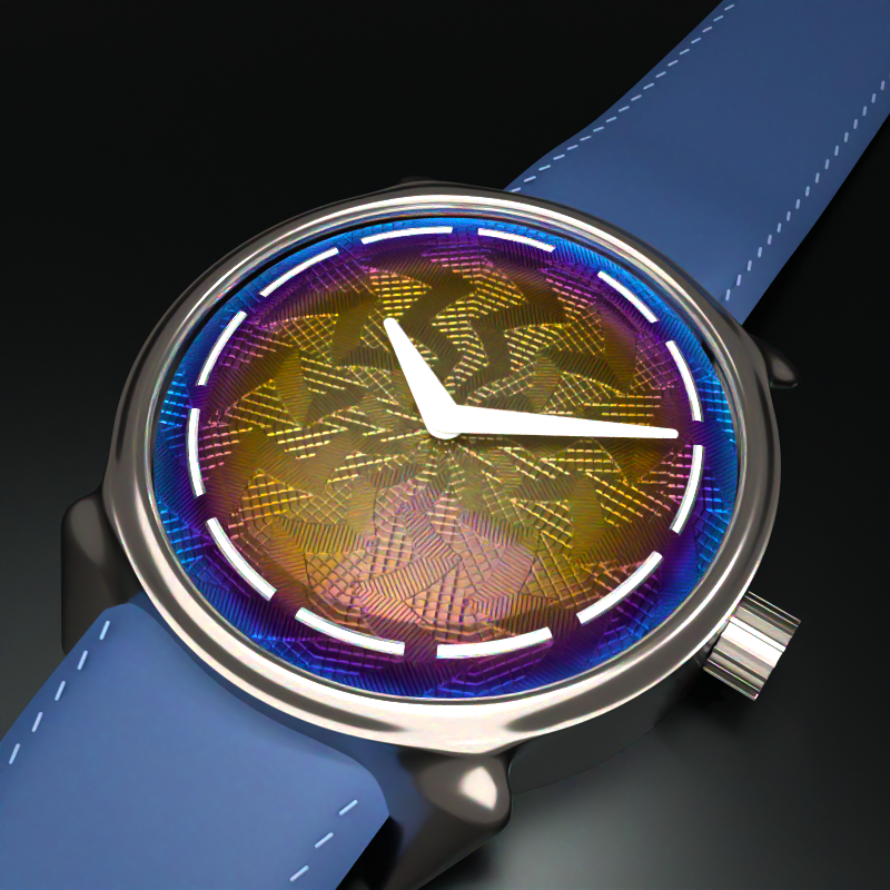
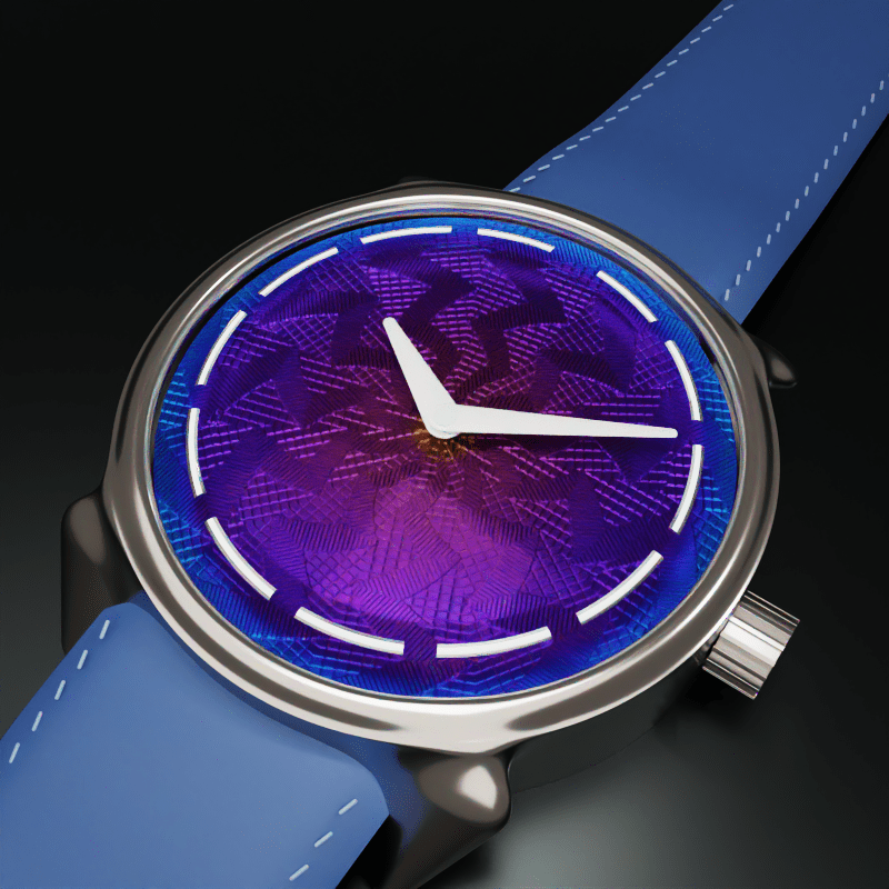
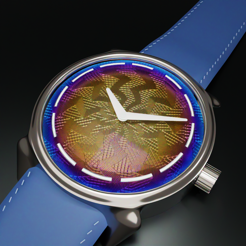
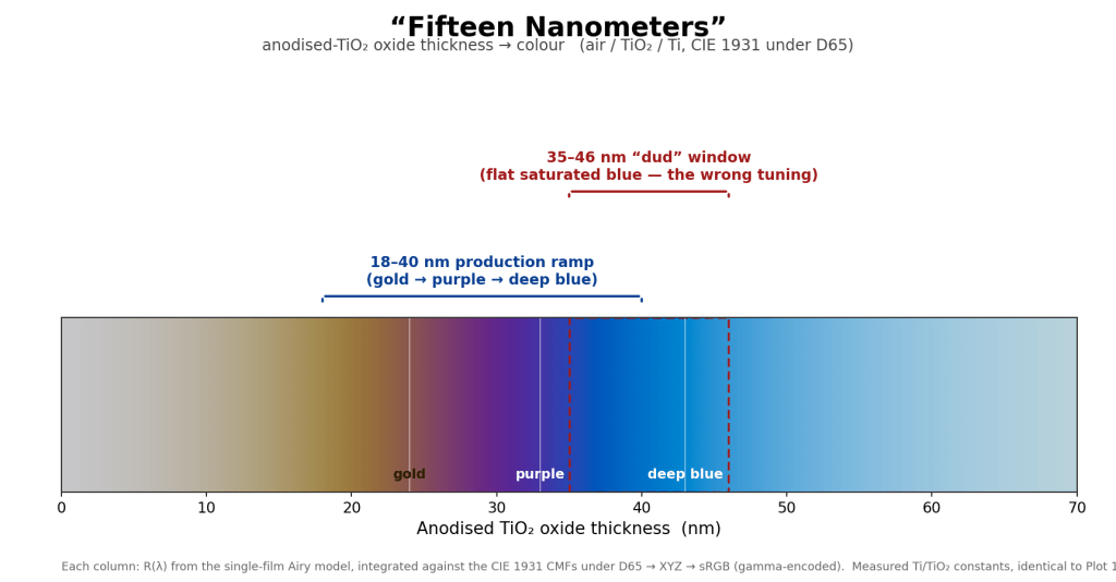
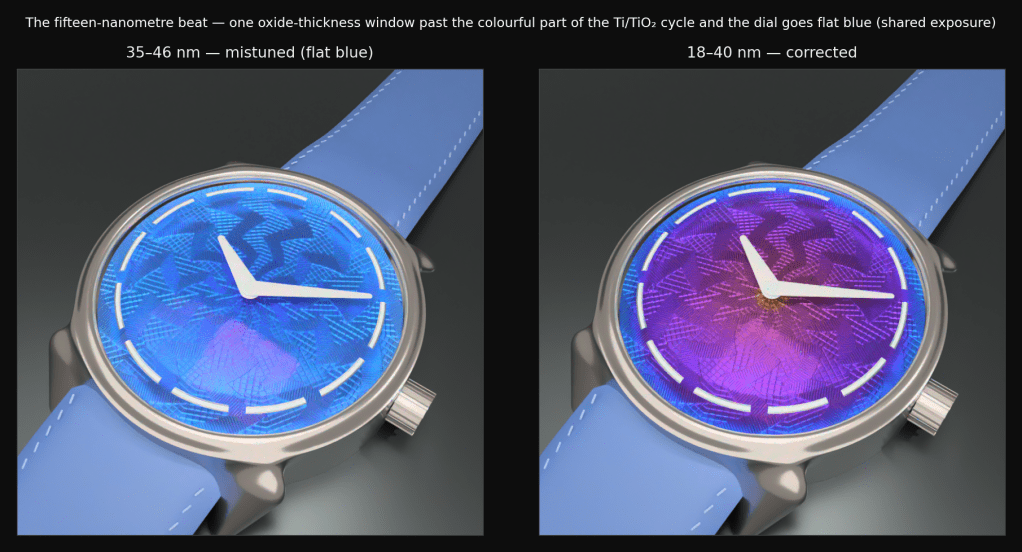
In early June, Ming and J.N. Shapiro released a watch called the 37.06 Lightning, and the first batch was claimed the same day it was announced. It is a grade-2 titanium dial, hand-engraved on a rose-engine lathe in Josh Shapiro‘s Los Angeles workshop, then hand-colored with a butane torch by Ming Thein in Kuala Lumpur. At around 6,250 Swiss francs it is, improbably, the least expensive way into one of Shapiro’s engine-turned dials. The color runs from warm golds and oranges at the centre, through purple in the middle, to a deep blue at the rim. It is not paint. It is oxidation, controlled by temperature, executed by eye, and a large share of the dials get thrown away because the color lands wrong.
This fired up a burning question: why does it look like that? The color is not pigment, the pattern is not printed, and the whole thing is doing something with light that I could feel I didn’t fully understand. The honest way for me to understand a watch like this is not to keep staring at the beautiful photography on the Ming website; it’s to try to rebuild the light that comes off it, and to find out exactly where my mental model is thinner than the dial.
Three weeks of evenings and some weekends later, RISE had grown a thin-film optics stack, its first implicit-geometry primitive, a deferred scene-realization pass, an HDR movie pipeline, and a small pile of bugs that were each more interesting than the feature that surfaced them. This is the account of that, dead ends and all. If you want the short version: the renders were never the point. The point was that the watch stopped being opaque to me.
The watch poses three mysteries, and they map cleanly onto three pieces of physics. There is the color, which is interference. There is the pattern, which is kinematics. And there is the problem of making the light actually play across the thing, in motion, without lying about any of it. I went after them in that order.
I. The color is not paint
The first real decision was a modelling one, and getting it right saved me a refactor I would have regretted.
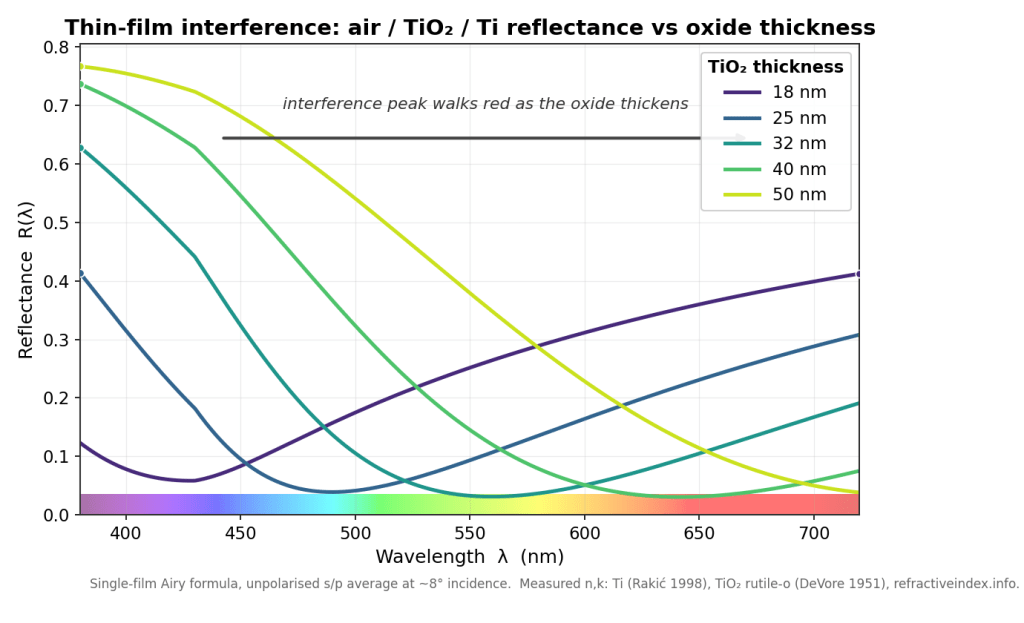
Heat tint and anodization look like a surface treatment, like a coat of something. They are not. Physically, the color is the specular reflectance of an air-oxide-metal stack: a thin, coherent dielectric film (the oxide) sitting on a conductor (the titanium). When white light hits it, part reflects off the top of the oxide and part off the metal underneath, the two paths differ in length by an amount that depends on the film thickness and the wavelength, and they interfere. Thicken the oxide by tens of nanometres and you walk the constructive peak across the visible spectrum, which is why a torch sweeping a dial paints gold, then purple, then blue as the metal gets hotter and the oxide grows. The color you see is the surviving wavelengths after interference, not a dye.
That single fact tells you where the feature belongs. The bare-metal reflectance already lives on RISE’s microfacet specular lobe, computed in exactly one place. Anodized color is the same Fresnel calculation with one extra layer in front of the metal, so it is not a new material type at all; it is a third Fresnel mode on the lobe that already exists.
This is also, pleasingly, the industry-standard surfacing. glTF calls the same thing KHR_materials_iridescence: a base metal plus an iridescence layer with a film index of refraction and a film thickness. RISE’s new slots map onto that one for one, so the material imports and exports glTF iridescence for free, which I did not plan and was glad to have. What it is explicitly not is a clearcoat (that is a thick, incoherent dielectric, a separate lobe) and it is not a color-gradient painter (RISE has one of those, a cosmetic lerp, and the design doc carries a literal warning not to mistake the two). The temptation to model a color gradient as a color gradient is strong and wrong; the gradient is a side effect of physics, and if you model the side effect you spend forever hand-tuning something the physics would have handed you.
Why a spectral renderer makes this trivial
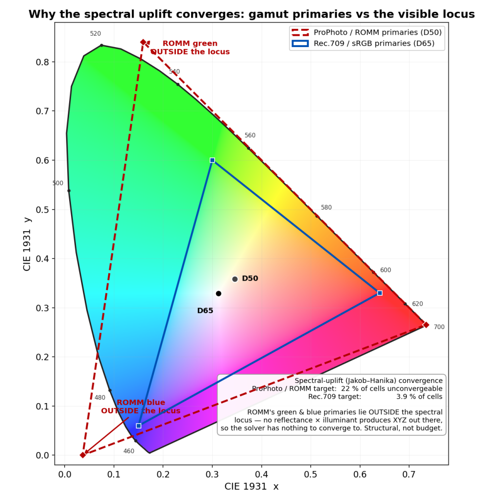
Here is the architectural fact that made the whole project tractable, the one I would put on the first slide. RISE does not carry red, green, and blue. Its primary integration path carries hero wavelengths: each camera path samples a small set of wavelengths (the watch uses sixteen across 380 to 720 nm), and a material is asked for its reflectance at a wavelength. Interference lives in the phase term δ = 2πnd/λ, an explicit function of wavelength. A spectral renderer evaluates the real reflectance R(λ) at each hero wavelength and is exact by construction. An RGB renderer is asked to represent that same interference integral with three point samples, which is roughly like trying to reconstruct a chord from three keys chosen in advance; you can fake an average color but you cannot get the spectral structure right, and thin-film is spectral structure. If you have ever wondered why iridescence is the thing that makes RGB renderers look subtly wrong, that is why.
So the spectral path needed no clever antialiasing, no famous paper. The famous paper here is Belcour and Barla (2017), which is the reference for thin film in a renderer, and the survey’s conclusion was that RISE does not need it on the spectral path. Belcour integrates in optical-path-difference space precisely because they cannot carry wavelength in an RGB engine; RISE can, so it just evaluates the truth. Knowing not to implement the famous paper was one of the better decisions. Their machinery does reappear, in a simplified form, on RISE’s RGB convenience path, which still has to fake the integral for tools that want a quick preview.
Implement the oracle twice
Phase one was deliberately standalone, no renderer integration at all. The point was a ground truth, and the discipline was to implement the optics twice and force the two to agree.
One implementation is a general N-layer transfer-matrix method (characteristic matrices, per-polarisation). The other is the closed-form Airy summation for a single film. With one layer, the transfer-matrix result reduces algebraically to the Airy result, so the two must match to machine epsilon or one of them is wrong. This redundancy is the entire point: a single implementation is internally consistent with its own mistakes, and the classic thin-film bug is a sign-convention slip in the p-polarisation branch that a lone implementation will reproduce identically in both its “check” and its “answer,” agreeing with itself all the way to a confidently incorrect render.
It paid off immediately and a little embarrassingly. The cross-check, 6,086 assertions worth, caught a sign-convention inconsistency in my own design doc: a mismatch between the forward-travelling cosine root, the matrix off-diagonal sign, and the Airy round-trip exponent. Pair the wrong two and you get a wave that grows instead of decays, and reflectance greater than one for an absorbing film, which is the universe’s way of telling you that you have invented a laser. The energy invariant (R must lie in [0,1]) and the transfer-matrix-versus-Airy comparison are both built to catch exactly that, and they did. The validated convention got pinned down and written into the doc, and the production evaluator, lifted from the Airy form, now matches that oracle to within 3.3e-16. Adversarial review found one more real bug before it shipped: a grazing-incidence NaN at cosθ = 0, fixed with an input clamp that leaves the valid domain bit-identical to the oracle, plus a sign-mutation test to prove the oracle comparison isn’t tautological. (If your test passes when you deliberately corrupt the thing it tests, your test is decorative.)
Generality is a data file
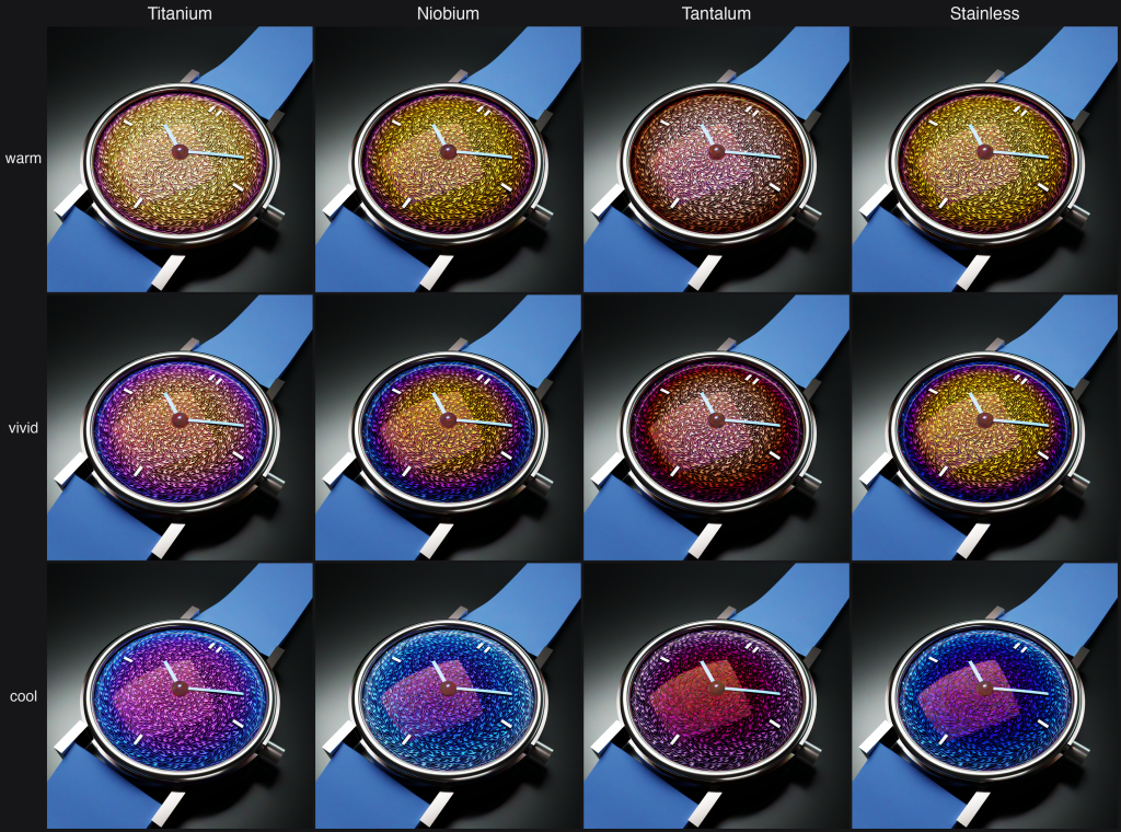
The hard requirement I set was that adding a metal must be data only, no code. The optical maths is N-layer from day one, so a new metal is a pair of measured optical-constant files (n and k) for the substrate and another pair for its oxide, dropped straight in from refractiveindex.info. The shipped set covers titanium with its TiO₂ oxide (the canonical case, the oxide is transparent in the visible), steel with magnetite (Fe₃O₄, which is absorbing, so it gives the duller, browner temper ladder you see on heat-blued screws), tantalum with Ta₂O₅, and niobium with Nb₂O₅ (the classic anodized-jewellery palette). Steel’s absorbing oxide is the coverage win: it exercises the complex-film-index path that titanium, with its near-zero absorption, barely touches. The human acceptance gate is therefore a single grid, metal down one axis and thickness across the other, that proves generality and stress-tests transparent against absorbing films in one image, and pins the D65 white point dead on while it is at it. The watch ships titanium, but the scene also defines the niobium, tantalum, and steel variants, swappable in the GUI, purely as authored data.
However, this is all pure theory, in practice, what happens with each of these metals is that once the temperature reaches a certain point, the oxide layer flakes off. This makes the physical effort that someone like Ming Thien has to go through to get just the right color even more daunting, push the temperature just a little too far and you’ve wasted the whole dial. This is also why for stainless steel, to get that blue color it’s typically anodized which allows precise oxide layer thickness but then you get none of that color gradient.
Two parallel pipes, and why IOR can’t go through the color one
This is the kind of detail that reads as trivia until it silently mangles a render. RISE has two parallel painter interfaces, and the split is load-bearing. One pipe carries color: reflectance, emission, anything tinted, and on the spectral path it uplifts an inline RGB value to a full spectrum through a learned lookup table (the Jakob-Hanika method). The other pipe carries physical scalars: index of refraction, roughness, scattering coefficient, film thickness. It never touches the uplift; it returns a per-wavelength magnitude directly.
The film parameters (film_ior, film_extinction, film_thickness) go through the scalar pipe for the same reason index of refraction does: routing an IOR of 2.7 through the color pipe would “uplift” it as if it were the color (2.7, 2.7, 2.7), handing you whatever spectrum the table thinks that means, which is nonsense. The historical version of exactly this bug is instructive: a scattering coefficient of one million, sent through the color pipe, got clamped to about 1.0 in the visible band, which rendered glass spheres invisible in every spectral mode for longer than I would like to admit. The rule, now written down, is a one-liner. Is it a tinted reflectance sample? Color pipe. Is it a physical coefficient? Scalar pipe. And never add a color accessor to the scalar pipe to “fix” something, because the absence of that path is the entire safety property. The type system is the correctness guard; encode the physical meaning in the type, not in a runtime check you will forget to write.
The bug that lived in two places at once
Two correctness bugs from this stretch are worth telling because of how they were found, not just what they were.
The first is an energy-conservation subtlety. Rough metals lose energy at each microfacet bounce, and a good renderer adds it back with a multiscatter compensation term. The term is nonlinear in the Fresnel reflectance. The draft pulled the metal’s tint outside that nonlinear function, which over-brightens tinted rough metals because the tint actually compounds through the multiscatter series and has to go inside. Measured, the tail was about 4.3 times too bright at a tint of 0.3. The fix is a one-line rearrangement. The interesting part is what came next.
Once you can state a bug in a single sentence (“the multiscatter tail pulls the tint outside the nonlinear term”), you can enumerate every place that sentence could be true. That compensation function has exactly two callers in the codebase: the GGX material I was working in, and the older Cook-Torrance material I was not. Cook-Torrance carried the identical bug. It was fixed in the same breath. The lesson, which I have started calling audit-by-bug-pattern, is that a fix is not done when the reported site is fixed; it is done when no sibling carries the same pattern. The reported site is a sample, not the population.
The second bug is a foundation I inherited from my own past. The thin-film-aware hemispherical Fresnel average was measured before it was implemented: a furnace test showed that ignoring the film and using the bare-substrate average was off by up to 0.50, a thirteen-percent albedo error on rough surfaces, because the oxide is strongly anti-reflective at some thickness-wavelength combinations. So it got implemented properly, sharing the existing integration rule so that the film-equals-air case stays byte-identical to the bare conductor. Measure first, then decide whether you even have a problem; I had assumed this one was negligible and the furnace told me it was not.
The color foundation under all of it
None of the color would have been trustworthy without a change I had made just before this work, almost as housekeeping. RISE’s internal working color space had been ProPhoto (a wide-gamut space with a D50 white point), and that was quietly poisoning the spectral uplift. ProPhoto’s green and blue primaries lie outside the spectral locus, which means a chunk of its color cube corresponds to colors no physical reflectance can produce, and the uplift solver had 22 percent of its cells unconverged. This is not a solver-budget problem; there is literally nothing for the solver to converge to in those cells. I tried a smarter solver, more iterations, a different training illuminant; all marginal, because the problem is structural, not numerical. The fix was to retrain against Rec.709 linear, whose primaries all sit inside the locus. Failures dropped to 3.9 percent, all in the deep-blue corner where the underlying sigmoid model itself runs out of expressive power, and the residual is comfortably below the display quantum. So by the time the watch rendered, the swatch I tuned color against and the image the renderer integrated lived in the same Rec.709/D65 space, which is the only reason the two ever agreed. The lesson is dull and important: get your color space honest before you trust a single color you measure in it.
II. The pattern, and the wall
Guilloché looks like ornament. It is closer to a mechanical recording of a motion.
A rose engine is a lathe whose headstock can rock side to side, steered by a shaped cam called a rosette as the workpiece turns. Run a cutter against the rocking face and it traces one wavy line per revolution; feed the cutter slowly inward and the lines stack into the pattern. So the “design” is not drawn, it is the trace of a kinematic system, and once you see it that way the whole field collapses into a little maths. A rosette with some number of lobes rocks the radius by an amplitude as the angle sweeps, which gives a phase field ψ = (r − amp·cos(lobes·θ)) / pitch, and the groove is just a sharp V whose height is the distance to the nearest line: h = clamp((0.5 − |frac(ψ) − 0.5|) / landHalf, 0, 1), zero at the floor of the cut and one on the flat land between cuts. Set the amplitude to zero and it degenerates to plain concentric circles, exactly as a rose engine does when you lock the rocking off. The companion field, the direction of each groove, falls out of the same expression by differentiation, and I needed it because the anisotropy of the brushed metal has to follow the grooves; a watch dial that catches light across the grain instead of along it looks instantly fake. Both fields were checked against an independent reimplementation of the formula at a set of dial points, to 1e-9. (A golden-image snapshot would not have been a real test here; the oracle has to be a second derivation, not a frozen output of the first.)
That is the satisfying part. Now the wall.
The constraint that decided the architecture
The constraint I refused to relax was authentic engraving pitch. Real hand guilloché cuts grooves at roughly 0.10 to 0.20 mm pitch and 40 to 130 µm deep, on a dial blank that is only 0.4 to 0.6 mm thick. I wanted to reproduce that, not a stylised approximation with the grooves three times too wide so the triangle count stays polite. And the moment you commit to honest pitch, a problem appears that has nothing to do with optics.
A faithful full-dial mesh at 0.20 mm pitch is 11 to 24 million triangles, and baking it transiently costs 19 to 43 GB of memory. For a dial the size of a coin. That is not a render-time number, it is a does-this-fit-in-the-machine number, and on this machine it does not. (There is a lesson buried here about the Mac Studio I did not order with 128 GB of RAM. Had I bought the bigger box, 43 GB would have fit, I would have shrugged, accepted the mesh, and moved on, and none of what follows would have happened. Under-specifying my own hardware turned out to be the single best decision in the project, which is not a sentence I expected to write.) The original plan had been a fine displaced mesh with anisotropic shading and no bump mapping (I had rejected bump as an off-brand fake), and the measurement phase demolished the plan. The right response to a wall is not to argue about which technique you prefer; it is to build all the candidates and score them. So the plan became a three-way study: realize the same dial as a bump map, as a displaced mesh, and as an exact signed-distance surface, from one shared kinematic field and one shared material, and measure each against the exact surface as ground truth. A number, not a dogma.
The verdict, with the trap inside it
The exact signed-distance surface holds 0.23 GB regardless of pitch, because it never tessellates; it evaluates the height function analytically as a ray marches it. The displaced mesh at a coarse, demo-able pitch is fast to trace (about five times faster than the exact surface) but already wants 3 GB, and at honest pitch it walks straight into the 19-to-43 GB wall. So the deciding axis is memory, not trace time, and the exact surface is the only memory-feasible representation of the full dial at real pitch. That single fact is why it got promoted from a benchmark curiosity to the production path.
And “exact” turns out to matter for this particular look, not as a purity argument but visibly. Under flat, diffuse lighting all three realizations agree to about 95 percent; geometry barely shows. But the guilloché look is a sharp directional flash raking across the grooves, and under that flash the faceted mesh deviates from the smooth exact surface, because the flat facets throw glints the smooth surface does not. That extra sparkle reads as detail and is in fact an artifact: it is the tessellation, not the metal. The smooth analytic normal is the honest one.
The trap in the study was a measurement trap, and it cost me a couple of hours and some dignity. The first pass reported that bump mapping “did not engage at any scale” and disqualified it, which sounded like a plumbing bug. It was not; it was a unit mismatch. The bump strength and the mesh displacement were set to the same number, but they are different units, and the legacy bump’s amplitude secretly couples to its sampling window, so the value that matched the mesh was about eight times too weak and the dial rendered flat. Fixed (with an opt-in flag that makes the strength window-independent, default off so every existing scene stays byte-identical), the bump suddenly carried the full twelve-lobe rosette. And then the second trap: the now-working bump scored a higher error against the exact surface than the broken flat one had. Not because it was worse, but because root-mean-square error rewards the conditional mean, and a featureless grey disc is an excellent approximation of the average of a textured one. A flat disc scores low error with zero structure. The lesson, which generalises well past rendering: never read RMSE without a structure metric beside it, or you will congratulate yourself for predicting nothing. The honest verdict is that bump is the lightest and fastest of the three and reproduces the pattern fine head-on; it loses to the exact surface only when the shot tilts into grazing relief, where a normal-only fake has no self-shadow, no parallax, and no silhouette, which is exactly where guilloché earns its keep.
III. RISE grows an implicit primitive
The study needed an exact surface, and separately the watch case needed organic, melded forms: flying-blade lugs that flow into the bezel, a ribbed gear of a crown. Both pointed at the same missing capability, so RISE got its first implicit-geometry primitive: a signed-distance field, a surface defined as the set of points where a distance function reads zero, ray-traced by sphere tracing (you step along the ray by as much as the known distance to the nearest surface, which is always safe because nothing can be closer than that, and you close onto the surface without ever tessellating it). It is a list of distance primitives (spheres, boxes, rounded boxes, cylinders, tori, capsules, cones) composed with union, smooth-minimum (which gives the molten fillet where two forms blend), subtraction, and intersection. It was built for the watch’s lugs, and named and shaped so that nothing in it knows what a watch is, which is a rule I will come back to.
The directive I set myself was that it be a first-class citizen, not a guarded stub: real mesh generation and real surface sampling, not bounding-box fakes. Real meshing meant a marching-tetrahedra mesher (I chose tetrahedra over the more famous marching cubes because the cubes algorithm’s 256-case table cannot be safely hand-written, and a watertight, unambiguous mesh mattered more than familiarity). Real surface sampling meant that an emissive signed-distance surface is a genuine light the renderer can aim shadow rays at, which I validated by Monte-Carlo-integrating the lighting integrand against the closed form and getting a ratio of 1.00019. The machinery is provably unbiased, which is the sort of sentence that is boring to write and very reassuring to have.
The black-glass bug
The gem of this stretch was a bug that rendered a glass signed-distance object solid black, and its cause is two correct-in-isolation pieces conspiring.
When a ray refracts into glass, the renderer spawns the continuation ray exactly at the surface point, with no offset. That is correct. Separately, a sphere tracer reports its hit a hair before the true surface, because it marches until the distance drops below a small epsilon and stops just shy of the zero crossing. That is also correct. Put them together and the refracted ray, born exactly on the reported hit, is actually a hair outside the true surface; it immediately re-hits the same surface band it was just spawned on, the renderer concludes the ray travelled an infinitesimal distance through glass and then another and another, and the interior medium absorbs over what is effectively an infinite path. Black. The fix is to step the ray off the surface band before deciding which side of the glass it is on, which is exactly the trick analytic primitives use to reject the spurious “I hit myself at distance zero” root. It is a general correctness fix for any glass implicit surface, and it only became visible because the watch needed glass with an interior medium. This is the recurring shape of the whole project: the interesting bugs live at the seams between components that are each individually right, and the way you get to meet them is to build the thing yourself.
A small family of related bugs surfaced the same way and each got fixed at its own layer: bounds that grew wrong when a watch crystal’s huge dome blew the box out to dead space (the union-of-boxes was order-blind, and the first fix for it was also order-blind, caught by review before it shipped); an “invisible lume” bug where a wide, thin emitter’s bounding pad was thinner than the marcher’s surface band, so camera rays entered already inside the surface and reported the exit face, silently skipping the tops of the lume batons (glowing sides, dark tops). None of these are exotic once found. All of them are invisible until an implicit surface makes you confront the gap between a bounding box and a true surface.
And one more measurement trap, because they cluster. A signed-distance emitter has about twice the pixel variance of an analytic one, for a real reason (its surface-curve sampling fragments the stratification at the visibility boundary). Through an 8-bit sRGB PNG, that extra noise reads as a fake four-percent brightness deficit, because clipping and the concave display transfer interact with noise the way Jensen’s inequality says they will. I spent real time chasing a brightness bug that did not exist. The rule that came out of it is blunt: compare emitters in linear high-dynamic-range, never through an 8-bit preview, because the preview is not a neutral observer of brightness when noise is in play.
IV. The boring twenty-five-x
Here is the least glamorous and most quietly important thing I built, and it never appears in a single pixel of the final image.
The watch scene defines six dial patterns but renders only one; the other five are an artistic library I flip between in the GUI. Under the old model, parsing the scene baked all six displaced meshes, spending minutes and gigabytes on five dials that never appear on screen. The fix is to defer all the expensive parse-time work into a single realize pass that runs once, on a single thread, at the precise moment the scene becomes immutable and just before the parallel render starts. (Deliberately not lazily during the render itself, because the scene is shared and immutable across all the render threads, and realizing geometry there would be a data race wearing a convenience costume.) A small freeze gauge asserts, loudly and in every build, that nothing tries to realize during the parallel pass, so the invariant is exercised by the whole test suite rather than trusted.
The payoff on the watch: parse 25 times faster (17.55 seconds to 0.69), parse memory 6.4 times smaller (3.74 GB to 586 MB), total wall time 2.3 times faster, and provably behaviour-neutral (the before-and-after images differ only at the renderer’s own run-to-run noise floor, which is the only honest way to prove a change like this is neutral, because the multithreaded integrators are not bit-deterministic and “exact zero difference” is a fantasy).
There was a second phase available, deferring the painters and image decodes too, and I scoped it, found it was a roughly 75-class recursive cascade with five separate correctness landmines, noted that the motivating case was already solved and the remaining cost was an environment map that is almost always used anyway, and did not do it. Knowing where to stop is a feature. The most expensive code is the code you write to solve a problem you do not actually have.
V. Finishing the dial, and two times the watch lied to me
With honest optics, an exact surface, and a fast parse, the dial could finally be finished as the actual Lightning motif: eleven jagged radial bolts, the in-bolt grooves running straight but re-angling at every zigzag of the bolt, and the finer sector grid kept between the bolts. I assembled it under a real double-domed sapphire crystal (two concentric spheres, a roughly 1.2 mm wall, with the hour markers cut as cavities into the underside and filled with inset lume, the way the real watch etches them), and shot it on a macro rig built the way watch photographers actually work: a 100 mm lens on a full-frame sensor at f/16, lit off-axis so no light sources sit in frame, the watch laid on a dark glossy tabletop that fades to black. Then the watch lied to me twice.
The fifteen-nanometre lie
I had tuned the dial’s color on a fast RGB preview, the convenience path, using scalar indices of refraction. On that preview the bronze-to-purple-to-blue interference cycle landed across a thickness sweep of 35 to 46 nm, so I set the production oxide ramp to sweep 35 to 46 nm from centre to rim, hit render on the real spectral path, and got a dial that was flat, sulking deep blue. No gold. No purple. A blueberry.
The diagnosis is the title of this essay. The production material uses measured spectral optical constants for titanium and TiO₂, not the scalar approximations the preview used, and the same color cycle lives about fifteen nanometres lower on the real material. At 35 to 46 nm the real titanium was already fully into saturated blue, past the colorful part of the cycle entirely. A thin-film color tuned on a scalar swatch simply does not transfer to the real spectral material; they are not interchangeable per thickness, and nothing warns you, because each is internally consistent.
The tool that nailed it is the obvious one in retrospect: render a spectral swatch of the actual material, a flat panel with the exact measured constants and a thickness gradient, on the real spectral path, and read the thickness-to-color map straight off it. With that map, the ramp re-tuned to 21 to 40 nm, then to 18 to 40 nm with a deliberately thin gold centre, and the dial finally read gold at the centre, purple through the middle, deep blue at the rim. The general rule is now a law I keep: tune a thin-film color against the material the hero actually renders, not a convenient proxy.
And this is the place where I have the most respect for the people who made the real watch, because they cannot cheat the way I did. My fifteen-nanometre window is a number I can dial in with measured spectra and a swatch render. Theirs is a butane torch and a man’s eye and the moment he decides to pull the heat. The reason so many of the real Lightning dials get scrapped (Ming has put the reject rate as high as two thirds) is that same narrow window, except he is hitting it by hand, on a guilloché surface whose grooves heat unevenly, on titanium whose crystalline structure, by the brand’s own account, can betray the color at the last second. I spent two days finding the window with instruments. He finds it with a flame, and throws away the ones that miss. After this exercise I understand exactly how thin that margin is, and I did not understand it before.
Which reframes the price, too. The 6,250 francs I mentioned up top looked steep for a steel watch with a hand-wound Sellita inside, a spec sheet that elsewhere costs a third of that. It looks different now. You are not paying for the movement. You are paying for a hand-cut guilloché surface and a hand-torched color with a brutal yield, and once you have felt how narrow the window is, the number stops reading like a markup and starts reading like an honest tally of everything that has to not go wrong.
The blurry-crystal lie
The second lie was subtler. The dial looked faintly soft, blurred, when viewed through the crystal, and the obvious suspect was the crystal: refraction, lensing, the dome acting as a bad magnifier. I almost spent a day on the optics of the dome.
It was innocent. A concentric meniscus shell, inner and outer surfaces sharing a centre, is afocal; it bends light on the way in and bends it back on the way out, and does not blur anything. The real culprit was the denoiser. The dial was being lit almost entirely through stochastic refraction (the direct-lighting shadow rays were being blocked by the glass shell, because a shadow ray treats the crystal as opaque), so the dial pixels were extremely noisy, and the denoiser, doing its job on garbage, smeared the noise into softness. I proved it with a clean A/B at high sample count with the denoiser off: through the crystal and with the crystal removed entirely, the raw images were equally sharp (and equally noisy). The geometry was never the problem. The fix is a general engine feature, transparent shadow rays: let a shadow ray pass through a clear dielectric, attenuated by the per-surface Fresnel transmittance, instead of treating glass as a wall. The dial snapped crisp. Both lies share a moral I will state once: the obvious suspect is usually innocent, and the cost of arresting it is the day you do not spend on the actual culprit.
VI. Making it move
The whole point of this watch is the flash. The anodized shimmer and the specular highlights are the look, and a still can only ever show you one instant of them. So the turntable had to be high-dynamic-range, and the existing movie writers were 8-bit, which clamps everything brighter than white to white and crushes every highlight the watch is famous for into a flat sheet. I rebuilt the export to an HDR10 ProRes 4444 master: take the renderer’s scene-linear output, convert from Rec.709 primaries to Rec.2020, encode through the PQ transfer (which keeps headroom above reference white so highlights survive the codec’s integer quantisation), and tag the result as HDR10. Two color-science bugs got caught in review along the way, both instructive: encoding through a linear transfer re-clips the highlights at the integer encode even though the float buffer held them fine (HDR in a codec needs a transfer with headroom, which is the whole point of PQ), and tagging Rec.2020 onto Rec.709 data without actually remapping the gamut produces oversaturated color in any color-managed player. Either convert the colors or tag them honestly; do not tag what you did not convert.
The atom that wasn’t there
And then the best bug of the entire project, the one I will be telling for a while.
The headless encoder produced a file that was HDR in its pixels, HDR in its bitstream color tags, and reported as correct HDR by every probing tool I pointed at it. And it played back as standard-dynamic-range. Flat. The pixels were right, the tags were right, the tools agreed with me, and the picture was wrong.
I found it by dumping the low-level atoms of two files side by side, mine and a known-good one from the GUI path, and diffing. The good file had a tiny container-level atom called colr; mine did not. It turns out QuickTime and macOS decide whether to engage HDR off that container atom (nclc: pri 9 trc 16 matrix 9, meaning Rec.2020 / PQ / Rec.2020), not off the ProRes bitstream tags that every probe tool reads and reports. The bitstream tags are real, and read correctly, and the player ignores them. Worse, the obvious flag to force the atom writes a different, useless atom (marked “unspecified”) because the color flags do not reach the relevant muxer. The working recipe is to stamp the frame parameters and force the atom explicitly, and to verify with a single grep that the atom reads pri 9 trc 16 matrix 9, identical to the GUI output that was never broken. An entire afternoon, an HDR pipeline that was correct in every component, defeated for want of one container atom. I wrote the whole workflow down as a reusable skill so I never have to rediscover it, which is the only revenge available against a bug like that.
The animation itself was authored in RISE’s native keyframe timeline, no script: a turntable orbit with the lights held fixed so that the specular highlight sweeps across the guilloché and the thin-film colors shimmer as the dial turns, which is the entire reason for making it move at all. (One standing rule the watch reinforced and I will pass along: keep the denoiser on for presentation renders. I once turned it off for an animation out of a flicker worry, and was overruled, correctly and emphatically. At high sample count the denoise is light, and a steady standing preference beats a clever one-off aesthetic theory every time.) The watch later grew running hands, each hand a small implicit cone whose orientation is keyframed about the hub, which is a pure scene change and needed no new engine feature, exactly as it should be. (Like the real Lightning, mine carries no seconds hand; Ming left it off on the grounds that the dial was busy enough without one more moving thing reminding you that time is passing, and I saw no reason to argue with him. The hour and minute hands sweep, which is plenty to make it feel alive.)
VII. The discipline
The technical work above would have collapsed under its own weight without a process, and the process is as much the deliverable as the renders. I ran this the way I increasingly run everything: as a master-controller session directing worker subagents, with the humans (me) holding the parts that must not be automated.
Three rules carried it. First, every non-trivial change was validated by two or three independent reviewers, each given an orthogonal concern (the optics maths, the spectral integration, the API and lifecycle, the thread-safety, the blast radius) and run in parallel; the thin-film merge alone went through three rounds and nine reviewers. This is not a rubber stamp, and the proof is that it found real bugs before they shipped: a material that dereferenced an optional parameter unconditionally and segfaulted on a documented-as-supported scene, the order-blind bounds fix that was itself order-blind, a photon-map classification that would have rendered a dispersive-caustic test black. Implement, review on orthogonal axes, fix every finding, then declare done.
Second, features must be general. The test I apply is simple: would this chunk look reasonable in the engine’s feature list, next to “sphere” and the Perlin painters? If its description needs the watch to make sense, it is wrong. This is why so much of the work was excision. A “watch strap geometry” I had written early was a scene generator wearing an engine-feature costume, and it got deleted and replaced by two genuinely general primitives (a profile swept along a path with rotation-minimising frames, and a template stamped along a path), with the strap’s actual cross-section moved out into the scene file as authored data, derived in a comment. The guilloché field itself eventually dissolved the same way, into a general in-scene maths-expression evaluator, deleting a couple of hundred lines of pattern-specific C++; the proof of equivalence was a dense fifty-thousand-point sweep that matched bit-exact. The watch scene is now fully procedural, no baked meshes and no baked textures, and the truth of the dial is readable in the scene text. Every excision left RISE more capable than the watch required, which is the entire return on the discipline: the watch was the muse, and the engine kept the technique.
Third, trust the measurement before the conclusion, and cross-check the tool. The three-way study is the canonical instance (a number, not a dogma), but the theme runs through everything: the RMSE-versus-structure trap, the compare-emitters-in-linear-HDR rule, the behaviour-neutral proof against the noise floor, and a sibling lesson from elsewhere in the codebase that I keep taped to the inside of my skull, which is never trust a tool that reads through the suspect component. (The EXR reader had been silently clipping very bright values on read, so a “the integrator produces infinities” verdict turned out to be a reader artifact, not an integrator bug. The bug was in the instrument.)
A few environment traps were vicious enough to institutionalise, and they are worth a paragraph because they are the kind of thing that is never in a paper and always in the work. The build compiles with fast-math, under which infinity does not behave, and an infinity-seeded min/max reduction in the dial bake produced uniformly 37-times-compressed heights while the identical source compiled without fast-math was correct; the fix is to never seed a reduction from infinity and never write a NaN guard that assumes IEEE semantics you have told the compiler to discard. The source is hard-tab indented and the editor renders tabs as spaces, so a multi-line edit reconstructed from what you see silently mismatches what is on disk. And the shell does not word-split an unquoted variable the way I assumed, so a list of frames collapsed into one impossibly long filename. None of these are interesting. All of them cost time, and all of them are now written down, because the second time you lose an afternoon to fast-math is the afternoon you should have read your own notes.
I will say one honest thing about the human-and-machine arrangement, because it is my actual day job and I think the shape of it matters. The machine is extraordinary at the breadth: holding a 99-commit feature branch in view, running adversarial reviewers in parallel, enumerating every sibling of a bug pattern, writing the swatch test that disproves the brightness deficit. The judgement that did not delegate well was the taste: refusing to relax the pitch, rejecting the color gradient as a model, deciding not to implement the famous paper, knowing when to stop the deferral work. The interesting frontier is not whether the machine writes the code (it does, well) but where exactly the irreducible human judgement sits, and on this project it sat almost entirely in choosing the constraints and refusing to bend them. The workers never committed and never pushed; the controller verified independently and committed to a branch; only the human pushed. That last rule is not about trust in the machine. It is about who is accountable for the artifact, which is still, for now, a person.
Coda
What I came away with is not a render I am proud of, though I am, and not a longer feature list for the engine, though that too. It is an appreciation I am fairly certain I could not have reached any other way.
Before this, I would have looked at the Lightning and seen a very pretty dial. Now I see the specific, unforgiving things that had to go right to make it. I know what a rose engine is doing, that the pattern is a recorded motion and not a drawing, and roughly how much control it takes to feed a cutter into titanium at that pitch without the whole figure wandering. I know that the color is not pigment but a fifteen-nanometre window of oxide, and I know it in my hands because I missed the window myself and rendered a blueberry. And I know that Josh Shapiro cuts that surface by hand and Ming Thein finds that window with a torch and his own eyes, on a metal that fights them both, throwing away the ones that miss. I had to assemble measured spectra, a swatch render, and an exact analytic surface to do, in software and imperfectly, a thin sliver of what the two of them do with a lathe and a flame.
That is the part that surprised me. I went in expecting to understand the physics, and I did. What I did not expect was to come out the far side with so much more respect for the craft, precisely because I now know which parts of it are hard and why. The bugs were the teachers in all of this, every one of them: the black glass, the fifteen nanometres, the missing atom, the flat disc that scored a suspiciously good error. Each was a place where I was sure I knew how the light worked and did not, and each one quietly moved a piece of the watch from “magic” into “earned.”
You can admire an object from across a display case. You can also take it apart in simulation, fail to reproduce it a dozen ways, and come out admiring it more, for sharper and more specific reasons. I went looking for the physics and found, instead, a great deal of respect for two people doing by hand what I could barely fake with a renderer. That trade was worth every evening.
The first day of lockdown meetings nearly broke me. Back-to-back video conference through the afternoon; by 4 PM, and not even a full day in, I closed the laptop genuinely unsure how anyone was supposed to do that job for another week. Two or three weeks later it was just Tuesday. When offices reopened and I spent a full day walking between conference rooms and talking to humans in three dimensions, the way I had done for fifteen years before the pandemic, I came home exhausted in exactly the same way and wondered, again, how anyone was supposed to do that job. A few weeks later, again, it was just Tuesday.
What sticks with me about that loop, beyond the obvious thing about resilience, is how completely the post-adaptation state erases the pre-adaptation state. I cannot really remember what it felt like to find video meetings exhausting; I know I did, I have written evidence, but the feeling is gone. The wall between the two modes is opaque from both sides. You cannot see across it until you are over it, and once you are over it you cannot quite remember what was on the other side.
I have been thinking about that wall in the context of how we are currently building products on top of LLMs, because most of the smart product work happening right now is, I think, work on a wall.
LLMs are stochastic in a way that nothing in mainstream software has been before. Same prompt, different output; same model, different output; sometimes same seed and the floating-point gods still go their own way. We have known this since the Midjourney and ChatGPT moments, both of which somehow now feel like ancient history (a recurring property of this field is that two years ago is the Pleistocene). And yet almost every piece of software the modern knowledge worker uses has spent thirty years promising determinism so thoroughly that the promise stopped being a feature and became a substrate. Move the slider, the pixels move. Hit Cmd-S, the file saves. Call the function, the function runs. Rendering is a quiet exception, but the user only ever sees the converged, de-noised frame.
The product question of the last two years, and the one most of us are still working on, is how to bolt a stochastic engine onto that deterministic substrate without breaking the user. The good answers, the ones that are working, all turn out to involve writing a new contract with the user inside a carefully walled-off part of the product. Lightroom’s generative remove is the example I keep reaching for, less because it is close to my work and more because it is close to my weekends. It is, mechanically, the most non-deterministic thing the product has ever done, but Adobe walled it off cleanly: distinct mode, distinct button, three variations by default, retry until you are happy. The rest of Lightroom is exactly as deterministic as it was in 2008. The contract on the exposure slider is unchanged; the contract on the generative button is new and legible, and the user, encountering it, adapts in about four seconds because the boundary is visible.
I had a version of this conversation with a colleague this week. We are looking at an LLM-powered feature landing at around ninety percent accuracy on the task we care about, and his concern (which I think is real and serious, not curmudgeonly) was that ninety percent will quietly cost us developer trust. Developers are calibrated for a world where the compiler either accepts the program or it does not; a tool wrong one time in ten will, the argument goes, be distrusted after the second miss and abandoned after the third. My response, which I am still mostly sure about, is that ninety percent is fine if and only if the contract is explicit, and that the work is to build a UX where the new contract is as legible as the old one. We will find out in a few weeks.
But the more the conversation stays with me, the more I think we are both solving a transitional problem, and the more I wonder what the same problem looks like once the transition is over.
Because the engineer my colleague is worried about is a particular engineer, with a particular formation. Most of us who ended up in this profession have some version of the same origin story; mine is a triangle on a screen, seventeen years old, and the joy was equal parts the triangle itself and the reliability of it. I had typed an incantation, the machine had obeyed, and the machine would obey again the same way every time I asked. Heisenbugs are part of the folk mythology of the field precisely because they violate that contract; we named them, the way pre-modern cultures named comets, because they were the rare exception to a world that otherwise behaved. The entire emotional substrate of the profession, the thing that makes a certain kind of person stay up until three AM debugging instead of going to sleep, is built on the premise that the system, in principle, behaves.
The engineer we are designing for today is that engineer. The contract we are carefully writing for the ‘ninety percent feature’ is a contract that engineer can read. The wall we are putting around the stochastic part of the product is a wall that engineer needs.
What I do not know, and what I find myself returning to, is what happens to the craft when the next engineer does not need the wall. The eleven-year-old getting into programming this year is not having the triangle moment. They are having some other moment, and I think it is something more like the first time they asked a model to build a small game and it mostly did, and they fixed the parts that were wrong, and the loop of negotiation, not the loop of obedience, is what hooked them. That is a different formation. The dopamine source is different; the substrate of expectations is different; the relationship to the machine is different in a way that the word “different” probably understates.
You can sketch out, without much difficulty, some of the second-order effects once that engineer is the median engineer. The unit of work stops being the function and starts being the intent. Code review stops being a quality gate at the end and becomes most of the job. Reproducibility becomes a thing you opt into for specific surfaces (releases, debugging, regulated systems) rather than the default everywhere. Testing shifts from asserting outcomes to asserting distributions. The senior engineer becomes less the person who can build the system and more the person who can sense where the system is quietly bluffing, which is a kind of expertise the field does not yet really know how to teach and a sentence that will, accurately, annoy a lot of senior engineers.
The Lightroom equivalent is even further out and even more interesting to think about. The wall Adobe so carefully built between the deterministic sliders and the stochastic generative tools is a wall built for me, the photographer trained on twenty years of deterministic Lightroom. The photographer who learns the craft on a stochastic-first tool may not need the sliders at all, or may keep them around the way we kept the floppy-disk save icon for thirty years after floppies died, as a vestigial pointer to a contract that no longer underlies the thing. The interface to the photograph might just be intent, expressed in language and gesture, with the file as a downstream artifact rather than the unit of work. The skill that matters in that world is not knowledge of the tool; it is taste, the ability to know which of the candidates is the one. Taste replaces correctness as the limiting reagent of the craft. That is also a sentence that will accurately annoy a lot of craftspeople, and probably should. I think it even annoys me!
None of this is a prediction so much as a question I cannot stop turning over. The products we are shipping right now, the ones doing the careful work of writing legible contracts and walling off the stochastic parts, are unambiguously the right products for the user we currently have. They are also, almost certainly, transitional products, in roughly the way that the early web was a transitional medium for documents that wanted to be interactive experiences but were still written as if they were articles in a magazine. The transitional version is necessary; the transitional version is also not the end state, and the end state is opaque from this side of the wall in exactly the way the post-COVID office was opaque from the pre-COVID office.
The thing I keep coming back to is that we will not, I think, remember the wall once we are past it. The engineer who grew up negotiating with stochastic tools will find it as quaint that we ever expected single-shot correctness; as we find it quaint that anyone ever expected to know a phone number by heart. The photographer who grew up describing intent will find the slider as quaint as we find the darkroom timer. The transition will, from the other side, look like it took about three weeks, and the things we are working so hard to preserve will be invisibly gone, and the things we cannot yet imagine will just be Tuesday.
The interesting question for anyone building one of these products today is not how to write the right contract for today’s user, although that work is real and necessary. The interesting question is what the product looks like when the contract no longer needs to be written down, because the user no longer remembers a world in which it could have been any other way.
Postscript on the image. The render is the Sponza atrium lit by ten thousand individual candle flames, output from my hobby renderer. Sponza has been the graphics industry’s standard stress test scene for two decades; ten thousand small emitters in it is a stress test of the stress test, almost entirely of the light-sampling code, since no renderer can afford to evaluate every candle from every shading point and instead has to learn which ones matter. I had implemented light BVH and path guiding and spent the week getting all the glTF importing just right.
A friend who works at an early-stage startup told me recently that the number of people at his company truly using AI to transform how they build software is relatively small. I found this surprising. I had assumed the lean, ambitious places were pulling away, that the picture I was getting from larger companies or browsing my X feed was a story about organizational inertia: real engineers using AI in real ways (autocomplete, generating tests for code that already exists, summarizing a diff or a stack trace) but not yet letting it shape the substance of what they build. But this was a young startup with strong people, real product-market fit, and no dead weight.
I have been wrestling with my hobby renderer for the last two weeks, trying to get a satisfying implementation of Specular Manifold Sampling working. SMS, briefly, is a technique for rendering light paths that bounce through a chain of specular surfaces before reaching a diffuse one (think caustics through a glass egg, the kind of bright pattern your eye picks up on a dining table at lunch). These paths sit on a thin manifold in path space; a vanilla path tracer will essentially never stumble onto them (in my scene, the only light source is embedded inside the displaced surface of the egg, which makes it inaccessible to a path tracer altogether). SMS finds them by setting up a Newton-style root finder over surface positions, which in practice means you are debugging a tower of half-broken pieces: the Jacobian construction, the surface derivatives, the solver itself, the manifold walk’s step-size logic, and the unbiasedness corrections that sit on top.
It has been slower than it should be. I am somewhere past thirty hours of evenings and weekends and the renderer still occasionally produces images that look less like caustics and more like the static at the end of a VHS tape. None of this matters as there are no stakes. The renderer is a personal project, the kind of thing that exists because somewhere around 2010 I had a graduate-level grasp of light transport and I like to pretend I can get it back.
What is interesting (and what I want to talk about) is what the project has done for my fluency with AI coding tools. I have had to invent and discard several workflows for getting useful work out of the agent on this problem. Early on I would describe the whole feature and ask for an implementation; the result was confidently wrong code that compiled but produced garbage. I tried more aggressive verification next, asking the agent to derive the math before writing, which caught some errors and missed the structural ones. Eventually I had to do the decomposition myself: isolate the Jacobian, write finite-difference tests for the surface derivatives, hand the agent the pieces with explicit acceptance criteria. There wasn’t a single bug but a stack of them: typos and arithmetic errors in the derivatives, chain-rule connection issues, geometric precision problems, and some fundamental limitations of the algorithm itself. By the time I was done, I knew which questions to ask and how to ask them, and I now apply that template to other unfamiliar work.
If I were still a working veteran of physically based rendering, none of this would have been necessary. The thirty hours I have spent would have been a few focused days of typing code I already understood. The agent would have been an actively negative contribution; reading and correcting its output would have cost more than just writing it. By any reasonable metric of “did this project ship faster,” the AI tools made it worse.
That is the wrong metric. What I got from those thirty hours wasn’t an SMS implementation (I could have downloaded one). What I got was a workflow for using these tools on hard, unfamiliar code, a sense for which tasks to delegate and which to break down myself, and a calibrated intuition for when the agent is just being lazy. These are foundational skills, and like most foundational skills, the only way to build them is to spend time on a problem where the foundation is the point.
This, I suspect, is what is happening at my friend’s startup and at most large companies. The senior engineers (the ones whose buy-in matters most for a real shift) are exactly the people for whom the local economics of AI tools are worst. They have decades of muscle memory for their workflows. They are under deadline pressure. When the agent produces something unsatisfying, it is rational for them to label it AI slop and return to the way they have always worked. Each individual instance of this decision is correct. The cumulative effect is that the people with the deepest context, the ones who would benefit most from an extension of their abilities, are the last to develop the new skill.
The optimistic reading is that the junior engineers, who have no tried-and-true workflow to fall back on, are pulling ahead, and the team will rebalance over time. I am not sure this reading survives contact with what the juniors are actually building. They are becoming fluent with the tools faster, yes, but the expertise the senior engineers have (the kind that lets you smell a code path is wrong before you can articulate why, the kind I was relying on every time I had to decide whether to trust the agent on SMS) is not something the tools deliver as a side effect of being used. It comes from years of being wrong in instructive ways, and the tools are quite good at preventing exactly that. A junior engineer who never sees the failure modes the senior engineer learned from, because the agent papered over them, is an engineer with a faster cycle time and a thinner foundation. A team needs both populations excelling, and the current dynamic delivers neither.
Without a forcing function the gap widens, and the forcing function cannot be “use more AI.” Every senior engineer I know who has actually become fluent with these tools has a project they tinker with at home: a smart home control system they’re writing, a synth they’re building, a renderer they swore they’d retire in 2010 and apparently haven’t. The pattern is suspicious enough that I have started to think the side project isn’t a perk of being AI-fluent; it is a prerequisite. You need a place where the cost of inefficiency is zero, where you can afford to learn slowly because nobody is waiting on the output.
Most engineers don’t have this. They have families, exhaustion, hobbies that aren’t code: in short, lives. Telling them to develop a side project isn’t a strategy; it is just a way of ensuring that the people who already had personal projects keep their lead. If a company actually wants its senior people to internalize these tools, it has to provide what the side project provides, and that is harder than it sounds.
The first instinct will be to schedule the time. A recurring afternoon, a quarterly week, a percentage carved off the calendar. We have run this experiment before and we know what happens. The time gets absorbed back into the day job when a release slips. The projects that survive review-cycle scrutiny are the ones quietly producing impact, which means the deadline pressure has been displaced rather than removed. The whole point of the side project, the reason mine has worked as a learning vehicle, is that nobody is keeping score. The output is allowed to be embarrassing. If a company schedules an “AI fluency block” that culminates in a demo to leadership, it has built a small hackathon, not the conditions for learning.
What is actually needed, and what nobody wants to defend in a quarterly business review, is something closer to unproductive play. The output shouldn’t matter, including to the engineer. The work should be allowed to fail in ways that don’t interest anyone else. The form it takes has to be the engineer’s to choose, because the choosing is part of the mechanism. The moment any downstream metric attaches itself (a promo case, a visibility win, a tool that gets adopted, a brag in a staff meeting) the local economics that drove the engineer away from these tools in the first place reassert themselves. Play that ladders to outcomes is not play; it is unconfessed work, which is what an engineering organization already excels at producing.
This runs against everything we know about how to run an engineering organization. We have spent a decade getting good at concentrating effort on outcomes, and “give your most expensive engineers time to do things that won’t matter” is a sentence I would have laughed at in 2018. But the alternative is watching your most experienced engineers, the ones whose judgment is doing the most load-bearing work in your company, fall further behind a tool that is now writing a non-trivial fraction of all new code. I would rather lose four hours a week to genuine waste than reframe them as productive in disguise; the disguise is exactly what stops the mechanism from working.
The Veach egg, incidentally, is now kind of rendering correctly (within the limits of what is possible for a heavily displaced surface with my current Newton solver). I am told by my agent that the implementation is “production-ready,” which I have learned means roughly the opposite.
For the last few days I’ve been building UI for a renderer I’m working on. It’s a project no one else will care about (just me, my code, and my own pixels). And still, getting AI agents to produce a UI that actually feels right has been a real chore. Endless iteration on cursor transition states, on button states, on panel animations, on the hundred small things that separate “functional” from “good.” It’s the kind of work that’s been on my mind, and it’s a big part of why I’ve been thinking about a pattern I’ve seen repeat over the years, across projects, teams and companies.
It tends to go something like this. Leaders observe, with growing frustration, that the same papercuts are still there, the test suite is still flaky, the retention curves haven’t budged. The consoling thought used to be “if only we had more headcount.” Now it’s: “Once everyone’s fully on Claude or Cursor or Copilot, we’ll have the time to clean all of this up.”
The premise is that the gap between the product you have and the product you wish you had is a capacity problem. Your team would have written better tests if they’d had more hours. They’d have polished the empty states if the feature backlog hadn’t been so long. They’d have shipped a tighter v1 if the date hadn’t been breathing down their neck. AI hands back hours, the logic goes, so AI fills the gap.
Take that argument seriously and look at what it actually implies. It implies that the people on your team know what good looks like, want to do it, and have been blocked only by the clock. On some teams that’s true. On most teams where the polish is missing or the tests are bad, it isn’t the clock. It’s the culture.
Polish doesn’t come from time. Polish comes from a person on the team who cannot let a panel-slide animation ship until the easing curve feels right (who’ll spend an hour tweaking cubic-bezier parameters because the default ease-out is technically fine but the motion doesn’t quite land under your thumb). When we built the first version of Google Photos, the PM and designer leading it were obsessive about exactly this kind of detail: animation curves, timings, whether photos were missing when you rapidly scrolled through a thousand of them. It’s a big part of why that first version felt so fast. Not because it was actually faster than its competitors on every dimension, but because every motion it made had been tuned until it felt responsive. Over time that kind of obsession hardens into systems (design reviews, performance budgets, the QA bars nobody argues with), but the systems exist only because someone cared first. That kind of obsession isn’t unlocked by capacity. It’s a trait the team has or doesn’t have, and it propagates because leadership rewards it, or withers because leadership rewards shipping the next thing instead.
I notice a related pattern in my own building right now. I’m targeting both Mac and Windows for this renderer’s UI, and the contrast is striking. On Mac, agents produce something that feels close to right surprisingly fast. The platform’s conventions are narrow, opinionated, and have been refined for decades, and the model can pattern-match into them; the HIG acts as an implicit loss function on the model’s output, having done the work of caring about polish on every example it has ever seen. On Windows, where the surface is wider and the conventions more permissive, I have to be the one sweating every detail. The agent produces something functional but generic, and I iterate on it for hours to get it to feel right.
The lesson generalizes uncomfortably. AI agents do their best work on top of a foundation that has already encoded taste, one that has already made the hard decisions about what good looks like. When the foundation is opinionated about quality, the agent inherits that opinion. When the foundation is permissive, the agent’s output is permissive, and the only thing standing between you and mediocre is your own iteration. Your team’s culture is that foundation. If the culture has already decided that flaky tests are unacceptable and that animations have to feel right, AI will produce work inside those constraints. If it hasn’t, AI will produce work that doesn’t, and you’ll be back to iterating it to good yourself, at the same rate you always did.
The reverse is also worth saying clearly. AI can help build the foundation, not just operate inside one: a leader who encodes quality into tooling (performance budgets, visual diffing in CI, a non-negotiable test bar, a design system the agent must conform to) lowers the cost of meeting the standard until meeting it becomes the default. But this still requires someone first deciding what good looks like and making it concrete; AI can scale a culture of quality, it cannot supply the will to define one.
A weak test suite tells the same story. Teams with a culture of testing don’t write tests because they have spare cycles. They write tests because the alternative (shipping code without them) feels unacceptable, the way scrubbing in without gloves would feel unacceptable to a surgeon. Sometimes a particular schedule really is impossible, and a test gets skipped. But over months and quarters, the repeated absence of tests is rarely a scheduling accident; it’s a revealed priority. “We didn’t have time” is the explanation. “We didn’t value it enough to displace something else” is the cause. Hand that team a productivity boost from AI and most of it will go where the priorities already point.
This is the part leaders find hardest to look at, because the culture is mostly a reflection of what they reward. If demos that look great but buckle under load get celebrated, you’re going to get more demos that look great and buckle under load. If the engineer who quietly fixes the flaky test gets less recognition than the engineer who launches a flashy new feature, your test suite is going to keep rotting. AI doesn’t change any of that. It just lets the same incentive structure produce more output, faster.
There’s a related fallacy worth naming. Leaders often convince themselves their product lacks PMF because they haven’t been able to iterate fast enough; AI will let them iterate faster, so PMF must be just around the corner. But teams that found PMF didn’t get there primarily through speed of iteration. They got there through quality of observation: watching real users, sitting with the data, being honest about what wasn’t working. A team that’s bad at honest observation will simply iterate faster toward the wrong things. The bottleneck on PMF was never typing speed.
The thread connecting all three is the same. Polish is attention made visible. In UI it shows up as motion and easing curves and the way a panel slides under your thumb; in product strategy it shows up as noticing the user behavior everyone else rounds away; in engineering it shows up as refusing to normalize a flaky test. Different surfaces, same muscle. And the muscle either gets exercised or atrophies based on what the team’s environment rewards.
The uncomfortable implication is that AI widens variance. Teams with a deep culture of quality, of polish, of genuine care about the user pour AI capacity into more depth, more rigor, more of the things they were already doing well. Teams that shipped sloppy work before will ship more of it, faster. The gap between the two grows, because AI is a multiplier and the thing it multiplies is whatever the team already values. But variance widening isn’t destiny. The same logic that makes this dangerous for inattentive leaders makes the work available to any leader willing to make the team’s standards explicit, and to recognize the work of meeting them.
So if you’re a leader staring at your product and seeing problems you’d quietly hoped AI would absorb (the brittle tests, the rough edges, the features that don’t quite land), the work in front of you isn’t really about adopting tools. It’s about looking hard at what you celebrate in reviews, what you promote people for, what you tolerate at ship time, and which details you yourself notice and care about in the product. The team takes its cues from that, not from the model.
AI is the most powerful capacity multiplier we’ve had in a generation. It can give you a thousand more hours; it cannot give you the heart to spend one of them on a button state.
There’s a formula from 1967 that explains why your 200-person team ships slower than when it was 30. It wasn’t written about organizations; it was written about CPUs. But the principle still applies.
The Law
Amdahl’s Law describes the theoretical speedup of a task when you add more processors. The insight is disarmingly simple: if any fraction of the work is inherently serial (i.e. can’t be parallelized), then adding more processors hits diminishing returns fast. If 10% of your workload is serial, you will never get more than a 10x speedup no matter how many cores you throw at it; not 100x, not 50x, just ten.
The formula is clean:
Speedup = 1 / (S + (1 – S) / N)
Where S is the serial fraction and N is the number of processors. As N approaches infinity, speedup converges to 1/S. The serial fraction is the ceiling.
Now, the computing world didn’t just accept this ceiling. Gustafson’s Law (1988) offered the optimistic counterpoint: as you add processors, you can also scale the problem size, and when you do, the serial fraction shrinks as a proportion of total work. The entire GPU revolution is a testament to this; people restructured their problems to be massively data-parallel, effectively defeating Amdahl’s pessimism through reformulation.
This matters for the organizational analogy, because the same option theoretically exists for teams. You can surrender to your serial fraction, or you can reformulate how you work to shrink it. Most organizations believe they’re doing exactly this when they expand their product areas and grow the scope of the problems they tackle. But scaling the problem size in an organization isn’t as clean as scaling a matrix multiplication across more GPU cores. Expanding scope often introduces new coordination demands, new stakeholders, and new dependencies that increase S even as the total workload grows. The Gustafson escape hatch is real, but it requires deliberate restructuring of the work itself, not just doing more of it.
In computing, the serial portion is usually some shared resource: a memory bus, a lock, a dependency chain. In organizations, the serial portion is decision-making, alignment, and communication. And unlike transistors, people get tired.
Why 1.0 Teams Feel Fast
Most people who’ve built products have felt this: the 1.0 team moves at a pace that feels almost unreasonable. Twelve engineers ship what later takes sixty engineers twice as long to iterate on.
Not every 1.0 team gets this right; plenty flounder. But the ones that ship well tend to share a structural property: low serial fraction. The product doesn’t exist yet, so there are no live users to protect, no incumbent features to preserve, no competing roadmaps to reconcile. The requirements are comparatively clear (build the thing that does X), decisions are fast because the option space is constrained, the communication graph is small, and everyone shares the same mental model.
In Amdahl’s terms, S is low and most of the work is parallelizable. Each person or small group can take a chunk of the problem and run, and synchronization costs are minimal because the goal is singular and legible.
This is the part teams remember fondly and mistakenly attribute to culture or talent density. Those matter, but the dominant variable is the serial fraction; during a well-scoped 1.0, it’s naturally compressed.
The Post-1.0 Drag
Then the product launches and users arrive. Success creates options, and options destroy focus.
The roadmap fragments into a surface area: growth, retention, monetization, platform concerns, partner requests, technical debt, regulatory compliance. Each of these is legitimate, each pulls in a different direction, and each requires alignment across people and teams that didn’t need to coordinate before.
The serial fraction explodes. Not because the people got worse, but because the work changed character. Success forces a phase transition from discovery to delivery; from “figure out what to build” (high risk, low S) to “protect what we’ve built” (low risk, high S). Much of what fills the post-1.0 calendar is inherently serial: regulatory compliance, security reviews, privacy assessments, backward compatibility guarantees. You can’t parallelize a legal review or distribute a compliance decision across twelve engineers. The defensive surface area of a successful product is, almost by definition, non-parallelizable work.
A larger share of every engineer’s week is now spent in this serialized portion: syncs, design reviews, cross-team alignment, roadmap negotiation, stakeholder and dependency management. The meetings aren’t dysfunction; they’re a direct consequence of the problem becoming less parallelizable.
This is where things get worse than Amdahl’s Law alone predicts. In the original formula, S is fixed. But in organizations, S grows with team size; communication overhead scales roughly with the square of headcount, as every new person adds edges to the coordination graph. This is closer to Brooks’s Law (from The Mythical Man-Month) than Amdahl’s, and it makes the scaling picture uglier: you’re not just hitting a fixed ceiling, you’re watching the ceiling drop as you add people. And the human “interconnect” can’t be upgraded. It’s bounded by the latency of speech, the bandwidth of meetings, and something like Dunbar’s Number (the cognitive limit on how many working relationships a person can actually maintain). CPUs got faster buses; we got ‘chat’, which arguably made things worse.
Suppose a team starts at 10 engineers with S at 5%, giving an effective speedup of 6.9x. The team doubles to 20, but as it grows, S climbs to 25% from all the added coordination. The new effective speedup is 3.5x. You doubled the team and got absolutely slower; not just slower per capita, but less total output than before. And if S grows quadratically with N, there’s an optimal team size where total output peaks. Add one more person beyond that point and you’ve entered negative scaling territory, where each hire makes the team slower in absolute terms, not just per capita. Most organizations never do this math explicitly, which is how you end up with teams of a hundred producing less than they did at sixty.
None of this is new, of course. Coordination costs are well-studied in organizational theory; Coase and Williamson were writing about transaction costs and governance overhead decades before anyone applied Amdahl’s Law to an org chart. But the physics metaphor clarifies something that management frameworks sometimes obscure: there is a hard quantitative limit to what adding people can do, and it’s set by the serial fraction.
Focus Is the Governor
The pattern, once you see it, shows up everywhere. Teams that stay fast post-1.0 tend to have something in common: an almost stubborn narrowness about what they’re doing right now (not forever; just right now). They sequence rather than parallelize when the serial costs of parallelization exceed the gains, and they make explicit bets about what they are not doing, which is harder politically than it sounds.
“Focus” is doing a lot of work in that sentence, so let me be more specific. There are at least two distinct things that drive the serial fraction in organizations. The first is strategic clarity: does leadership know what to prioritize, and have they made that legible to the team? The second is structural coupling: does the org design create unnecessary dependencies between groups that could otherwise work independently? Put differently: strategic clarity is knowing what to do; structural decoupling is the ability to do it without asking permission. You can have clear strategy but terrible org structure, or clean structure with muddled priorities. Both inflate S, but they need different fixes.
What focus means in practice is reducing both: making fewer bets (strategic clarity) and designing teams so those bets can execute without constant cross-team synchronization (structural decoupling). This is the organizational equivalent of what GPU architects did; reformulating the problem to be more parallel, rather than throwing more cores at an inherently serial workload.
The hardest part of this isn’t knowing you should do it; it’s having the organizational standing to say no. Every priority you add, every initiative you run in parallel, every “also can we” in a planning meeting increases the serial fraction. They add synchronization points and force alignment conversations that wouldn’t otherwise need to happen. And many of them are imposed from above: VP-sponsored initiatives, customer commitments, competitive responses, regulatory deadlines. S is often not a choice the team lead gets to make; it’s a constraint they inherit.
The most insidious version of this problem is when the loss of focus is disguised as ambition. The roadmap looks impressive with fourteen workstreams and everyone is busy, but the serial fraction has quietly climbed to 40%, and no amount of additional headcount will get you past 2.5x speedup. You have a team of a hundred performing like a team of thirty, but with the coordination costs of a team of a hundred.
There’s a tradeoff worth naming here: you can reduce S by giving teams full autonomy (no alignment needed, everyone runs independently). But you risk building an incoherent product. The interesting question isn’t always “minimize S” but “what’s the right S for your situation?” At the extremes, S=0 is entropy (every team diverges, nothing integrates, the product dissolves into chaos) and S=1 is stasis (every decision requires full organizational consensus, nothing ships, bureaucracy calcifies). The job of leadership is to find the critical S that allows for coherence without strangulation, and to make that tradeoff deliberately rather than letting S inflate by accident.
Enter the Agents
This is where the story gets most interesting, because we’re about to replay all of this; faster, and with higher stakes.
The promise of agent-powered development is essentially an Amdahl’s Law play: add massively more parallel capacity by giving every engineer a fleet of tireless, fast, cheap workers. The analogy to adding cores is almost literal, and for certain classes of work (the kind where the task is well-specified, the interfaces are clean, and the dependencies are minimal), agents deliver real parallel speedup. They don’t get tired, don’t need to context-switch, and can work twenty tasks simultaneously.
Agents also solve one piece of the scaling problem that humans structurally cannot: they don’t have communication bandwidth constraints with each other. Two agents don’t need a meeting to sync; they can share state through code, specs, and structured interfaces at machine speed. The communication graph doesn’t grow quadratically the way it does with people. This is a genuine structural advantage that removes one of the key mechanisms that makes S grow with team size in human organizations.
But “machine speed” has its own limits. Agents still operate within context windows and need shared taxonomies (consistent naming, clean interfaces, coherent architecture). If the underlying codebase is a tangle of implicit dependencies and undocumented conventions, agents hit a coherency wall: they can read code fast but they can’t infer intent from spaghetti. The communication overhead shrinks but it doesn’t vanish; it shifts from meetings to architecture.
But here’s what agents don’t solve: focus.
An agent fleet still needs to know what to build. It needs requirements, priorities, architectural direction, and product judgment, all of which come from humans. And if the humans haven’t resolved what the product should do (if there are three competing visions, or the roadmap is a sprawl of fourteen workstreams), then the agents inherit all of that incoherence. They’ll execute fast, but they’ll execute in conflicting directions. You’ll get twelve implementations of six features where you needed three implementations of two features.
There’s a subtler bottleneck too: verification bandwidth. Every piece of agent output needs a human to review, integrate, and validate it. That evaluation is serial, and it scales linearly with agent output volume. The faster and more prolific your agents become, the more human attention each cycle demands. If one engineer is orchestrating ten agents across three workstreams, the bottleneck isn’t the agents’ throughput; it’s the engineer’s ability to evaluate whether what came back is correct, coherent, and actually what the product needs.
The serial fraction for agent-powered teams isn’t “writing code.” Agents parallelized that away. The serial fraction is deciding what to build, verifying what was built, and owning the end-to-end problem; a chain that runs through a human at every link.
As N grows massive via agents, the ratio of deciders to doers shifts dramatically, and the serial fraction converges onto a single point of failure: the product owner’s cognitive load. Call it the sequential bottleneck of judgment. Even in a massively parallel agent fleet, truth is a serial resource; someone has to decide what “correct” means, what tradeoffs are acceptable, and whether the output actually serves the user. One person’s ability to hold the problem in their head, make those calls, and verify outputs becomes the governing constraint on the entire system. You’ve replaced a team bottleneck with an individual bottleneck, which is faster right up until that individual saturates.
In fact, agents may make the focus problem more acute. When execution is cheap, the temptation to pursue everything simultaneously gets stronger. “Why not try all fourteen workstreams? The agents can handle it.” But each workstream still needs a human to own the problem end-to-end: to define what done looks like, to make judgment calls when the spec is ambiguous, to reconcile conflicts when two workstreams step on each other, and to verify that the output is actually right. If you don’t have enough humans with enough ownership depth, you get a lot of code and very little product. Call it the hallucination of progress: the codebase is growing, PRs are landing, dashboards are green, but the serial cost of reconciling all those workstreams is growing exponentially, and no one has the bandwidth to notice that the pieces don’t fit together.
The Amdahl’s Law framing predicts this precisely. You’ve increased N enormously by adding agents, but if S hasn’t changed (if the serial fraction is still decision-making, verification, and product judgment), then your speedup is still capped at 1/S. You’ve just made the ceiling more visible.
The Same Lesson, Faster
The organizations that will use agents well are the same ones that already manage human parallelism well: the ones that invest in reducing S. That means clear ownership, sequenced bets, ruthless prioritization, and leaders willing to say no to good ideas because they’d increase the serial fraction.
The difference is that the penalty for getting this wrong will be faster and more expensive. With human teams, a bloated roadmap means people spend too much time in meetings and ship slowly. With agent-powered teams, a bloated roadmap means you burn through compute and get a codebase full of half-coherent features that no one fully owns. The failure mode is faster but structurally identical.
Amdahl published his law as a cautionary note to computer architects who thought they could just keep adding processors. The lesson was: before you add more parallelism, look at your serial fraction. Reduce that first. Everything else follows.
The same applies to your org chart, and soon, to your agent fleet.
Reduce S. Not because the rest is easy (reformulating the problem never is), but because nothing else you do matters until you do.